The Work
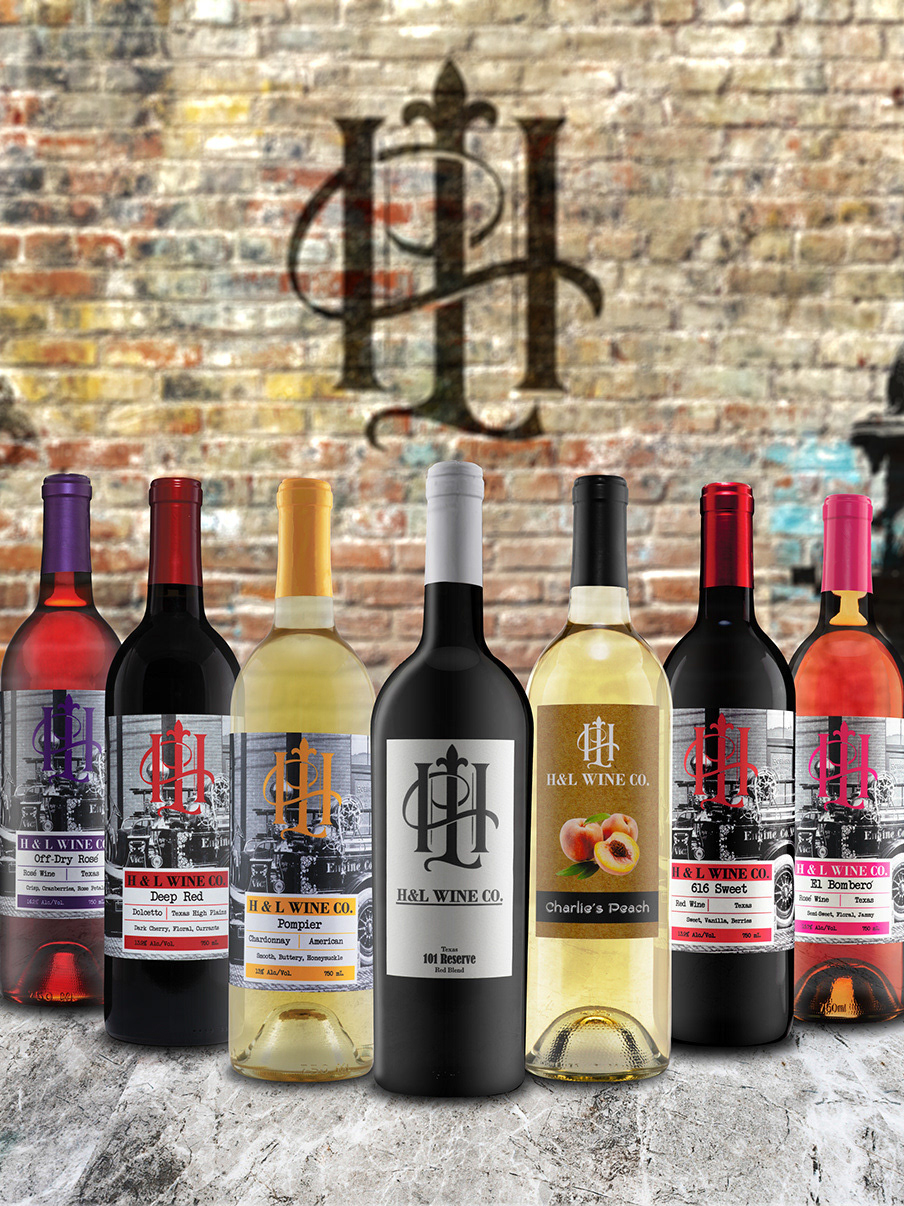
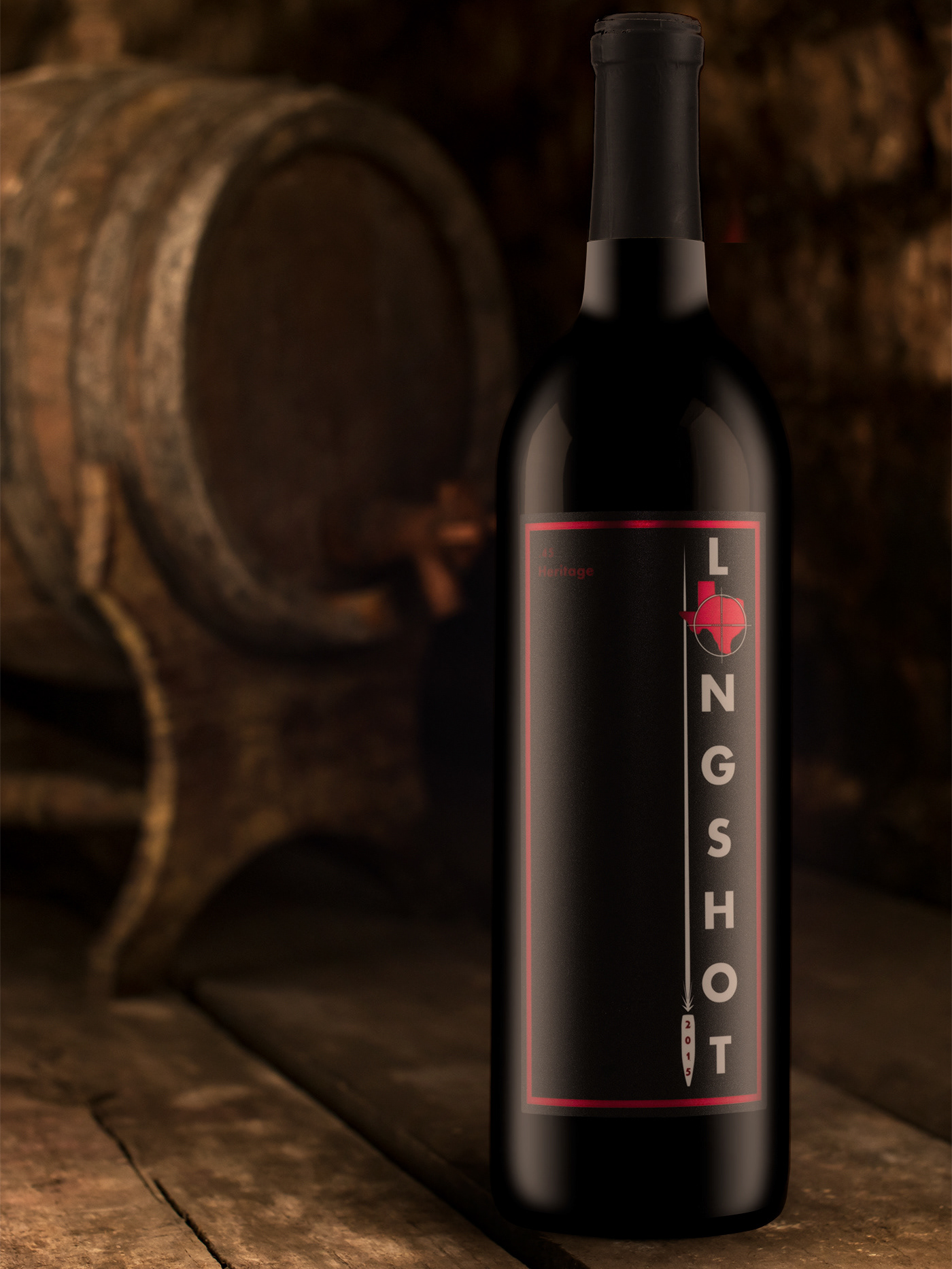
This is a project I completed for Texas Custom Wine Work. I was commissioned to complete everything from initial concept creation to finalizing print and direction for the brand and products moving forward. Specific tasks performed for this product included Packaging, Label, Concept, and Logo Consultation and Design; Marketing; Web Design; Social Media; Branding Direction; and Print Consultation and Direction.
The Client
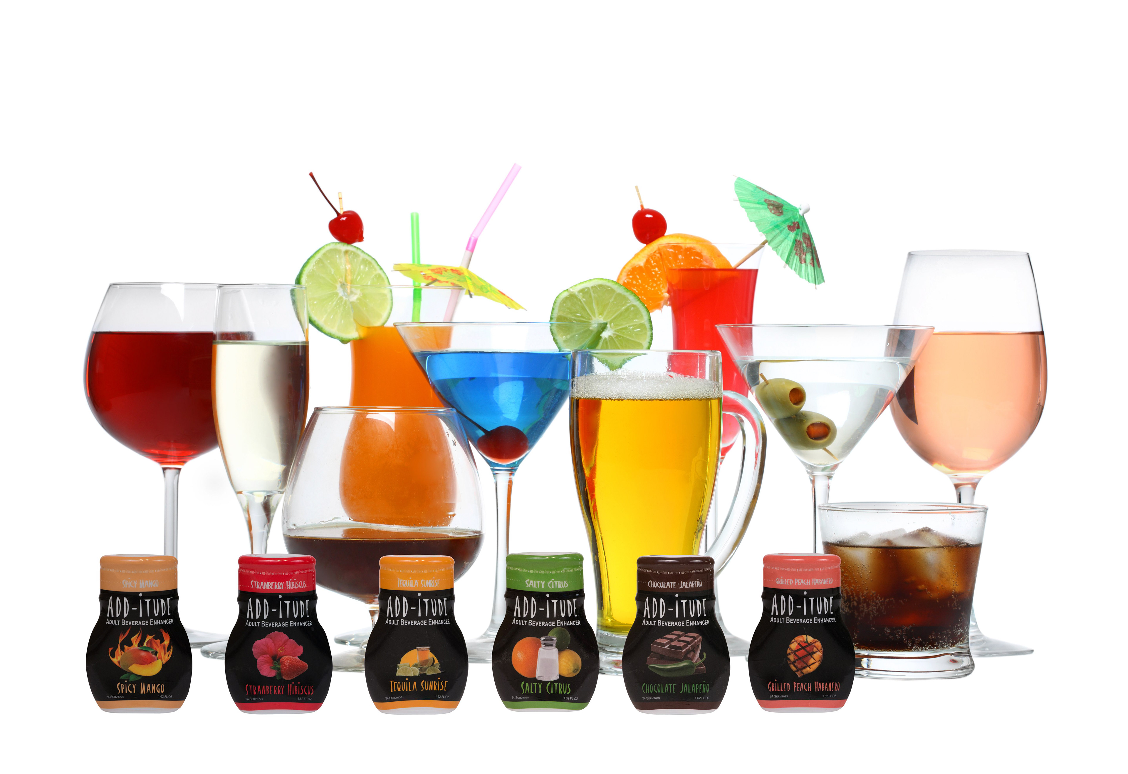
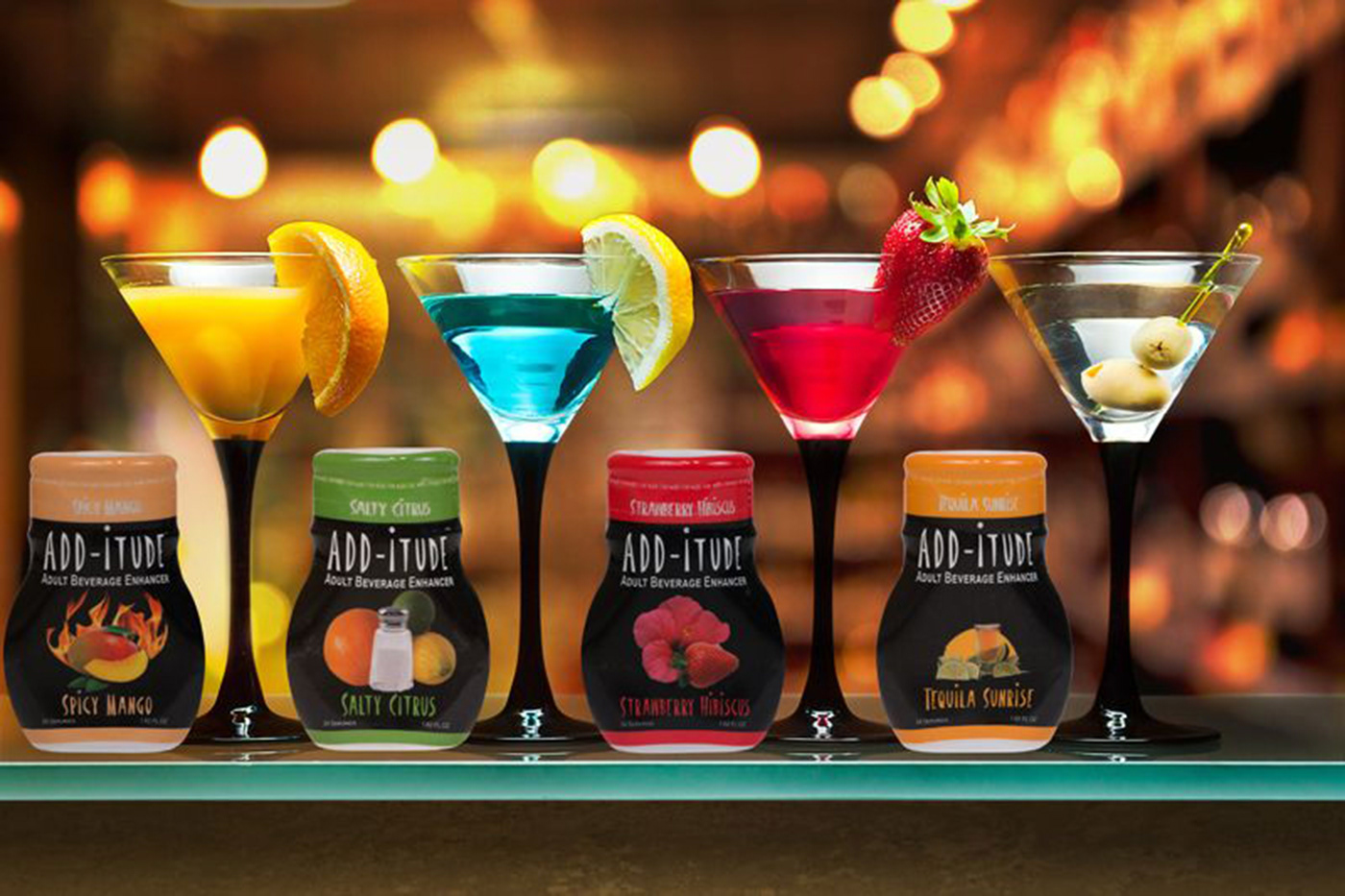
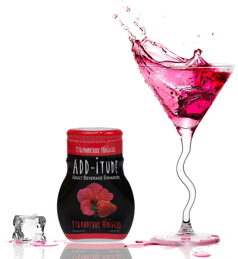
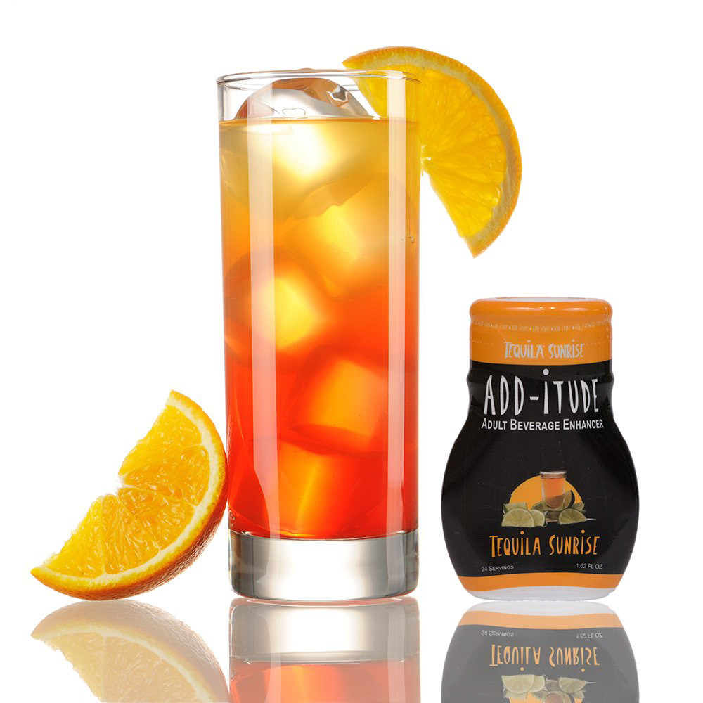
ADD-itude: Adult Beverage Enhancer was a flavor additive for beverages but intended for spirits, wine & beer. The idea is to puts the customer in the driver seat to become a mixologist, allowing them to mix different ADD-itude products to make flavorful drink combinations and let them choose how much flavor they want to add to their drink. With an initial release of six unique flavors giving a total of 720 different combinations, ADD-itude sought out to change the way you drink.
The Challenge
The goal for this project was developed and create a brand, logo, label, packaging, and marketing campaign and materials that are intriguing, intuitive, and youthful, to encourage the customer to become their own mixologist.
The Process
Client meeting for values and brand exploration, to get a sense of the personality and mission of this particular winery > Researching flavor enhancers, bottle designs, youthful culture in new drinkers, and edgy archetypes and symbolism > Concepts Created > Eliciting and encouraging feedback > Design Label Concepts of a few different styles to present to the head of the prodject > Final Label and Packaging Design > Directed and oversaw Label and Packaging printing and production > Production of ADD-itude was completed > Marketing Materials was designed and developed > Marketing and Website was completed along with social media set up and post.
The Design
Brand & Logo
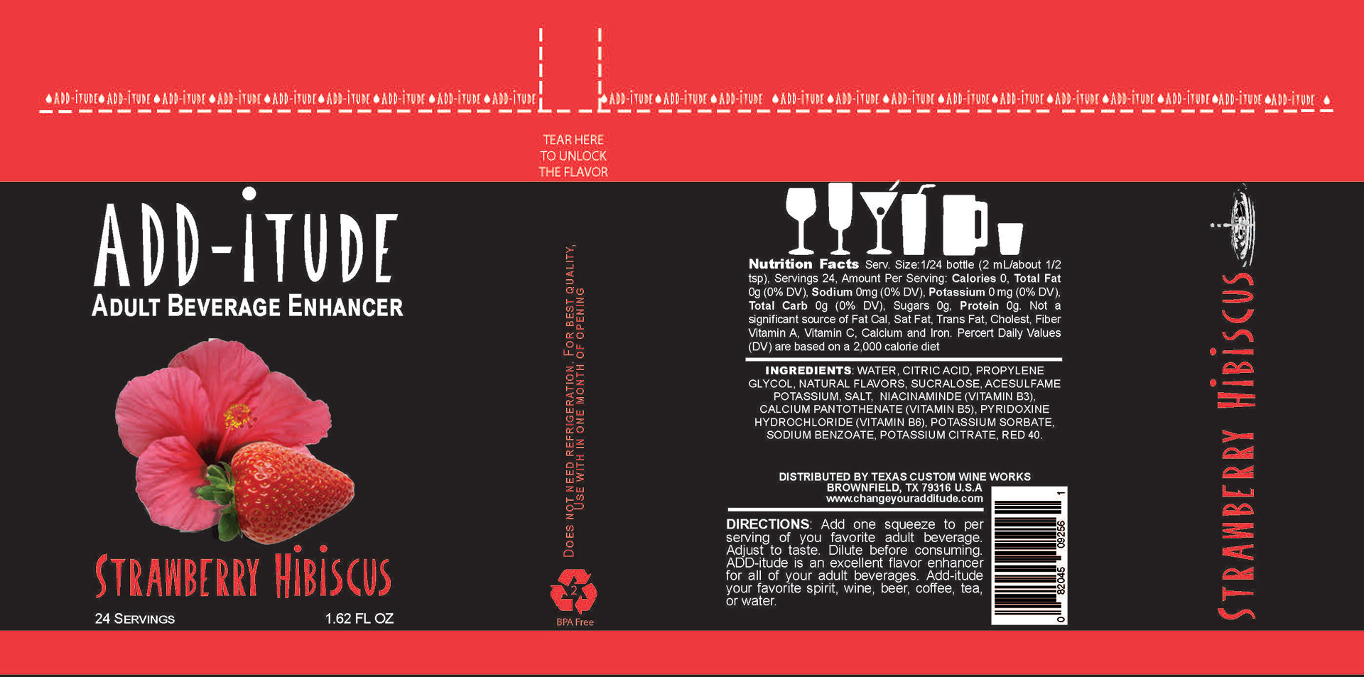
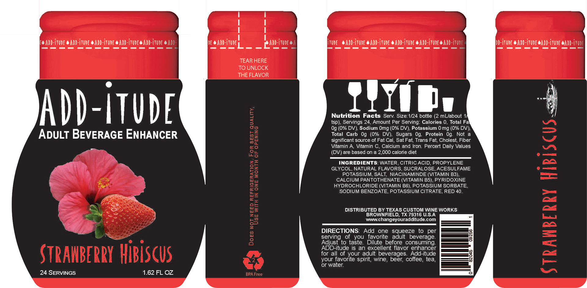
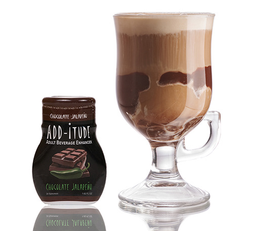
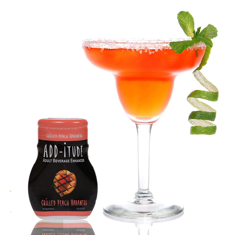
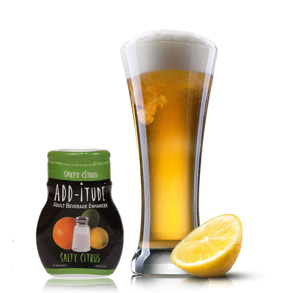
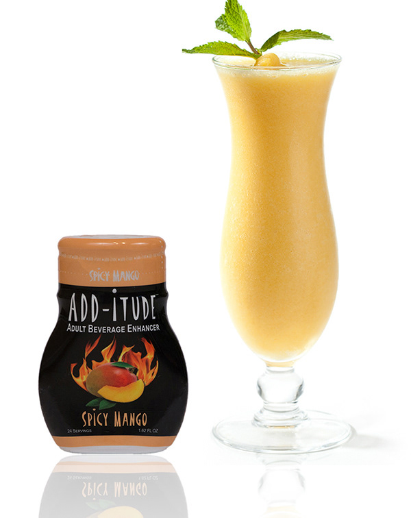
ADD-itude Adult Beverage Enhancer was designed to be appealing to both the casual and experienced drinkers that were looking at creating their style of drinks using a combination Add-itude flavors along with different wine, beer or spirits to change the flavor profiles. The term ADD-itude was a play on words from attitude and to "add it to" your drink. Youthful and aggressive fonts were selected to draw the eye to the brand name and give it a look that would appeal to the Millennial generation. The drop and ripple were designed for the logo to provide the label with motion and represent ADD-itude going into the beverage.
Label
The label was designed to have dark and contrast color pallets. The black background allowed the assigned color for the flavors to pop and be visible from afar. Images of the flavors were developed for the front panel to entice as well to be readily identifiable. The back label had the nutrition facts and other necessary information that the FDA required. I created some drinking icons to enforce the idea that the product was designed to accompany all styles of beverages. The directions on how to use ADD-itude has also added just in case the customer was new to drink enhancers.
Packaging
The packaging was used as it is standard drink additives that were already out on the market so when something new for alcoholic beverages where to be used that there would be no confusion as to how to use it. The packaging container also allowed for secure storage and travel so that the customer could take it anywhere with them. The label was shrink-wrapped onto the package container to achieve a similar look to other flavoring products out on the market. The shrink-wrap also sealed the product and kept the ADD-itude from potentially being tampered.