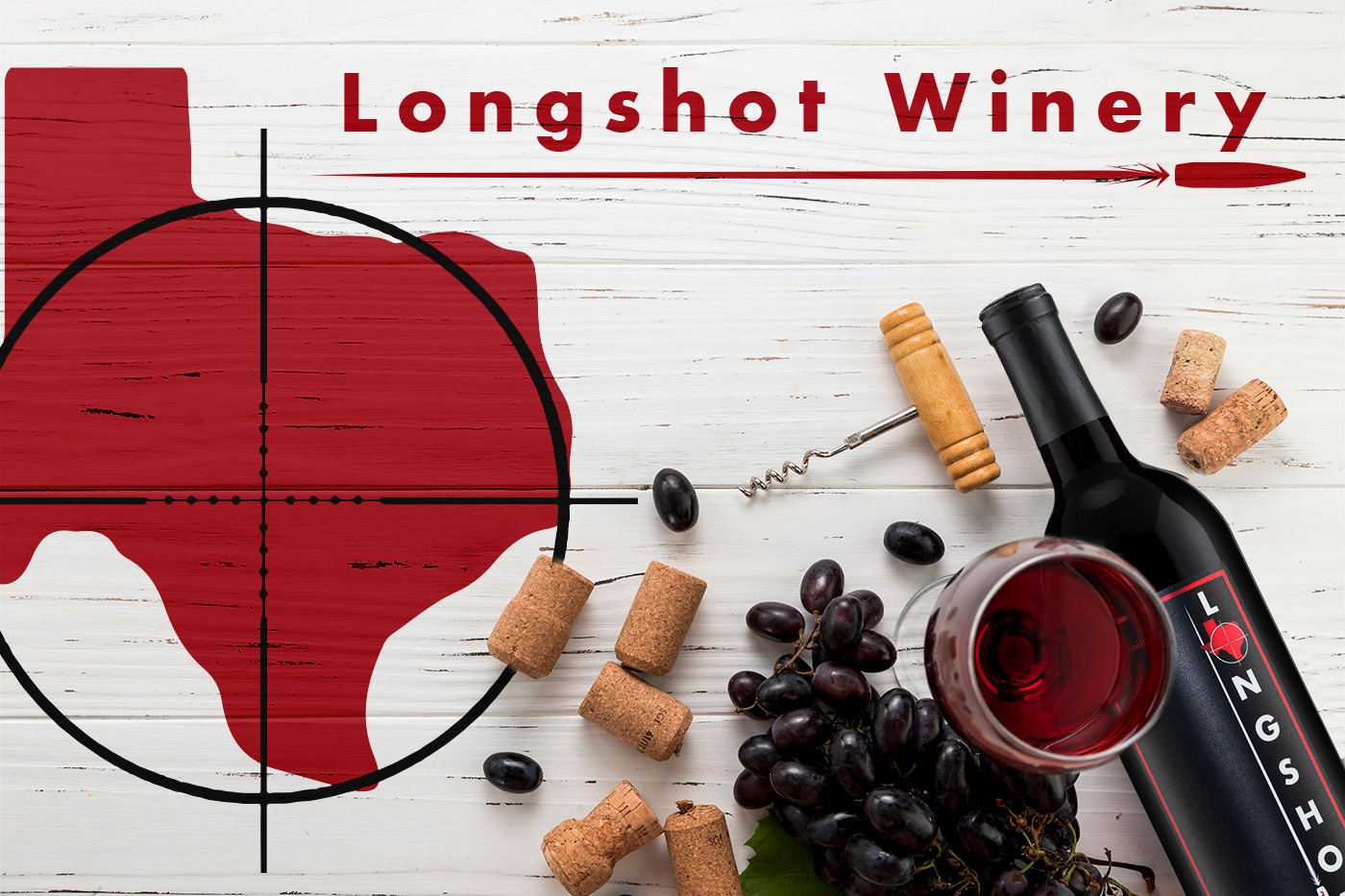
The Work
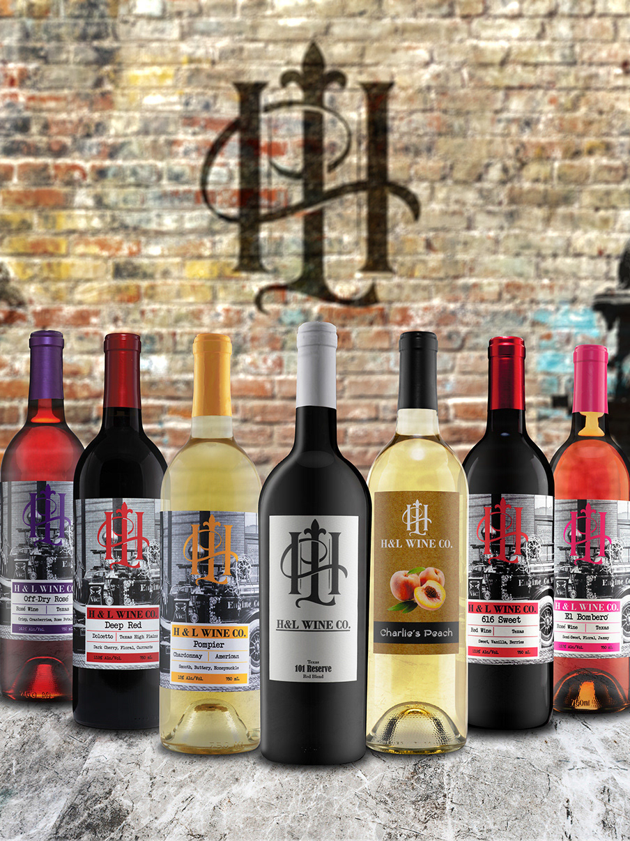
These are the projects I completed for Longshot Winery. I was commissioned to complete everything from initial concept creation to finalizing print and direction for the brand and products moving forward. I initially was tasked to design his premium label, packaging, and logo for his launch. I would then go on to build his website, develop two more styles of wine labels, create event posters, marketing, and business materials. Specific tasks performed for this winery included Packaging, Label, Concept, and Logo Consultation and Design; Branding Direction; Print Consultation and Direction; Production Photography; and Business and Marketing Materials Designs.
The Client
This fantastic winery is located out of New Braunfels, Texas, right next to the Comal River. With a great atmosphere and frequent events, this winery sets itself apart from others. Longshot Winery offers a variety of different wines for every pallet. With paying tribute to people who have served in the arm forces and the rich German heritage of the local area, this is defiantly is a must-go-to spot.
The Challenges
The client wanted to build a brand that encapsulated premium Texas wines that everyone can enjoy. He wanted his brand, that he named Longshot Winery, to reflect his time he served in the armed forces and pay tribute to Texas. Initially I was tasked to design his premium label, packaging, and logo for his launch. I would then go on to build his website, develop two more styles of wine labels, create event posters, marketing, and business materials.
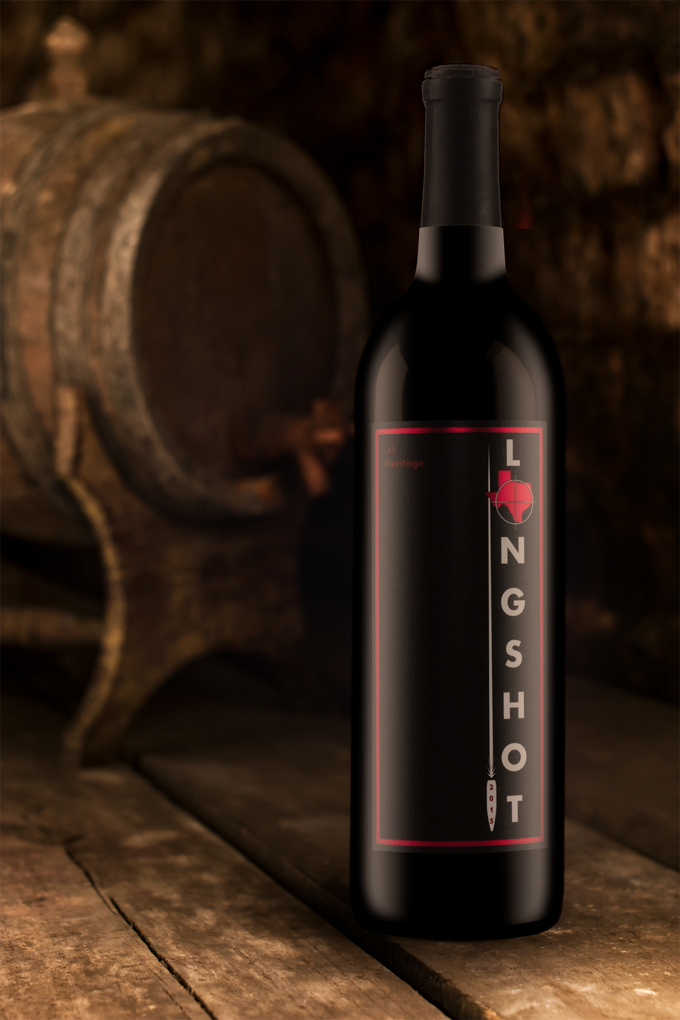
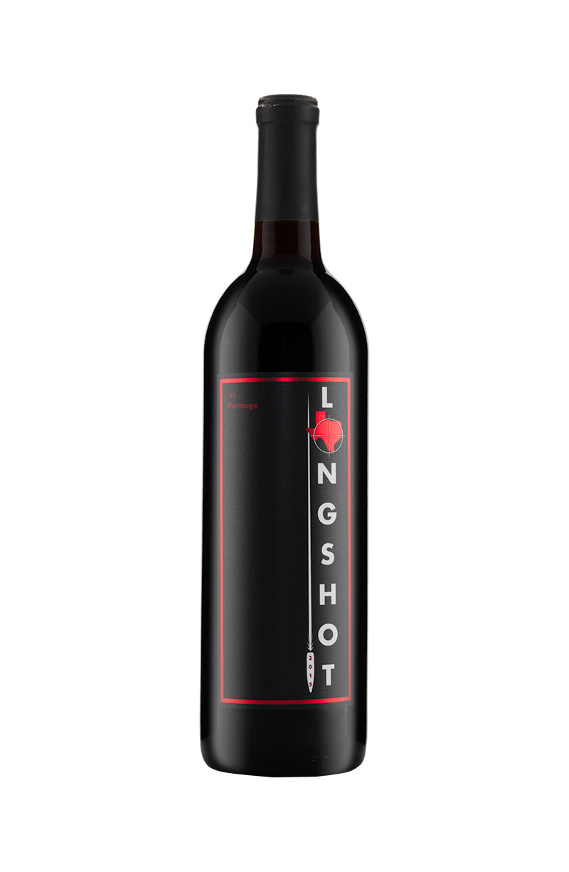
#1 The client wanted this project to be a high-end ultra-premium label and packaging. Everything needed to be unique and clean and stand out from the client's other wine labels and packaging. The client wanted someone to walk into their winery and be drawn to it.
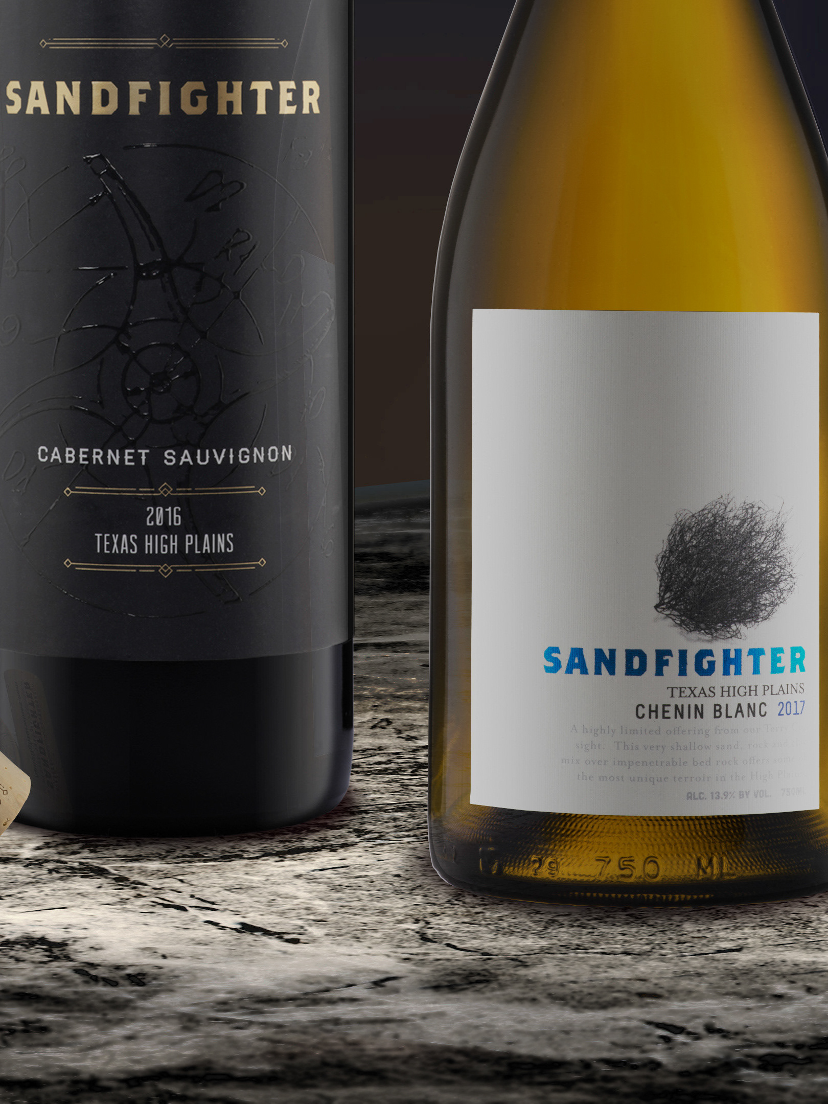
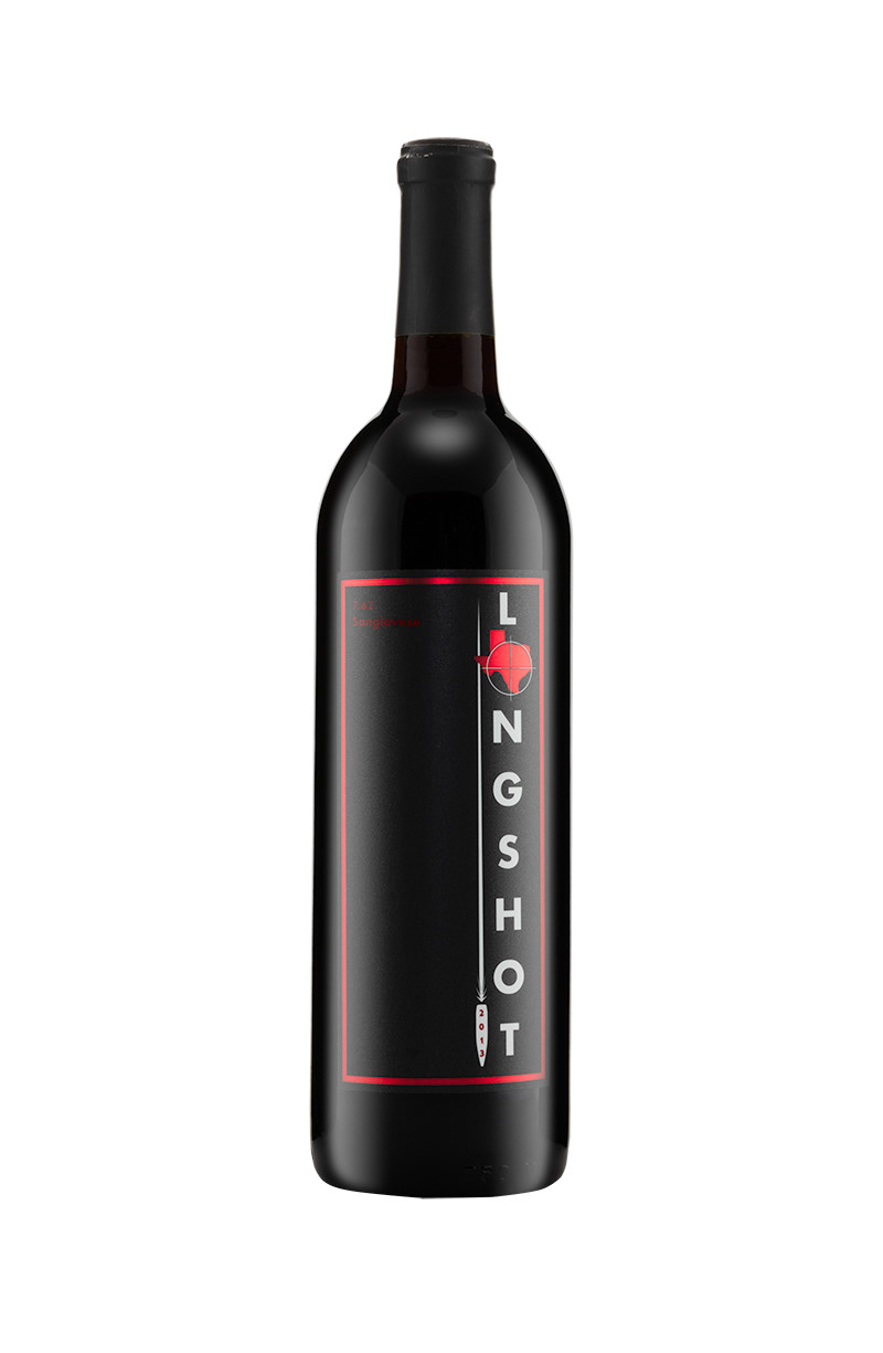
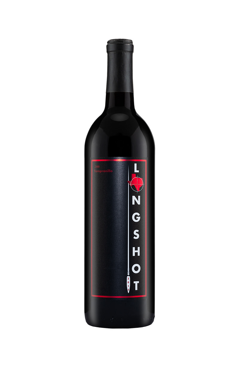
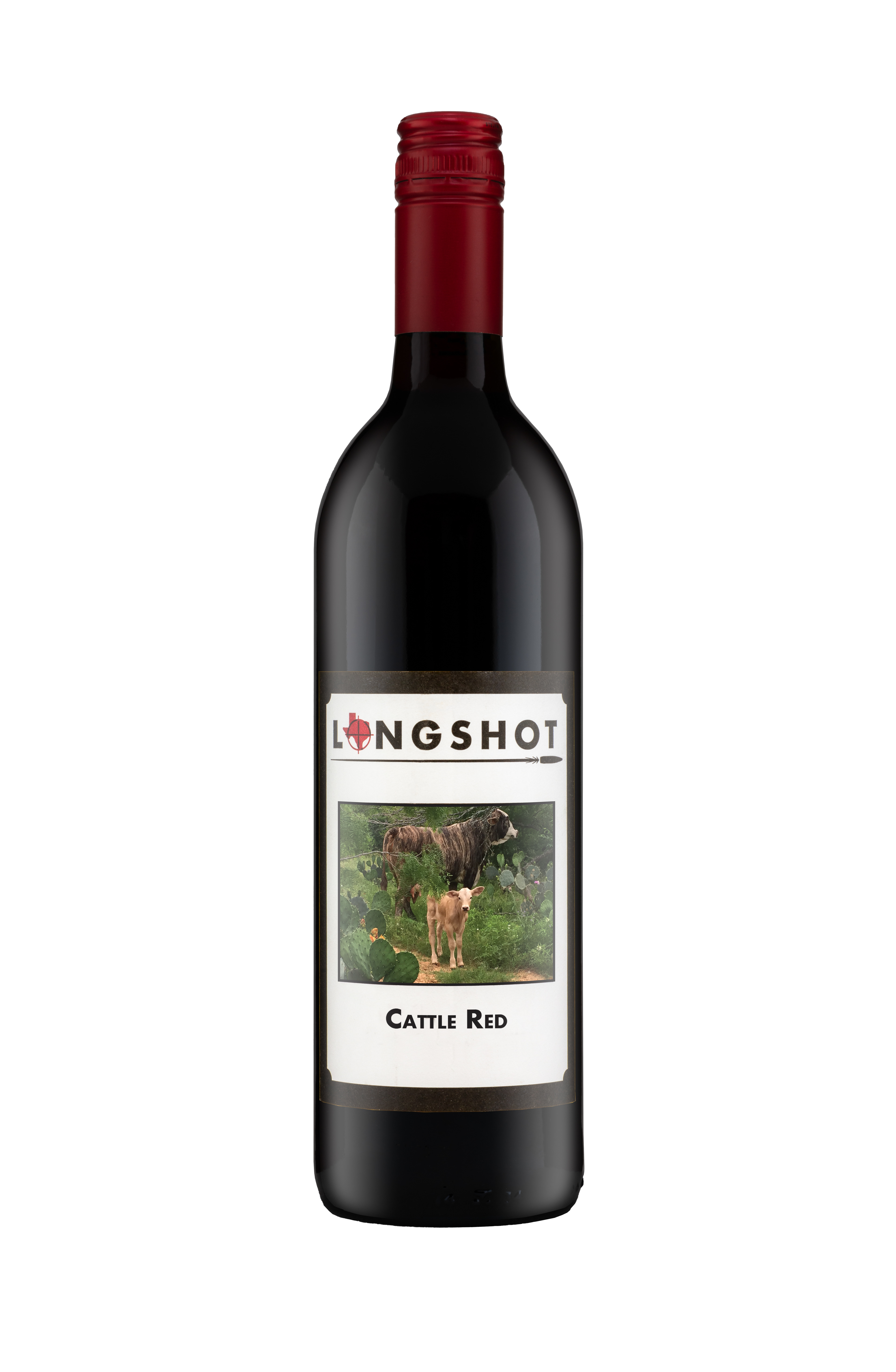
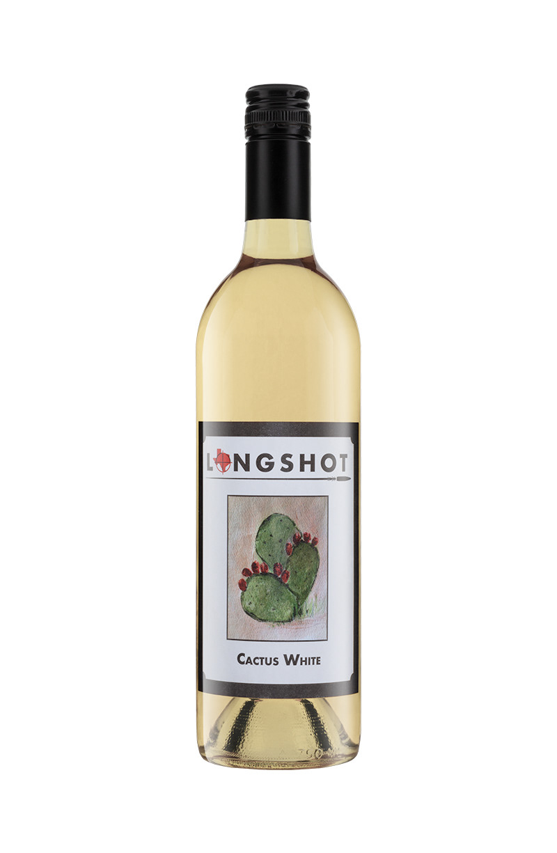
#2 The challenge for this label was to create a wine label for his house line of wines. These were basic wines that would need to survive the humidity of the region as well and not needing a high-end packaging option.
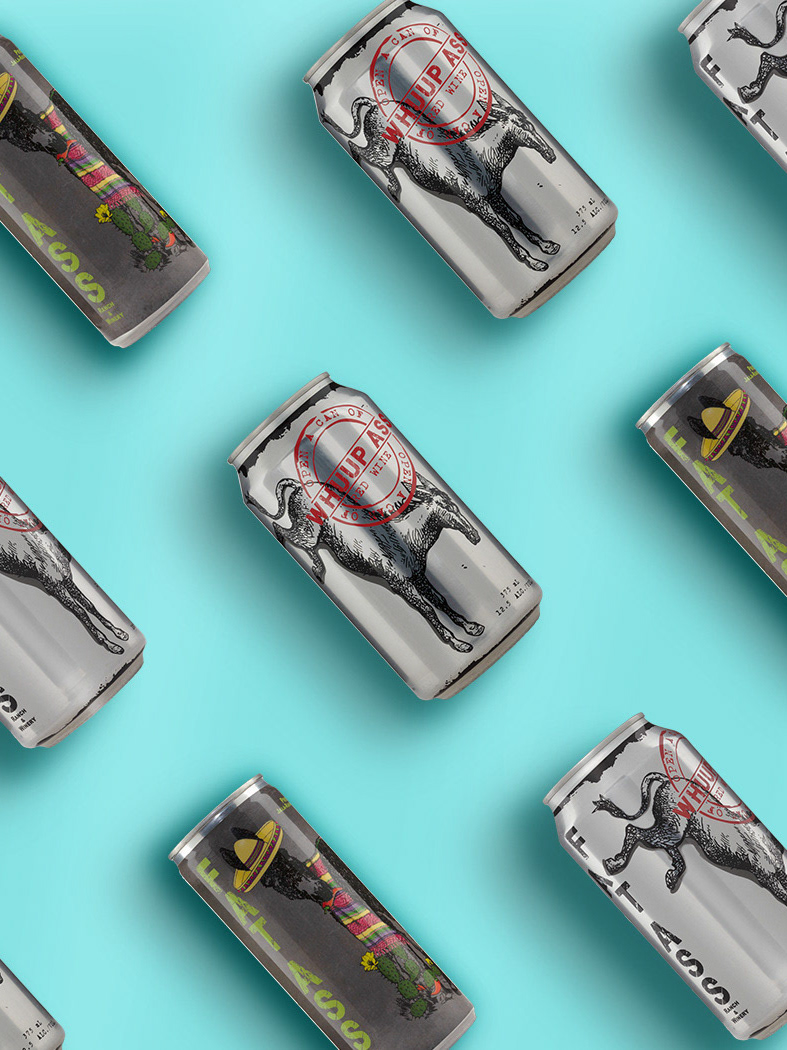
#3 The client requested a design that would show off Texas artists that would work with the same packaging as the house line.
#1 The client wanted this project to be a high-end ultra-premium label and packaging. Everything needed to be unique and clean and stand out from the client's other wine labels and packaging. The client wanted someone to walk into their winery and be drawn to it.
#2 The challenge for this label was to create a wine label for his house line of wines. These were basic wines that would need to survive the humidity of the region as well and not needing a high-end packaging option.
#3 The client requested a design that would show off Texas artists that would work with the same packaging as the house line.
The Design
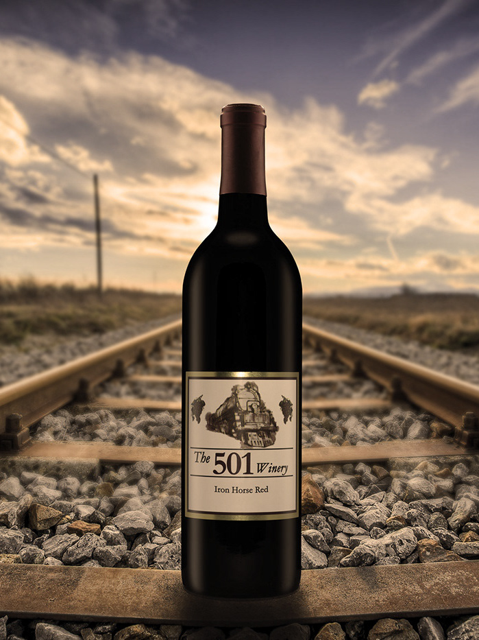
Base Line Label
The client wanted not only a premium label and brand but wanted something that would survive the humidity and moister of New Braunfels, TX. To achieve this a metallic Bopp label stock was used to give the red a foil appearance and a matte coat varnish was applied to make the label bulletproof.
Packaging
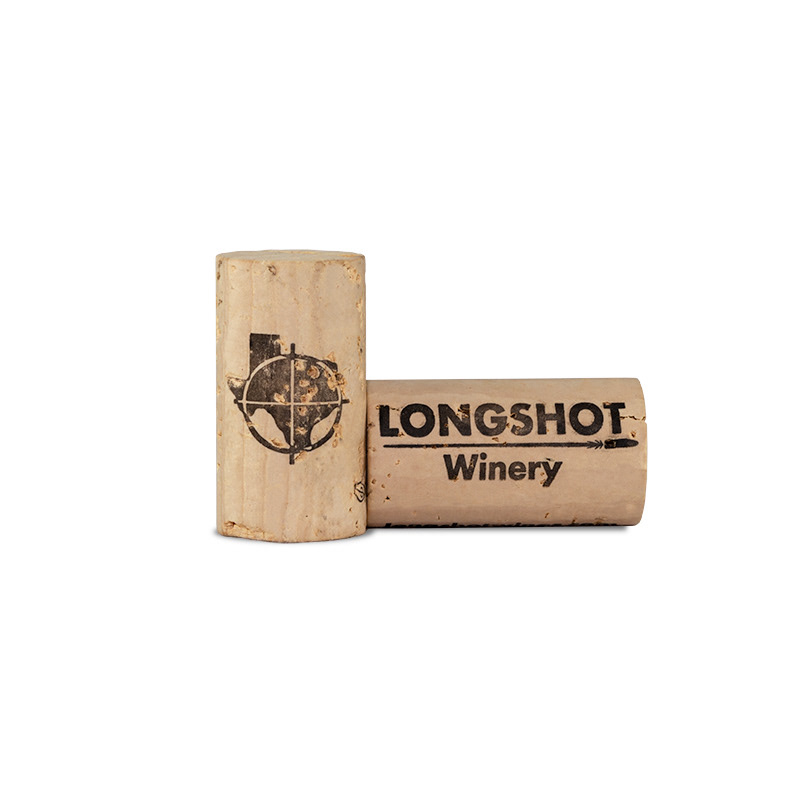
Traditional packaging was selected for the appropriate wines and a custom 44mm natural cork. To continue to push on the red, black, and white color theme that is across their labels. A matte black capsule and the traditional Bordeaux and Burgundy bottles were selected for the appropriate wine.
Bottle Photographs of the finished products.
The Design
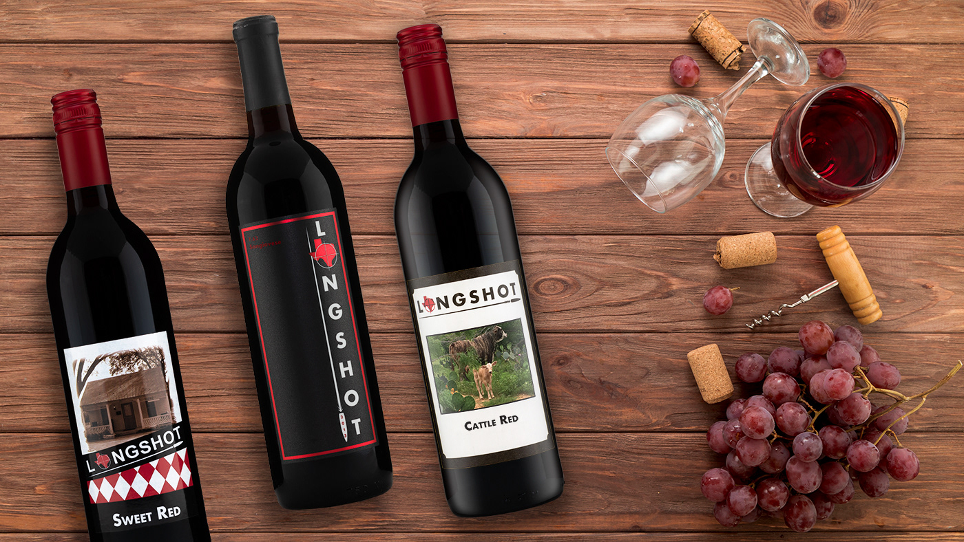
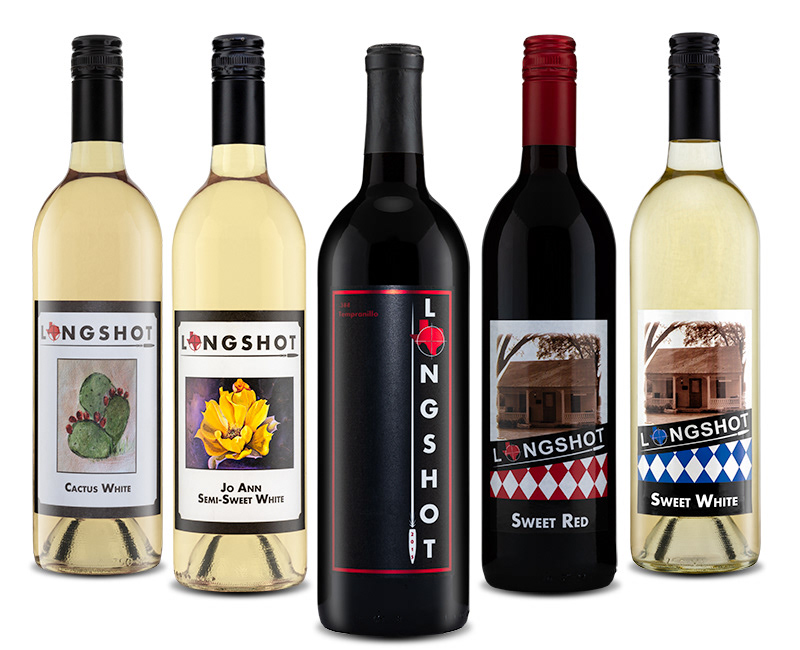
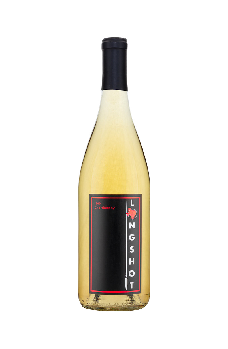
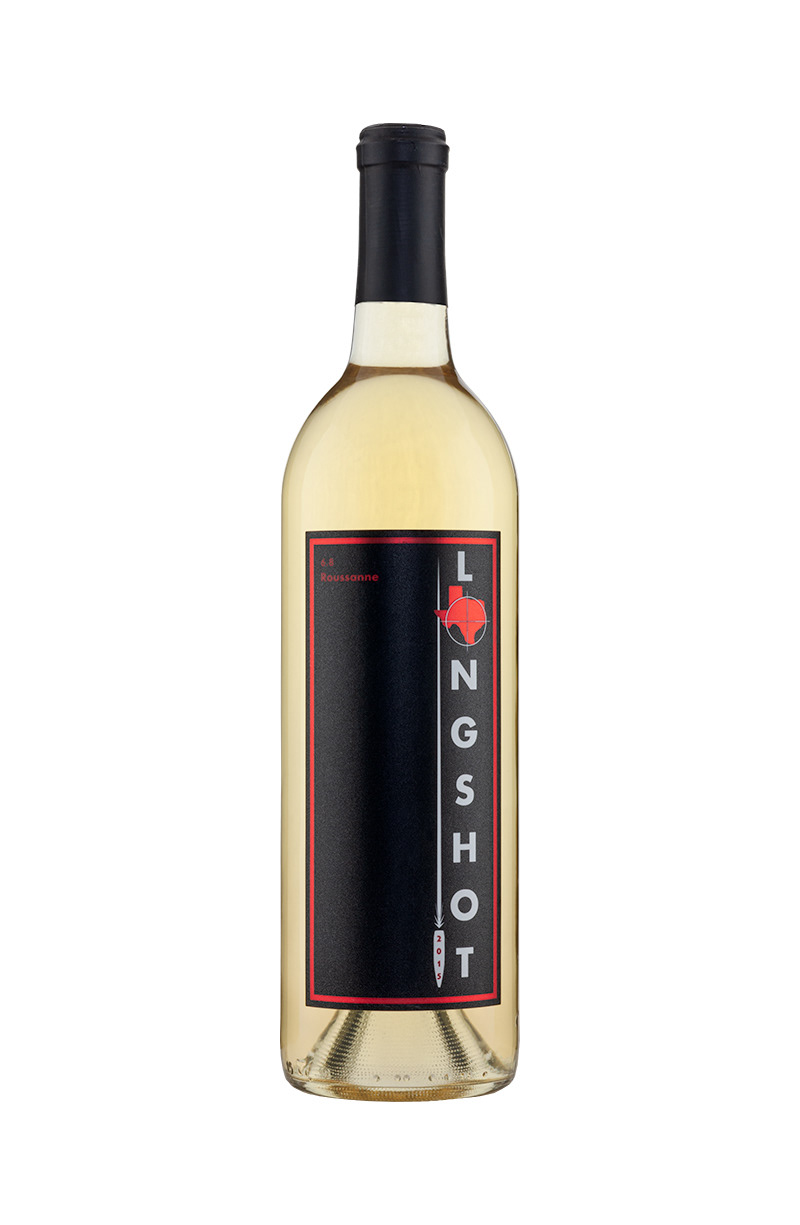
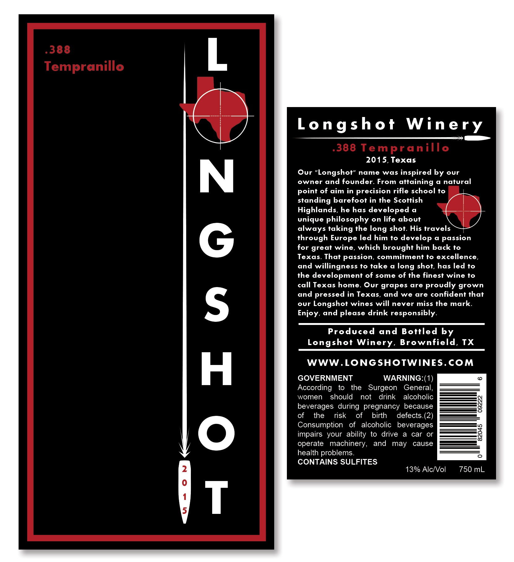
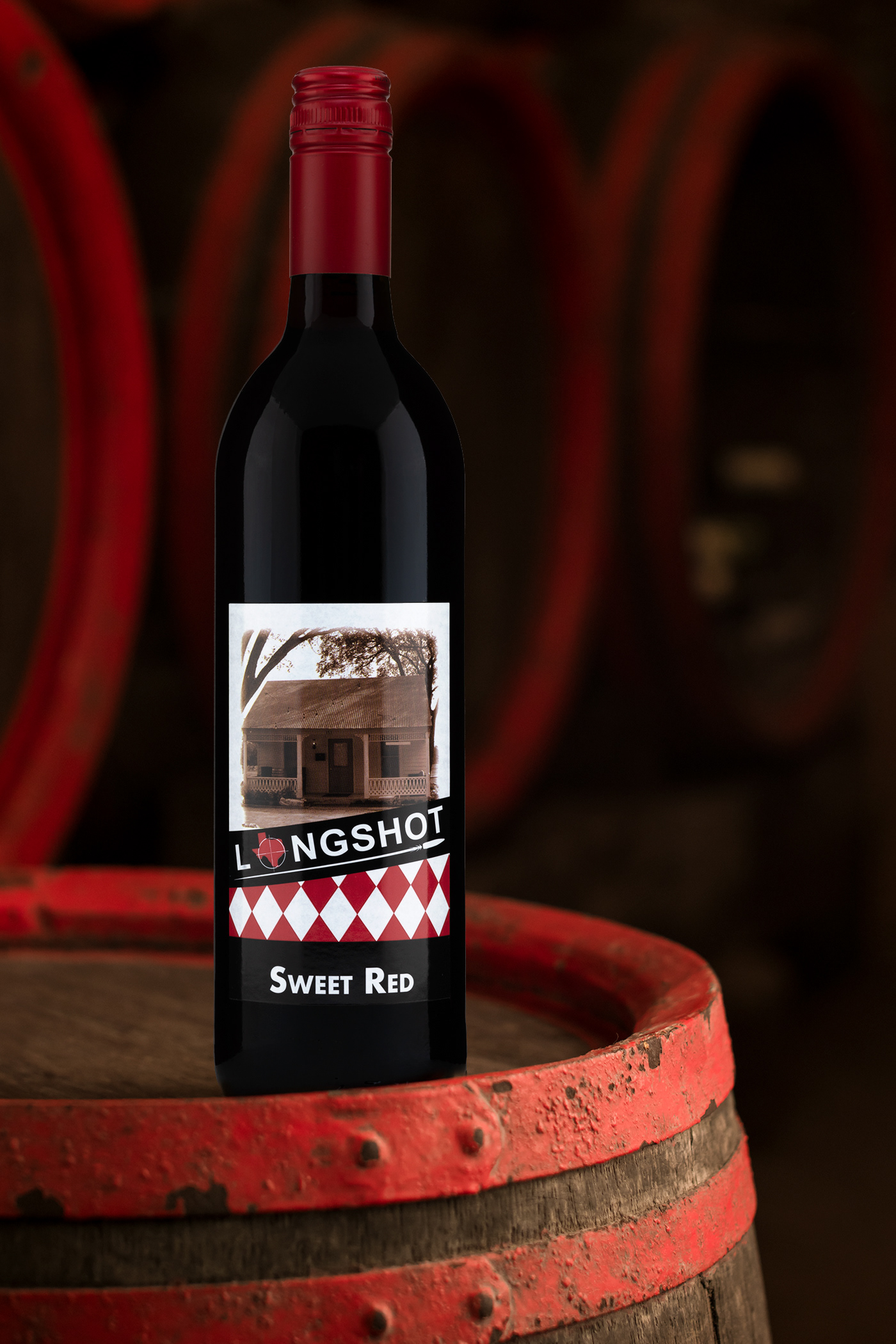
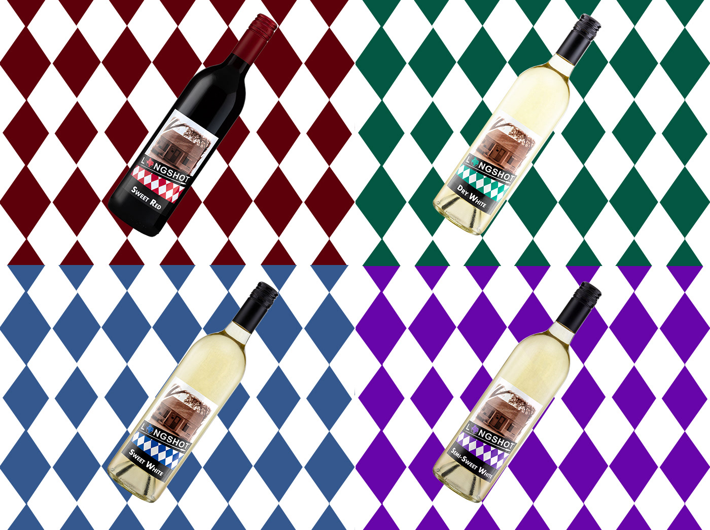
These wines were the client's house wines. These labels were designed to pay homage to the winery's city German heritage as well as the oldest building in the city. Printing the design on a coated paper gives the photo more pop as well as offering some protection to ice buckets and outside elements. Because this was their house wine, a Stevlin twist-off capsule was selected to be used for easier serving and storage. The packaging also created a higher perceived value for the client's premium line as well.
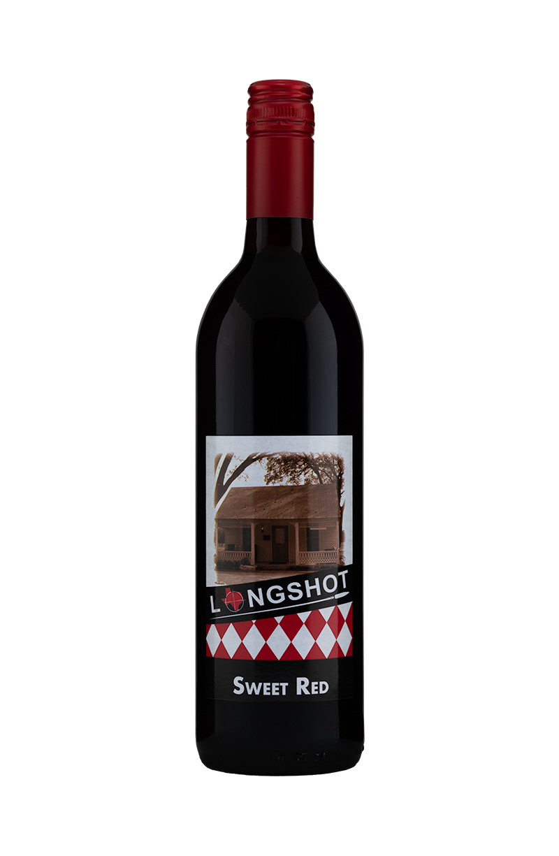
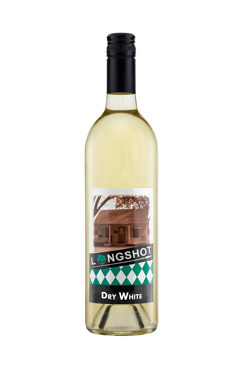
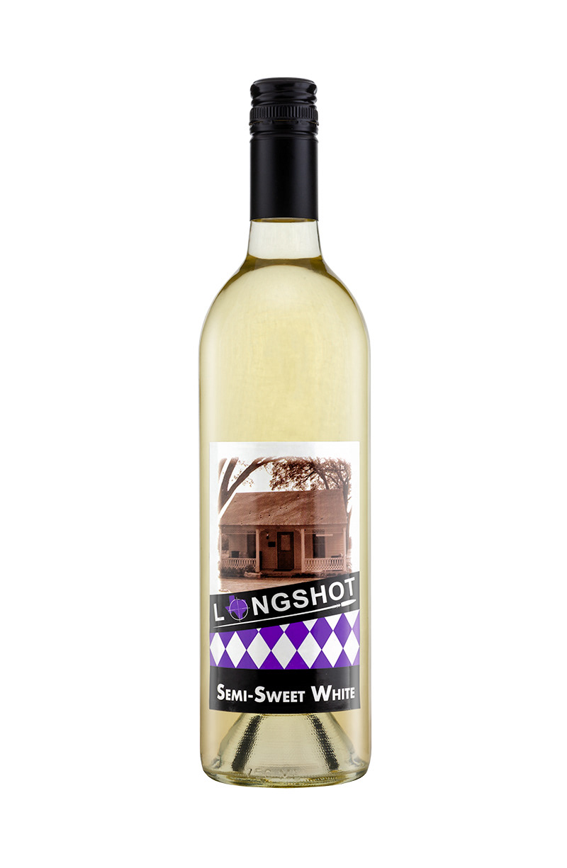
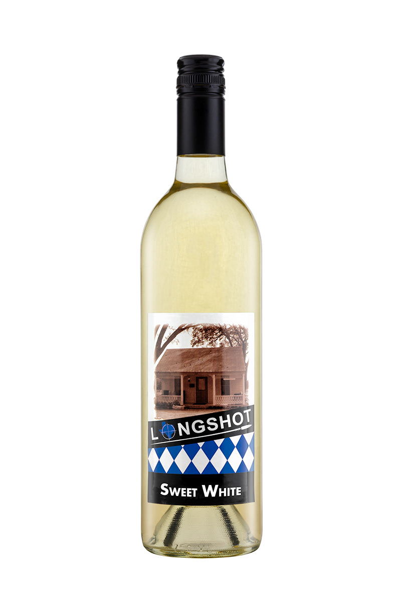
Product Photography of the House line wines

Image of the House line labels, size - front label: 3.xx" x 3.xx", back label: 3.xx" x 3.xx
The Design
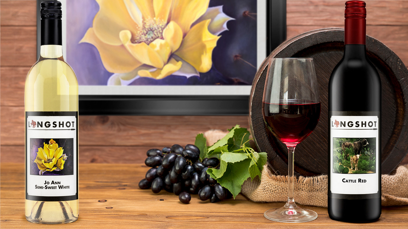
Because the client is a huge art fan and wanted to support local Texas artists, He wanted to do a series of labels that would bring a spotlight onto these artists. These were limited run labels that were printed on a matte cotton paper stock. The same packaging was used for the "Painter Line" as it was for the House Line.
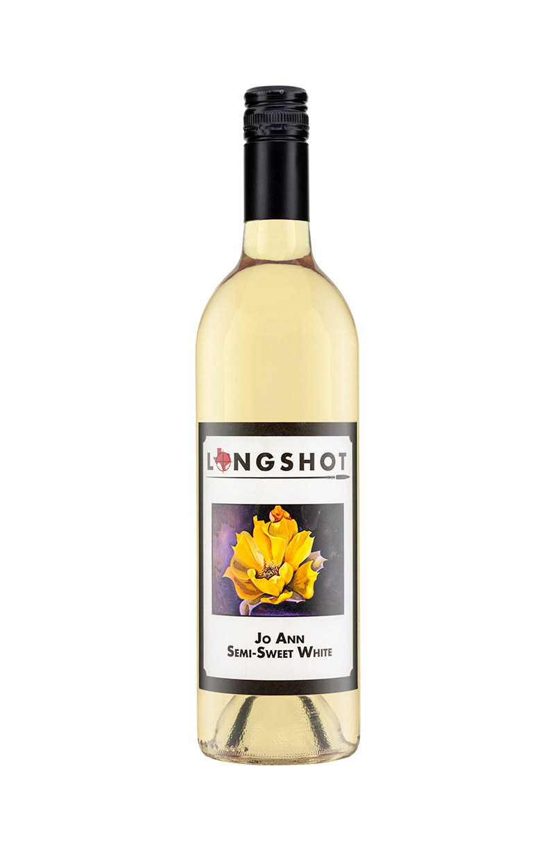
Product Photo of Painter Line wines
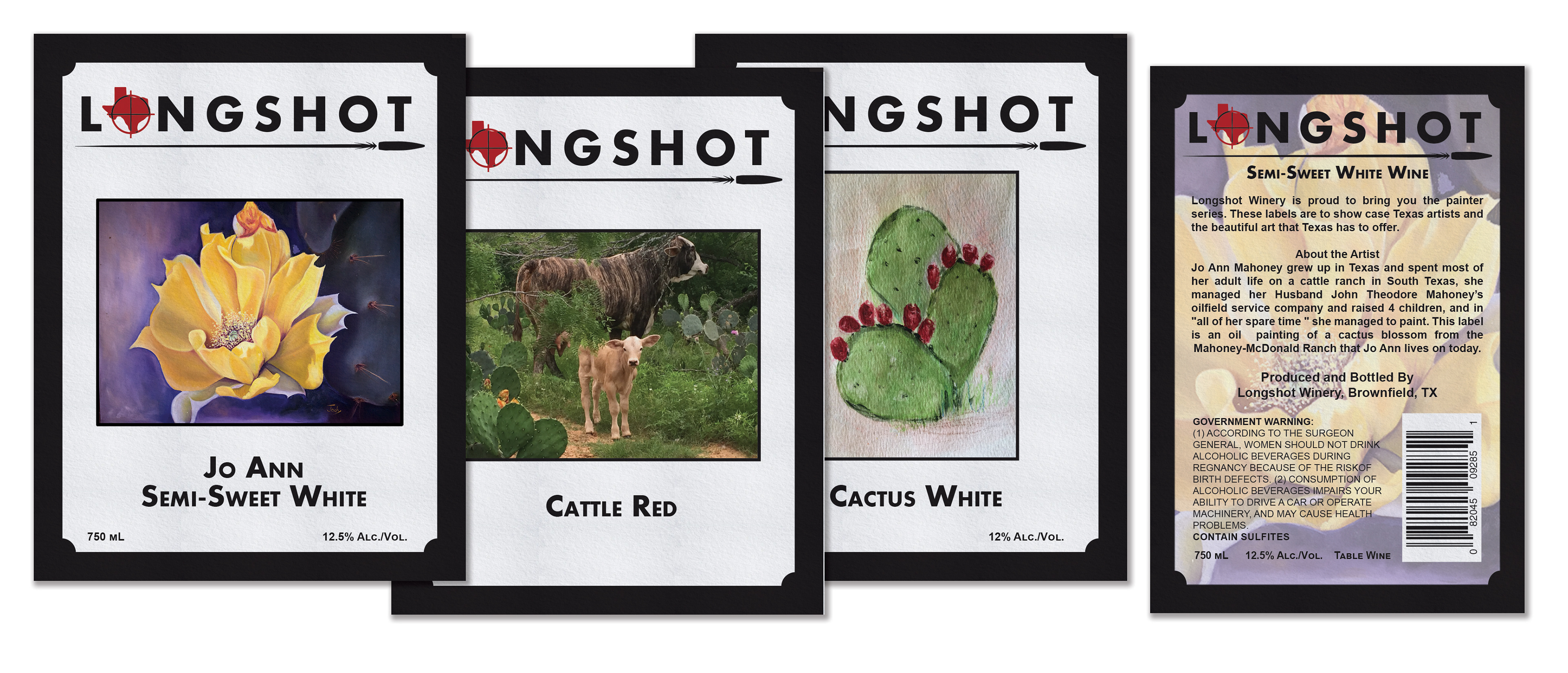
Image of Painter Line labels, size - Front labels: 3.5" x 4.5", Back label: 3.5" x 4.5"