The Work
This is a project I completed for Wine Fusion Winery. I was tasked to complete everything from initial concept creation to finalizing print and direction for the brand and products moving forward. Specific tasks performed for this winery included Packaging, Label, Concept, and Logo Consultation and Design; Branding Direction; and Print Consultation and Direction.
The Client
Wine Fusion Winery is in the historic Grapevine Mills Texas. This urban fusion winery with an atmosphere where people could come to relax, learn, laugh, and enjoy the many intricacies of wine. Wine Fusion has created the idea of merging two groups, the consumers and the daunting wine industry, without the intimidation. Wine Fusion aims to help teach people on shopping for wine with ease at the grocery store, wisely pick wines from a daunting menu at restaurants, learn how to dissect confusing wine labels, and identify wines based on taste, smell and sight. It is this fusion of education and enjoyment that will have you coming back for more.
The Challenge
The client brought in a logo they had created and requested that the wine label be edgy and urban but has a high perceived value. The client wanted it to reflect the art style that they were going to decorate their winery and be youthful and bold. With exposed brick and stainless countertops with wine taps, they wanted a label to compliment these features as well. They wanted to be a very new world that would complement the wine taps they were going to have.
The Process
Client meeting for values and brand exploration, to get a sense of the personality and mission of this particular winery > Researching the local area, culture, and the history of their city> Concepts Created > Eliciting and encouraging client feedback > Design Label Concepts of a few different styles to present to client > Final Label and Packaging Design > Completion of compliance submission for client > Directed and oversaw Label and Packaging printing and production > Wine Production, Bottling, and Labeling (working with these departments as a consultant and providing quality checks in-person to ensure successful final product).
The Design
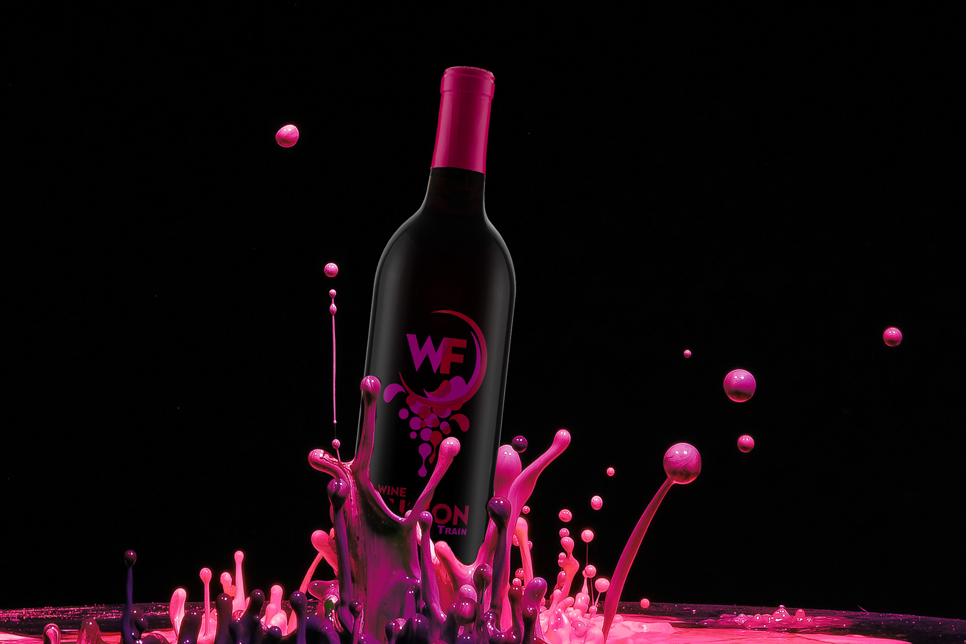
Label
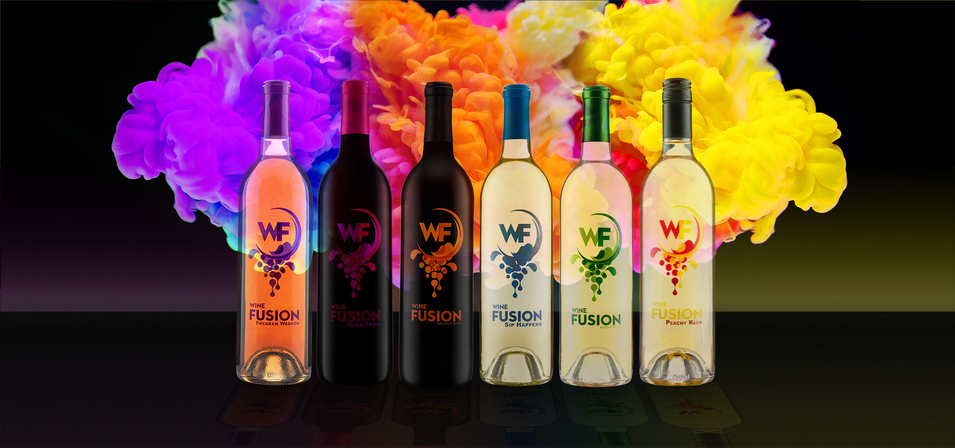
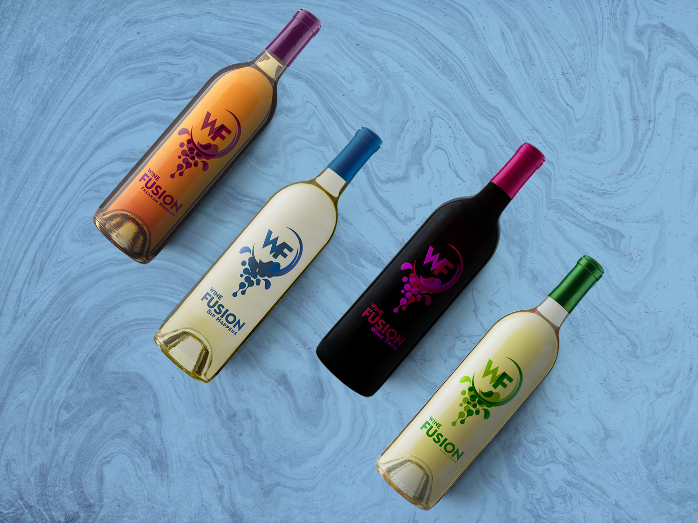
The initial logo that was given to me had "Wine Fusion Winery" with muted colors causing the brand not to stand out. So I remove the "winery" and relocated "Wine" and re-sized to focus on the fusion aspect of their brand. These edits also framed the logo and wine label better. I then assigned a unique color pallet to each of the different wines. Not only distinguish the wine from another but using color theory to evoke a sense of the wine from dry to sweet and flavors the wine drink could expect. To give the wine labels an edgy new world style, they were printed on a transparent label stock. Later designs had the fanciful name enlarged for better visibility.
Packaging
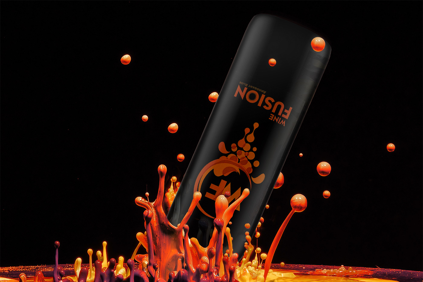
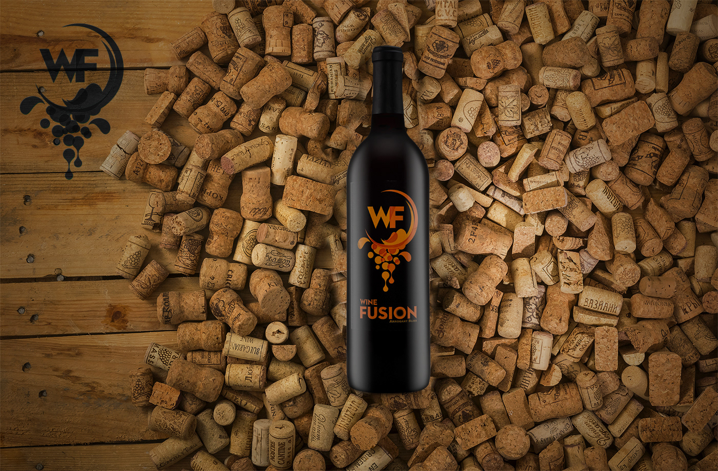
To give the wine products a high perception of value to match the brand. Full punt, medium-weighted, flint or antique green Bordeaux bottles were select with a cork finish. Custom color capsules were used to match the labels to tie in with the wine labels and make identification easier. Except for the Peachy Keen wine, which was given a matte black Stelvin twist-off capsule.

Arrogant Bliss
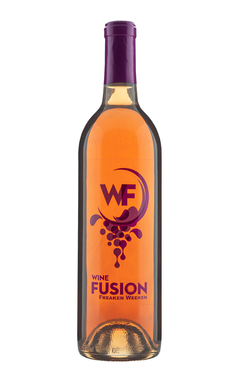
Freaken Weekend
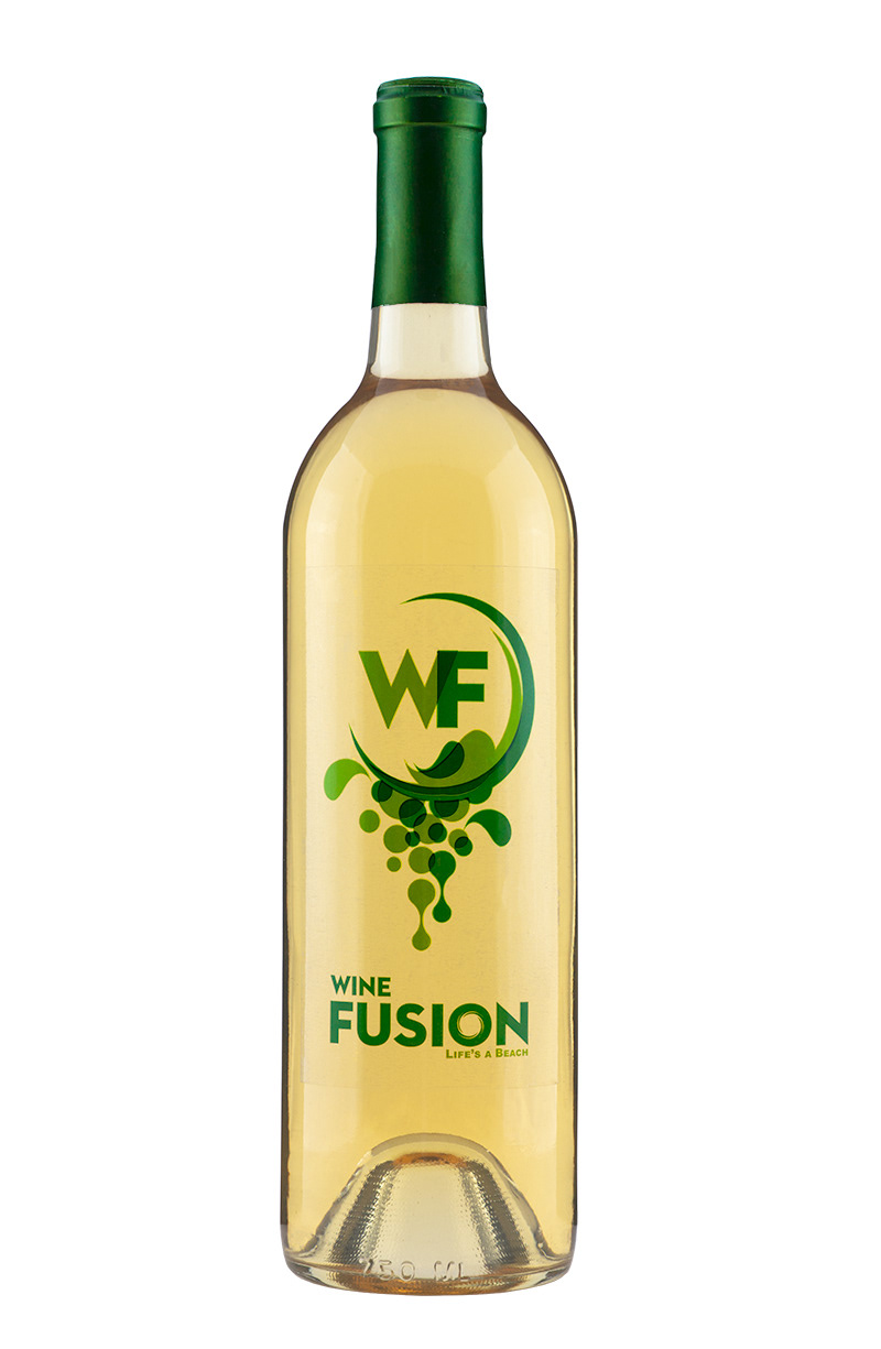
Life's a Beach
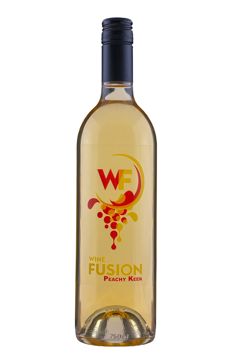
Peachy Keen

Sip Happens
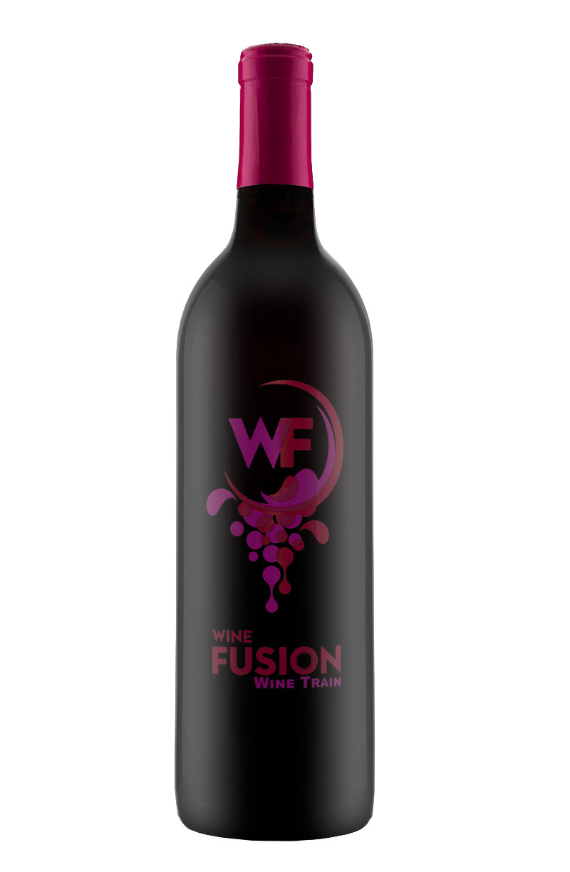
Wine Train