
Work Performed
These are the different projects I completed for Fat Ass Ranch & Winery. I was commissioned to complete everything from initial concept creation to finalizing print and direction for the brand and products moving forward. Specific tasks performed for this winery included Packaging, Label, Concept, and Logo Consultation and Design; Original Art and Illustration; Branding Direction; Print Consultation and Direction; and Photography and Videography.

The Client
This fabulous winery is in the wine corridor of Fredericksburg, Texas. Beyond its anti-stuffy winery feel, Fat Ass Ranch & Winery focuses on their wines and not the formalities. With a fun atmosphere and a great place to drink wine, this winery is setting itself apart from other wineries. As a result of having so many wine options for different ranges of pallets coupled with a laid back atmosphere, they are a must stop when in Fredericksburg.
The Challenge
I was tasked to bring this project to life with a label that matched the client's unique vision for his brand. The client wanted a wine label that was different, unique, and for it to be counter wine culture. The client wanted to target the person who was being dragged to different stuffy wineries and want that person to have a great time and intrigued enough to try their wines. Future challenges would amount to upping the ante on the wine labels by making them themed and wanted them to reflect the motif of the wine. The client also wanted the label to pay tribute to their donkey Jackson, to which the ranch & winery derived their name.
The Process
Client meeting for values and brand exploration, to get a sense of the personality and mission of this particular winery > Researching counter wine culture, the area and different wineries, classic archetypes and symbolism wineries use > Concepts Created > Eliciting and encouraging client feedback > Design Label Concepts of a few different styles to present to client > Final Label and Packaging Design > Completion of compliance submission for client > Directed and oversaw Label and Packaging printing and production > Wine Production, Bottling, and Labeling (working with these departments as a consultant and providing quality checks in-person to ensure successful final product).
The Design
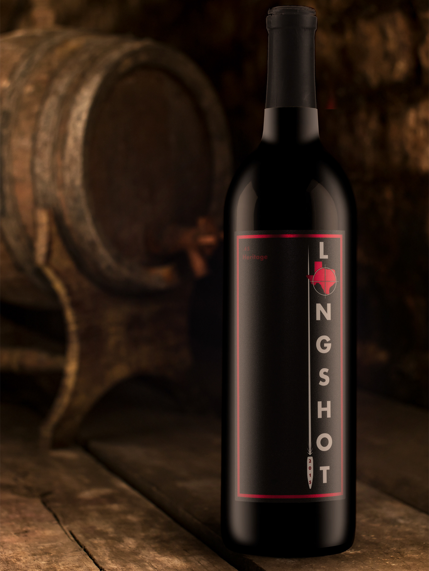
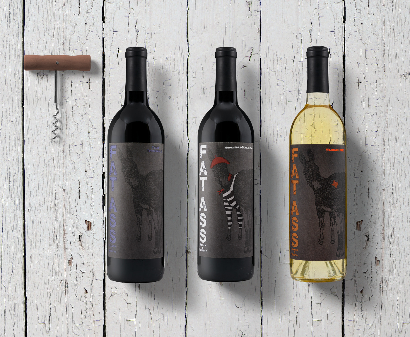
Label
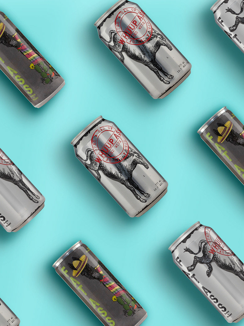
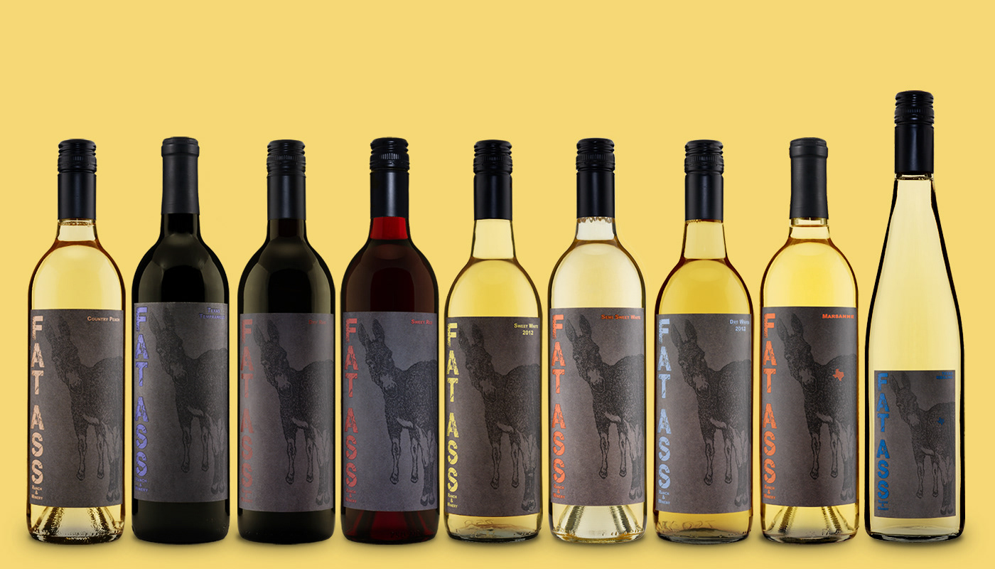
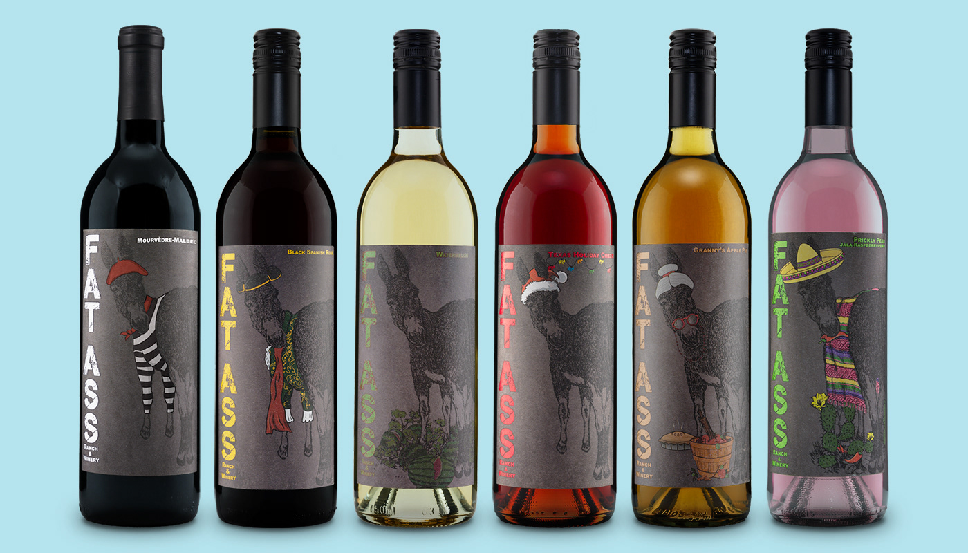
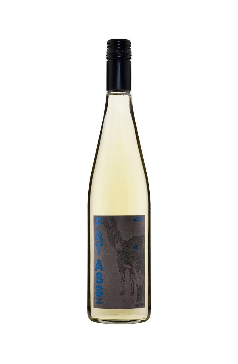
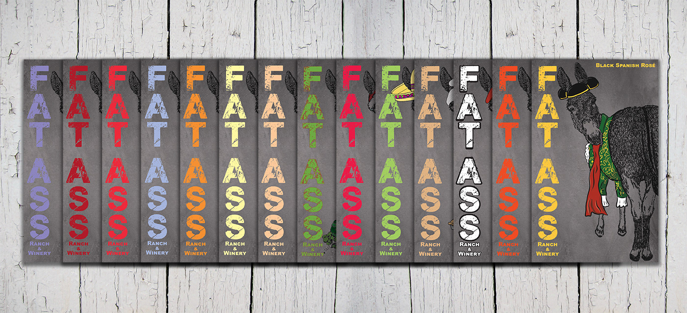
The label design was to put the donkey upfront and with its rump on full display. Not only is the winerie's name counter-culture but using "ass" as a double entendre. Multi-shade of grey painted canvas texture was used to color the background of the label as well as the donkey. An uncoated label stock was selected to give the wine label a rustic feel and compliment the wine label design. To distinguish the wines from one each other, a distinctive color is chosen for each of the wines. This unique color is applied to the brand and wine name. I wanted a font that was distress to draw the eye to the brand name and give it an old rustic feel. I had the wine label be applied with a tactile varnish on it to give it texture and raise it from the label stock. For the back of the wine label, I made it much smaller to hide behind the front wine label. The back wine label contained the required information: TTB and TABC required for state and federal requirements. It also included the story of the winery. To poke fun at the "pairs well with" statement an unexpected food was selected. I continued the color scheme on the back label using the color chosen for the wine to highlight key aspects such as their logo, brand, and wine name.
Packaging
The original packaging was a non-punt, no thrills screw-top Bordeaux bottle in other flint or antique green. A matte black Stelvin twist-off capsule was selected as the closure for the wine. This packaging option was done to make pouring and storing easier for both the tasting room and the customer. The closure was also another counter wine culture as twist-offs at the time were not widely used due to their perceived value. As the success grew and to better match, the perceived value of the wine brand, a full punt, medium weight bottle was selected but keeping the screw top. For exclusive select wines, a cork finish and matte black capsule are sometimes used.
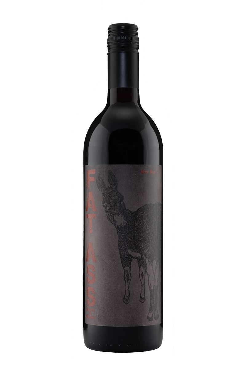
Dry Red
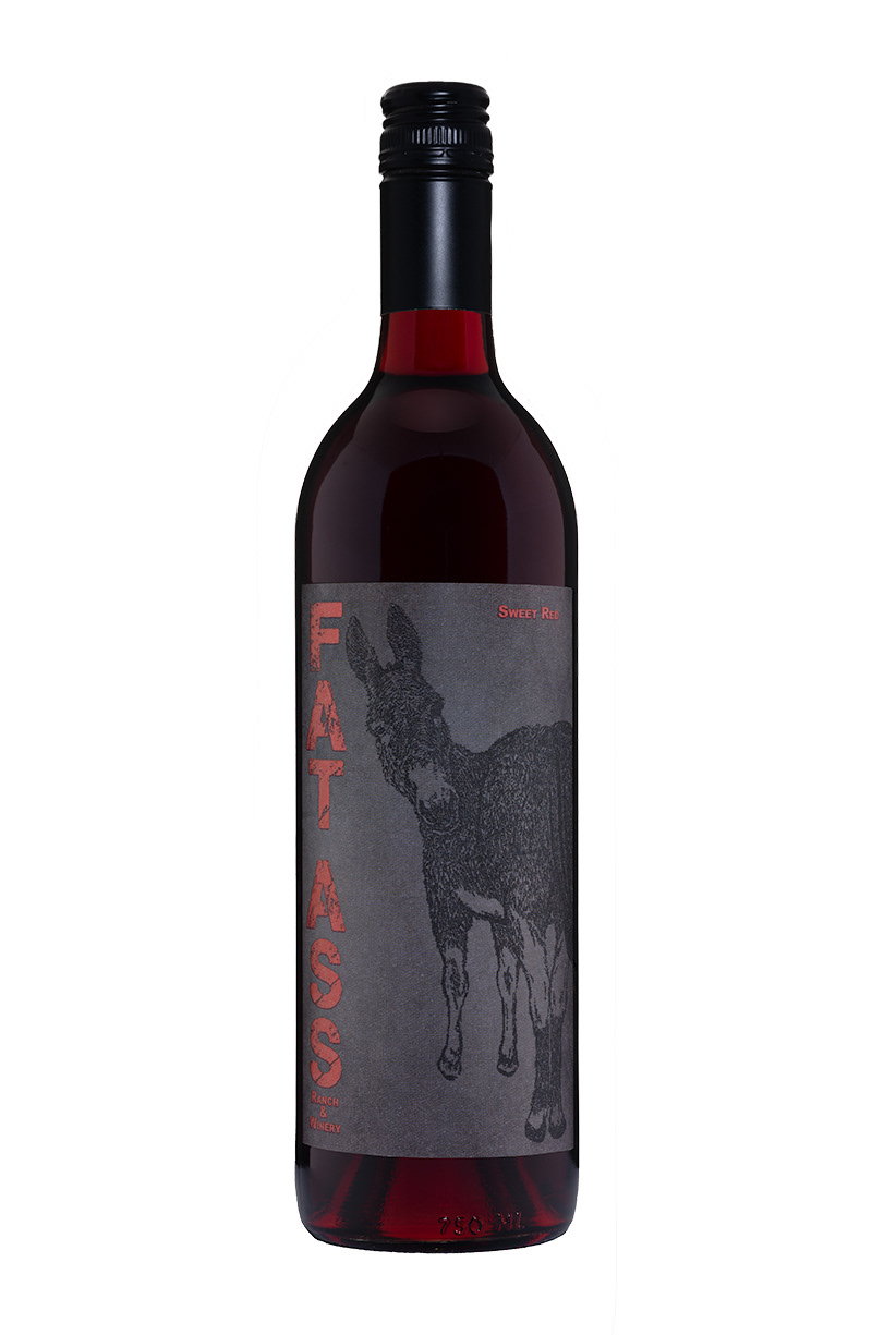
Sweet Red
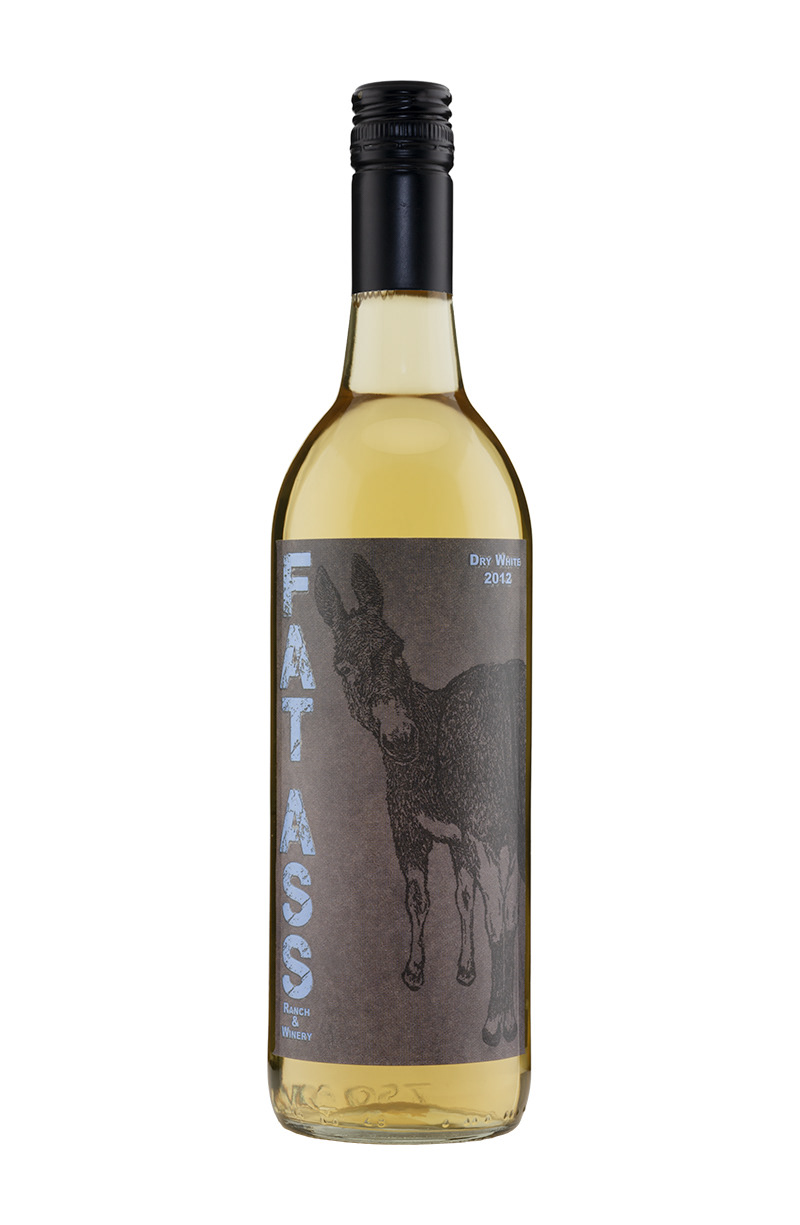
Dry White
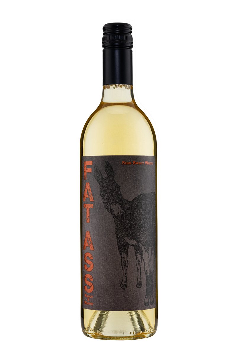
Semi-Sweet White
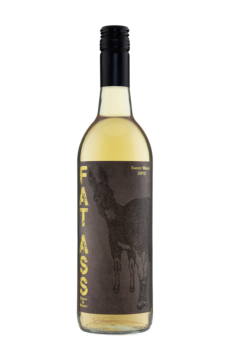
Sweet White
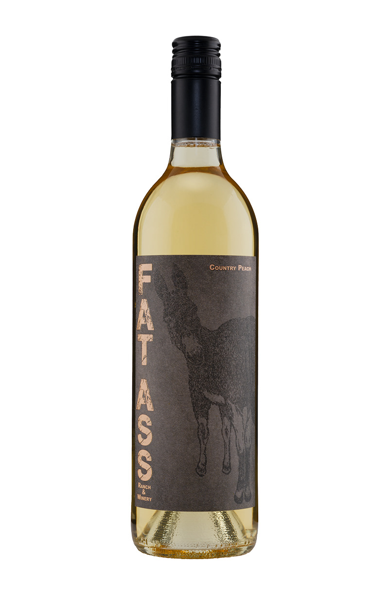
Country Peach

Watermelon
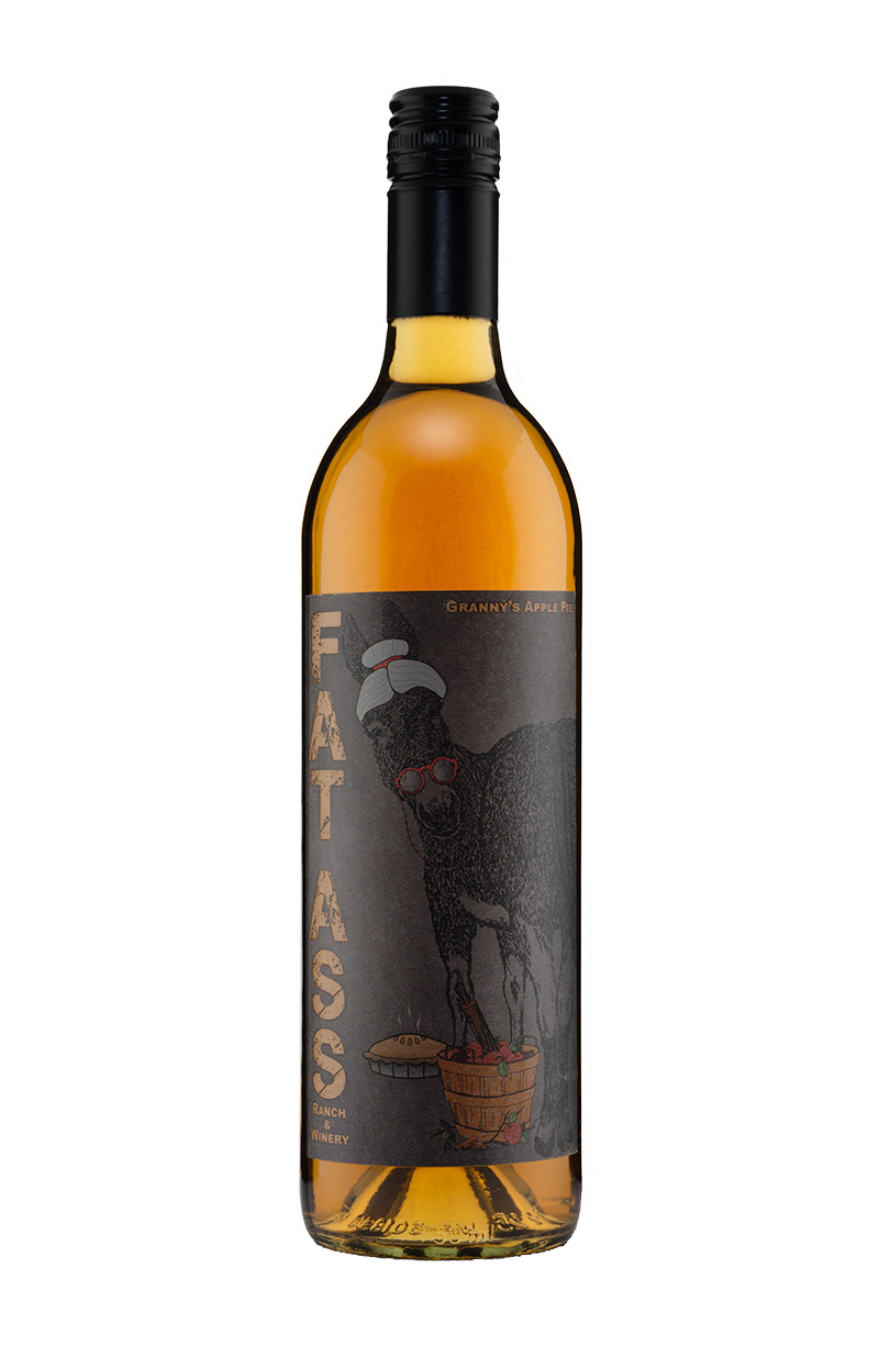
Granny's Apple Pie
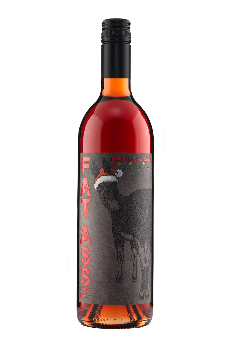
Texas Holiday Cheer

Black Spanish Rosé

Prickly Pear Jala-Raspberry-Peno
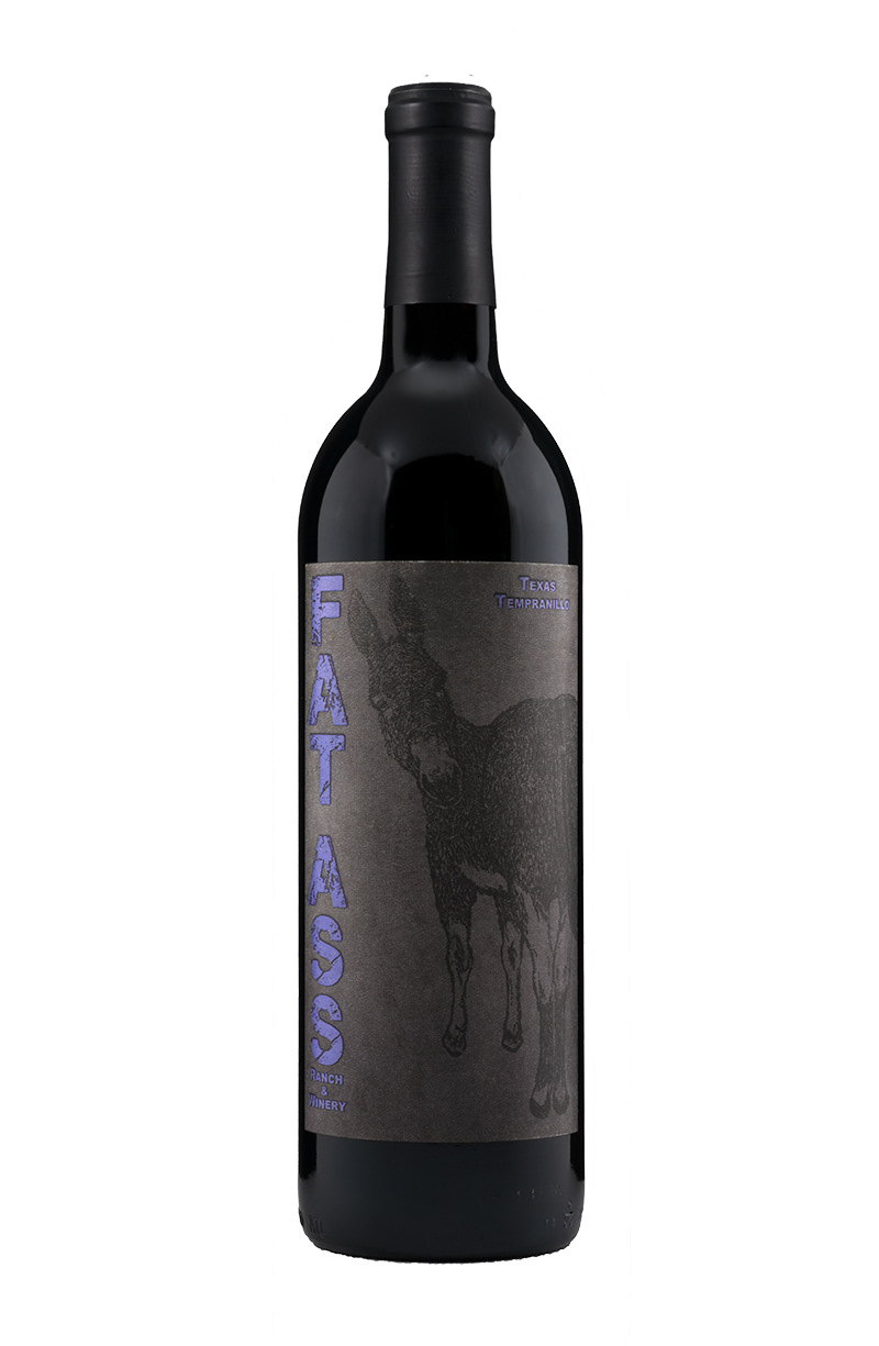
Texas Tempranillo
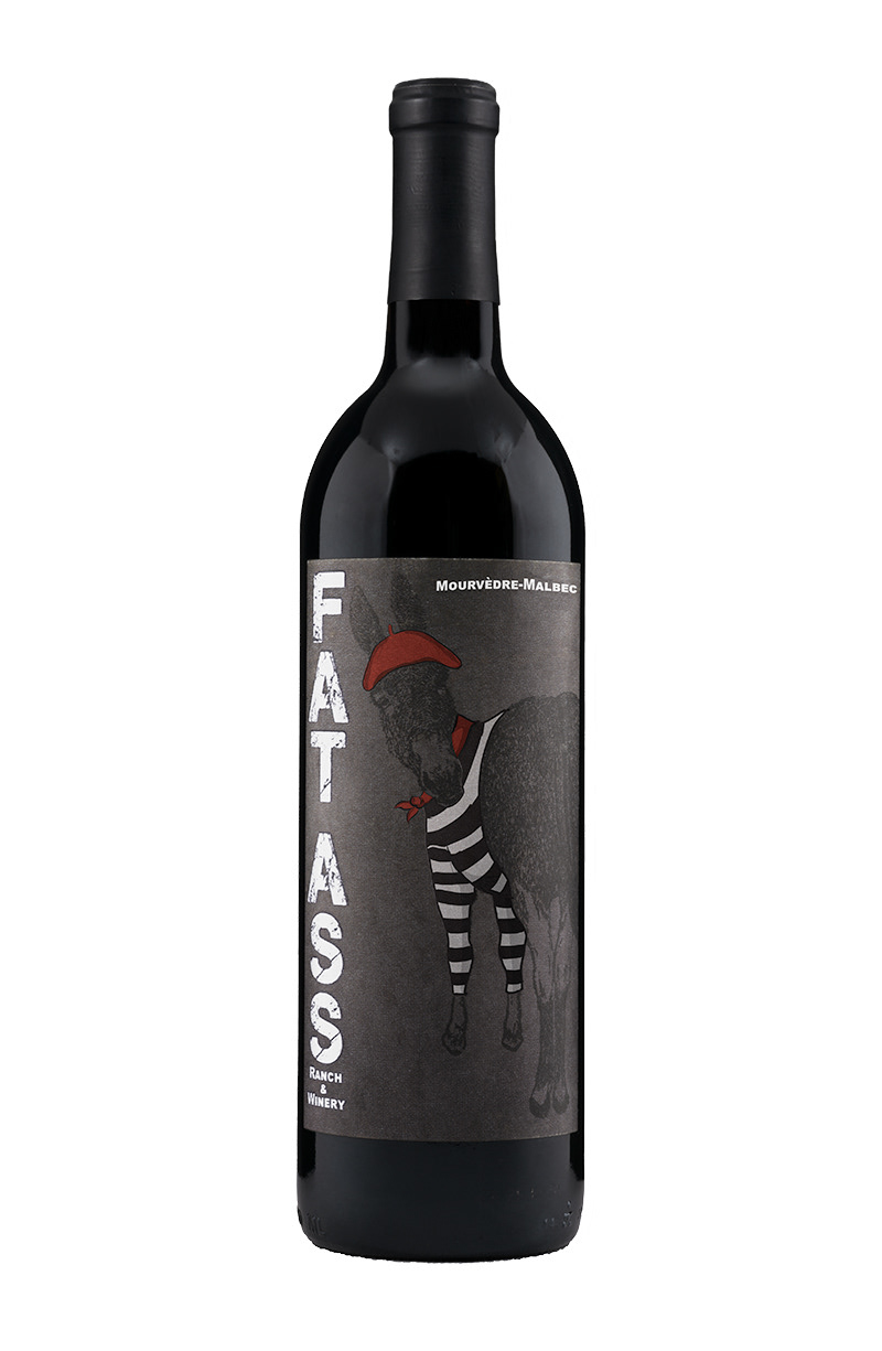
Mourvedre-Malbec
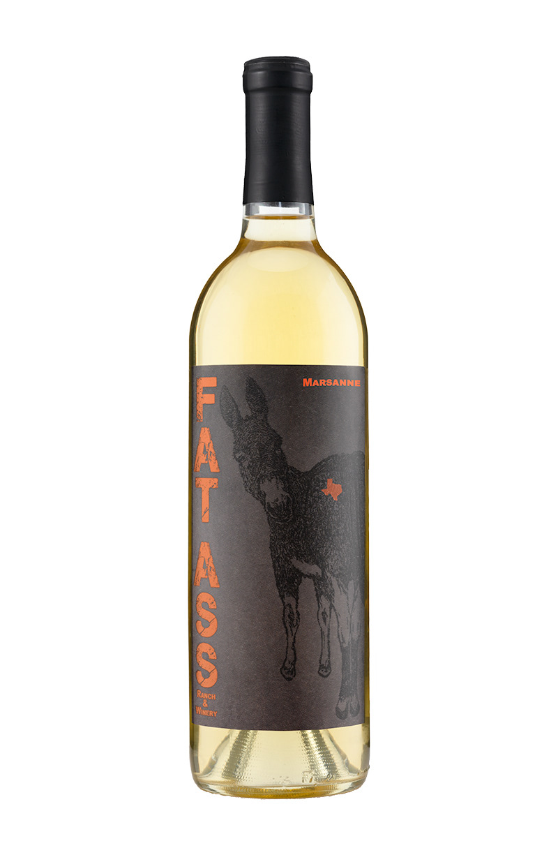
Marsanne
Riesling
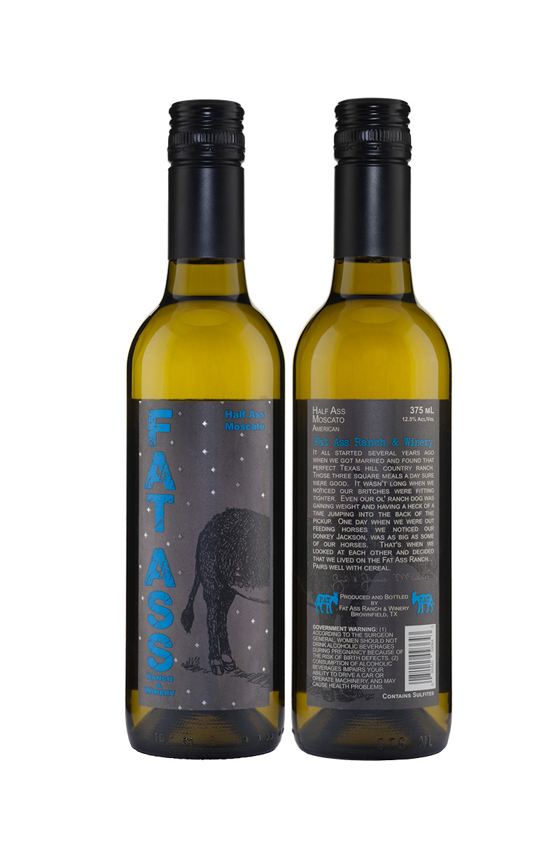
Half-Ass
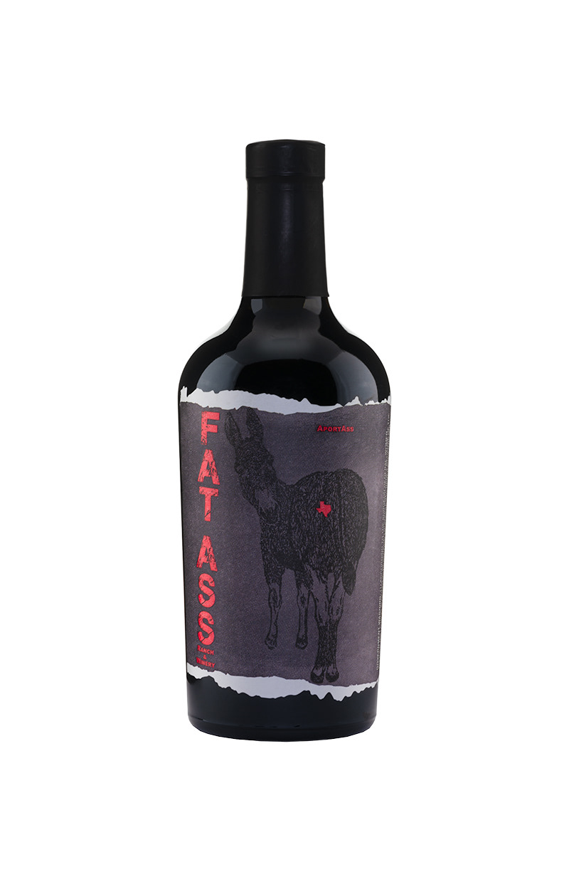
Aportass
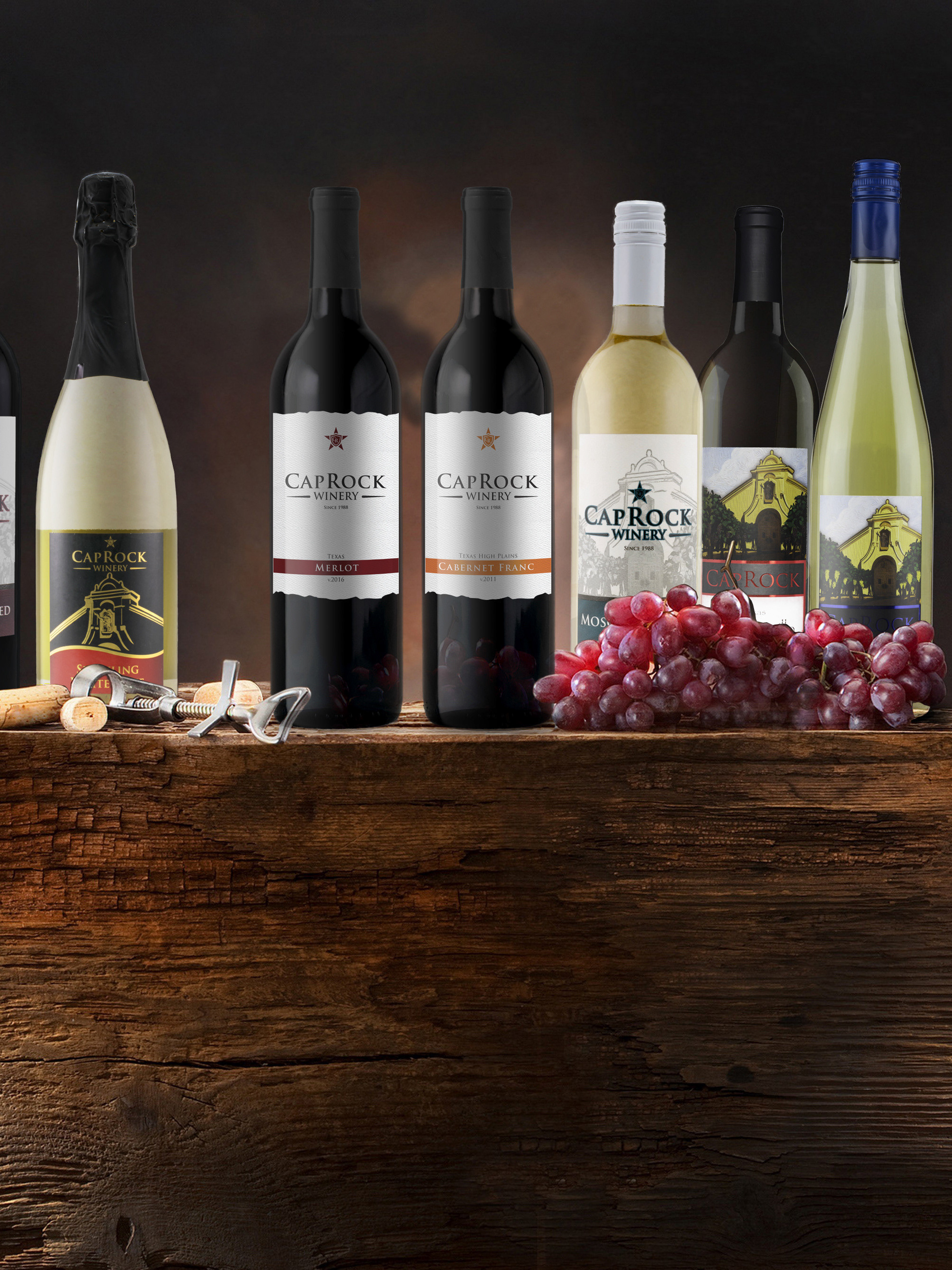
Product photos of the different wines that I created. It initially started out as 5 wines and has grown to over 17 different wines.
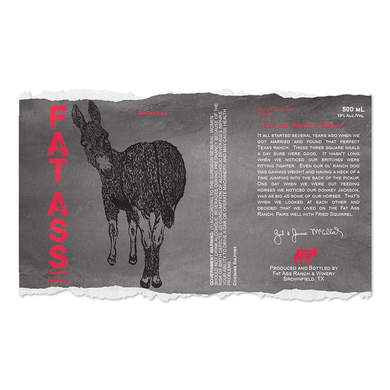
Aportass label
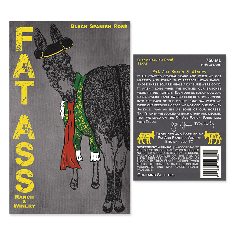
Black Spanish Rosé label
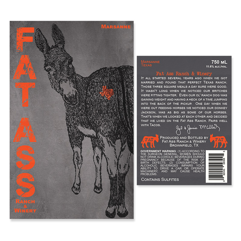
Marsanne label

Half Ass label
Image of Aportass label, size - 7.25" x 4.38"; Image of Black Spanish Rosé label, size - front: 3.59" x 5.75", back label: 3.75" x 2.75"; Image of Marsanne label, size - front: 3.59" x 5.75", back label: 3.75" x 2.75"; Image of Half-Ass label, size - front & back label size 2.5" x 5"; Riesling Label front & back label 2.75" x 4.25"
The Results
The label design and packaging have been received exceptionally well by both the client and their customers. Showing that a non-stuffy wine brand is capable of growing in the heart of the Texas wine industry. Fat Ass Ranch & Winery continue to thrive and have expanded to satellite tasting rooms and starting other new anti-stuffy wineries. I also have the opportunity to create two different can wine projects for the client and can be found here.