Work Performed
These are wine projects I completed for Fat Ass Ranch & Winery. I was commissioned to complete everything from initial concept creation to finalizing print and direction for the brand and products moving forward. During the canning process for Whuup Ass, I did photography and videography for the client. Specific tasks performed for this winery included Packaging, Label, Concept, and Logo Consultation and Design; Illustration; Branding Direction; Print Consultation and Direction; and Photography.
The Client
This fabulous winery is in the wine corridor of Fredericksburg, Texas. Beyond its anti-stuffy winery feel, Fat Ass Ranch & Winery focuses on their wines and not the formalities. With a fun atmosphere and a great place to drink wine, this winery is setting itself apart from other wineries. As a result of having so many wine options for different ranges of pallets coupled with a laid back atmosphere, they are a must stop when in Fredericksburg.
The Challenge
I was tasked to bring this project to life with a label that matched the client’s unique vision for his brand. The client wanted a wine label that was different from anything that was currently being done by putting wine in a can.
#1 - Built and create a label design with the focus of the theme of opening a can of “Whuup Ass.” I was tasked with shooting and editing video and photos of the wine during the canning process for their website and social media.
#2 - Redesign current wine label Prickly Pear Jala-Raspberry-Peno into a 250ml can of wine and packaging for the four-pack of canned wine.
The Design - Whuup Ass
Label
Design of this label was a fun project to work on, as it is very much a new way of enjoying wine and packaging that I had never done before. The client wanted the project to be called Whuup Ass. The idea behind the theme was to open up a can of “Whuup Ass.” The cans that were selected are 375mL and could be sold as a single can of wine or a pack due to federal regulations. The label was a heat shrink label sleeve and applied to an unpainted silver can. I drew up the donkey and had it kick the “A” in Fat Ass to give it a sense of motion while the person rotates the can to read the client’s story. The clients are huge Oakland Raider’s fans, so I designed the color palette of the NFL team colors. I let most of the bright silver of the can show through and used black lettering giving it a black and silver look to match the team’s colors. I created a stamp using red ink and gave the seal a grunge feel. To add more black into the design and give it a vintage feel, I added a grunge board to match the Whuup Ass stamp I had created and made the Whuup Ass logo stamp stand out. I also applied red to their donkey logo as well to draw the eye to the client story.
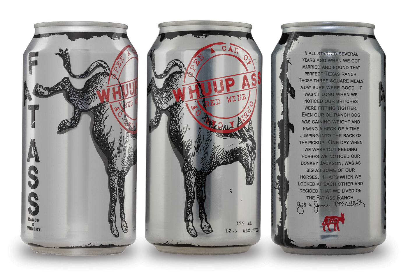
Whuup Ass can product photo

Whuup Ass label image
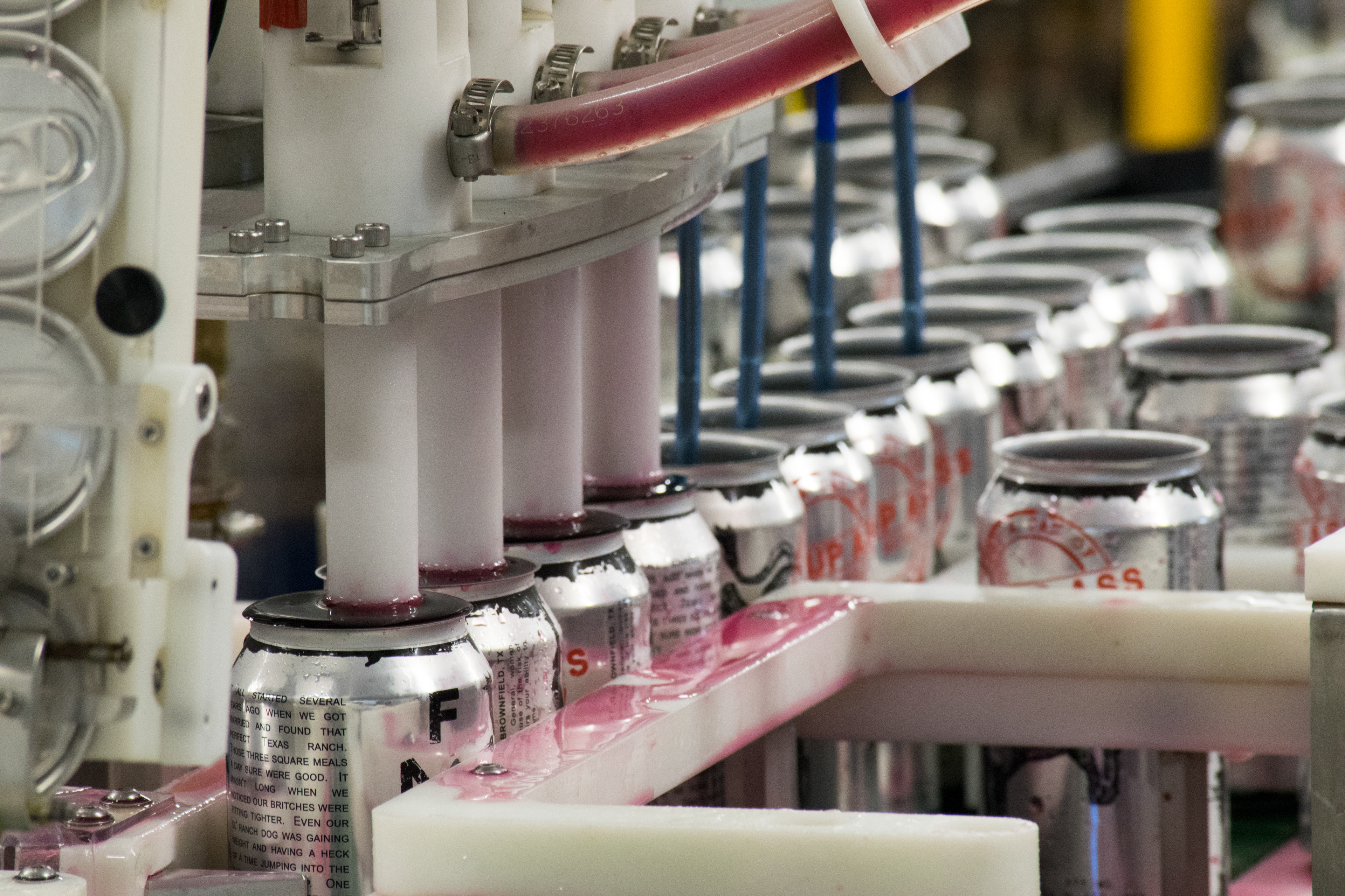
Whuup Ass cans being filled before being capped
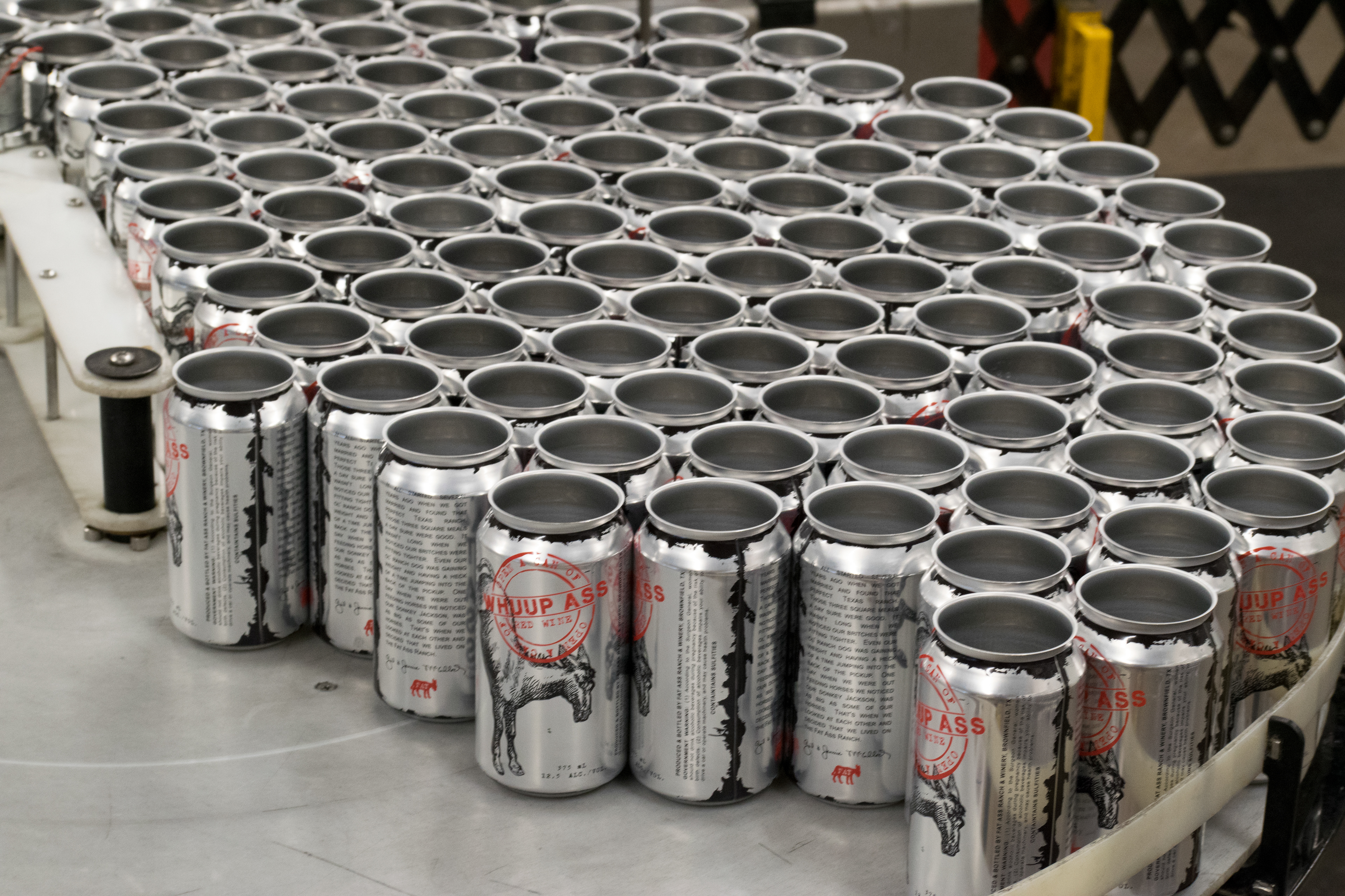
Whuup Ass cans load and waiting to be filled
Product photo of Whuup Ass can; Image of the Heat Shrink a Label; Some of the photos from the production during the production run.
The Design - Prickly Pear Jala-Raspberry-Peno
Label
This project was to take the existing Prickly Pear Jala-Raspberry-Peno wine label and transition it to a 250mL can. Not only was the can label needed to be designed but an outer box design was required due to federal requirements on 250ml cans of wine. Sizing down the artwork and accounting for the color change going from an uncoated paper to a shrink sleeve label was an exciting process because of trying to account for the color change that would happen. Having to shrink down the wine label down to fit the can, I also had to make sure that the federal requirements were being followed made its interesting design.
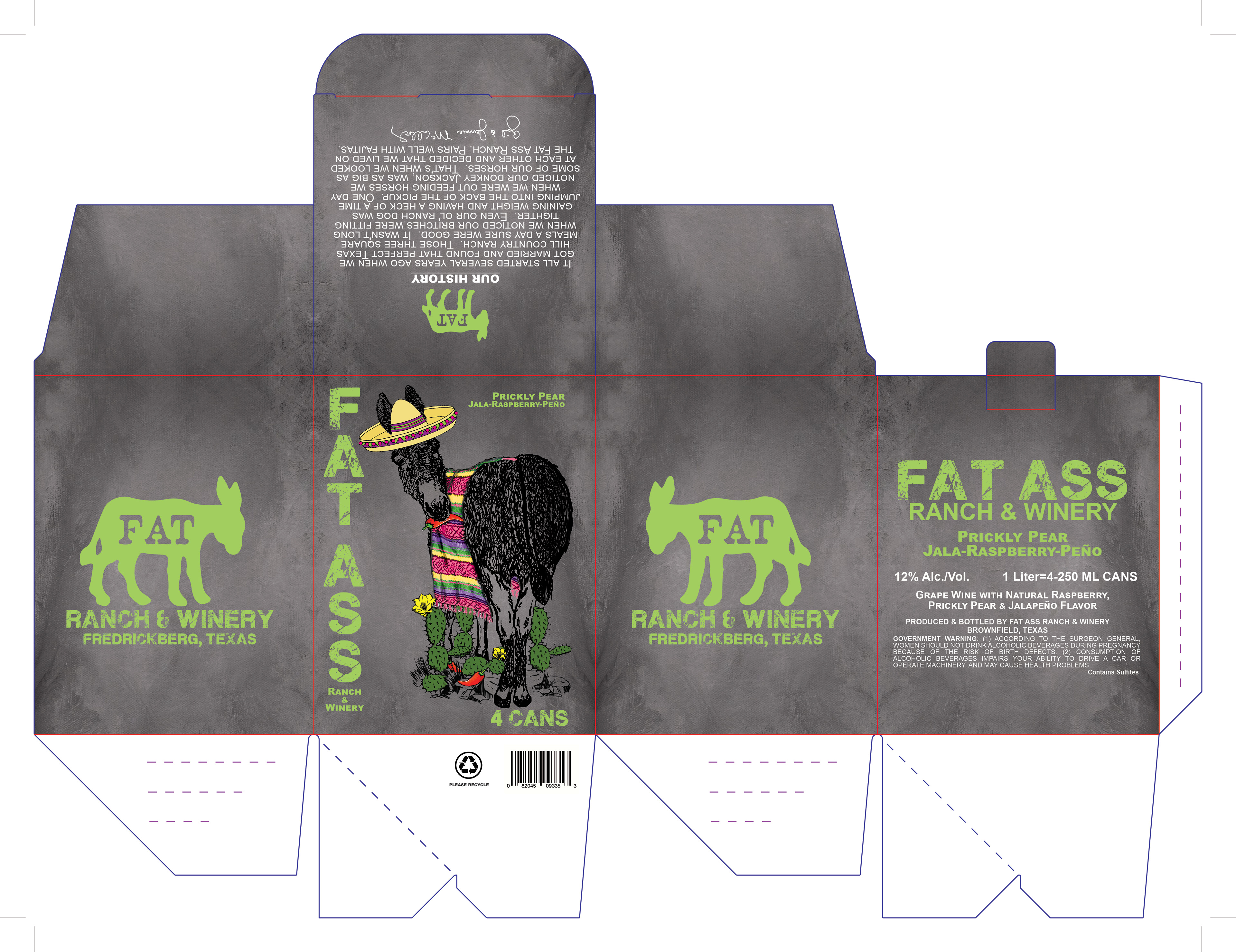
4-pack box design
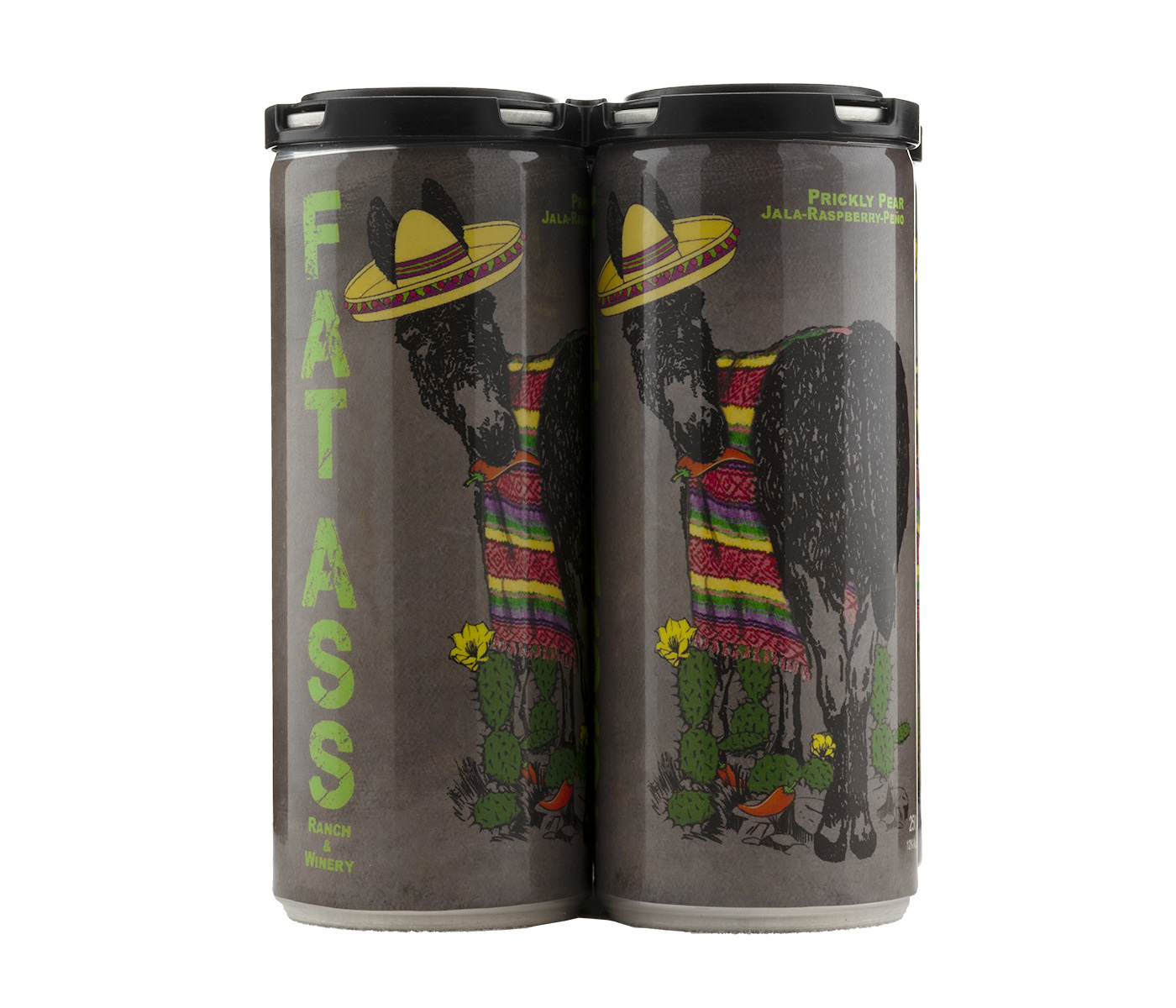
4-pack Prickly Pear Jala-Raspberry-Peno cans
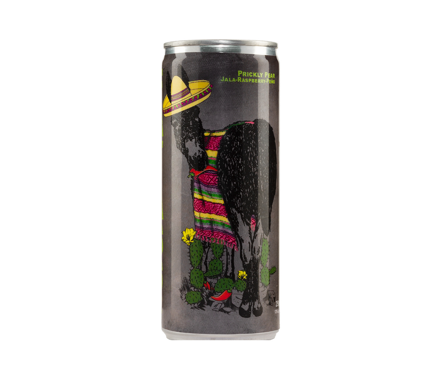
Prickly Pear Jala-Raspberry-Peno can (Front)
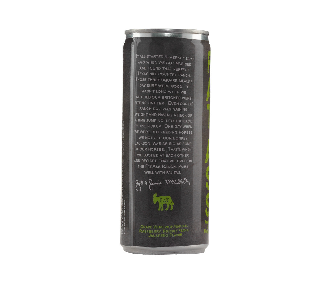
Prickly Pear Jala-Raspberry-Peno can (Back)
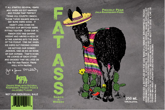
Prickly Pear Jala-Raspberry-Peno label
Wine box design; Photo of front with 4 pack caps; Photo of front of can; Photo of back of can; Image of heat shrink label label
