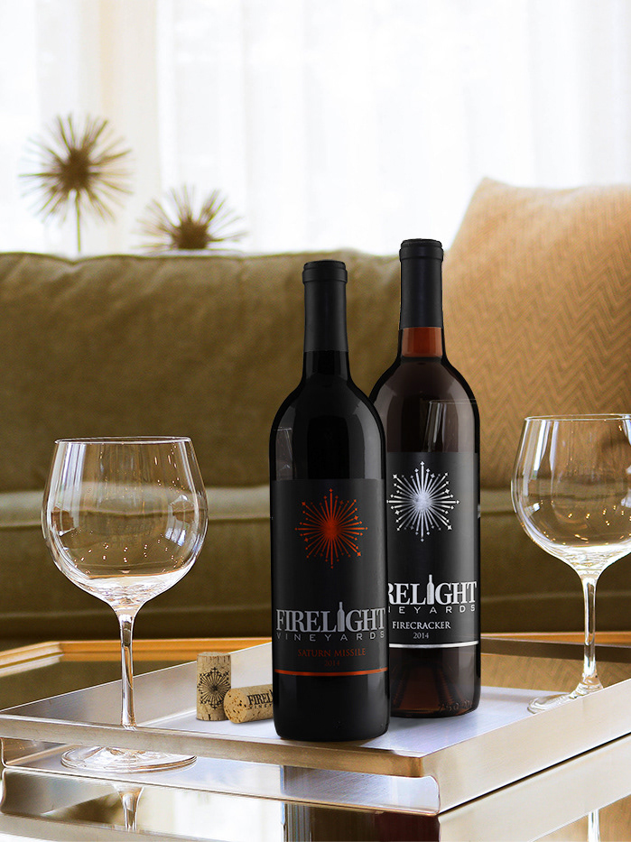
Work Performed
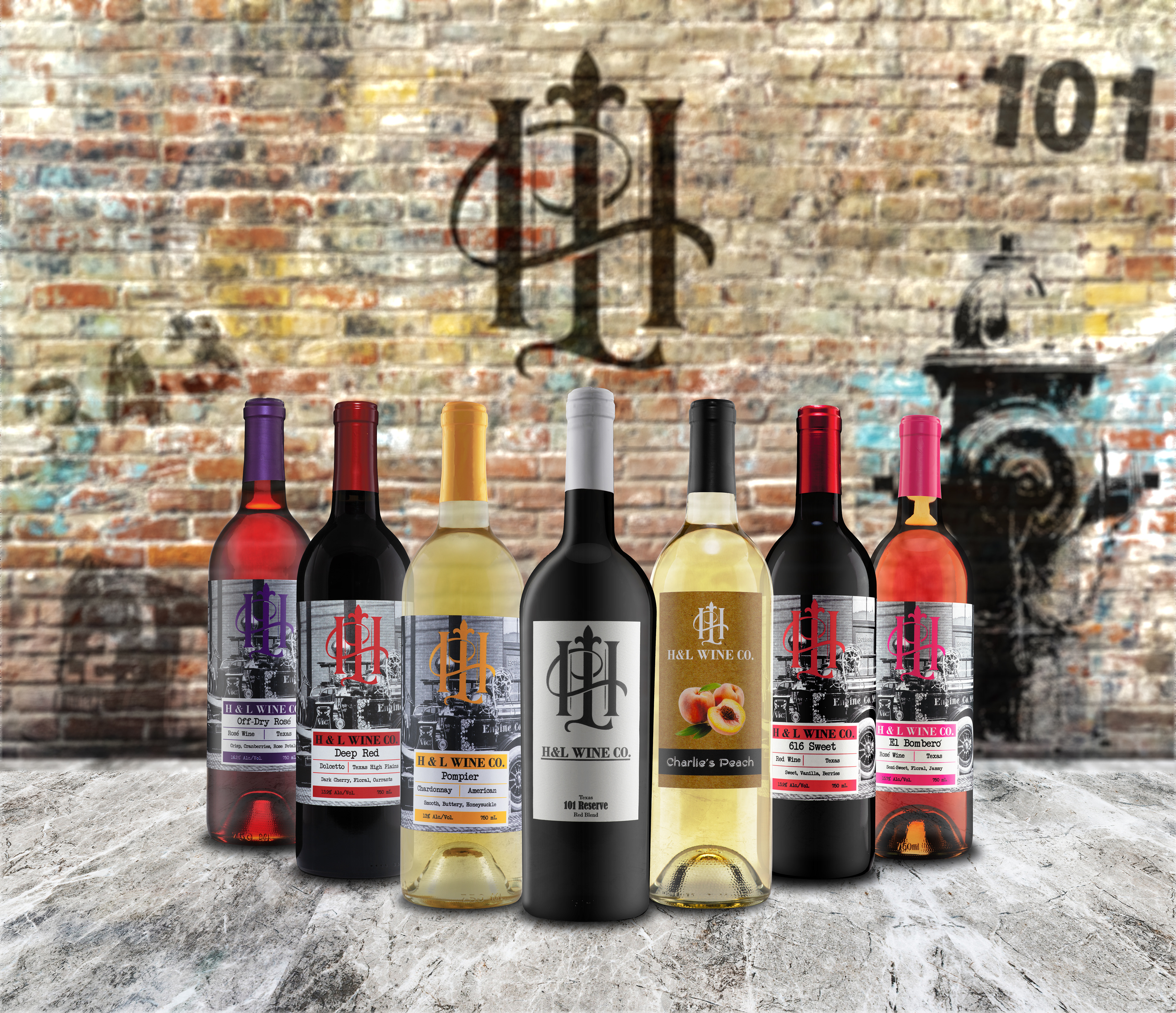
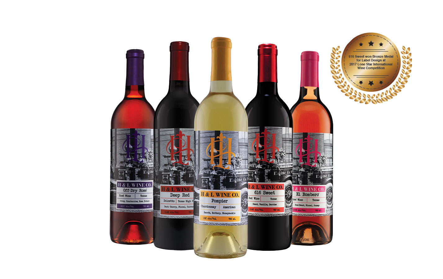
These are the projects I have completed for H&L Wine Co. I was commissioned to complete everything from initial concept creation to finalizing print and direction for the brand and products moving forward. Specific tasks performed for this winery included Packaging, Label, Concept, and Branding Direction; and Print Consultation and Direction.
The Client
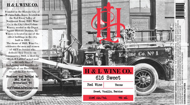
This great little urban winery located out of Wichita Falls, Texas. H&L stands for Hook and Ladder in a way to pay tribute to their former jobs. These veteran firefighters have combined their passion for wine & coffee while honoring the thousands of men and women around the world who serve by protecting the public every day. After creating a successful coffee company, the owners wanted to venture into the Texas wine industry and bring a winery to town.
The Challenges
The client wanted to expand its growing coffee company brand into the wine industry. They already had a logo and established a coffee brand that they wanted to complement their brand. They requested three different projects, a baseline label, and packaging, a high-end label and a rustic style that reflected the peach wine.
#1 The client wanted also wanted to pay tribute to the firefighters but also celebrate the urban space they have in Wichita Falls. The client had several old photos that they wanted to use that spoke of their roots as both retired firefighter and a celebration of the Wichita Falls Fire department.
#2 The client wanted this project to be a high-end ultra-premium label and packaging. Everything needed to be unique and clean and stand out from the client’s other wine labels and packaging. The client wanted someone to walk into their winery and be drawn to it.
#3 The challenge for this label was to be a rustic, crafty style that was far different from any of their other wine labels. They wanted it to feel crafty as well as scream peach wine.
The Process
Client meeting for values and brand exploration, to get a sense of the personality and mission of this particular winery > Researching the local area, culture, already established coffee brand, and firefighter archetypes and symbolism > Concepts Created > Eliciting and encouraging client feedback > Design Label Concepts of a few different styles to present to client > Final Label and Packaging Design > Completion of compliance submission for client > Directed and oversaw Label and Packaging printing and production > Wine Production, Bottling, and Labeling (working with these departments as a consultant and providing quality checks in-person to ensure successful final product).
The Design
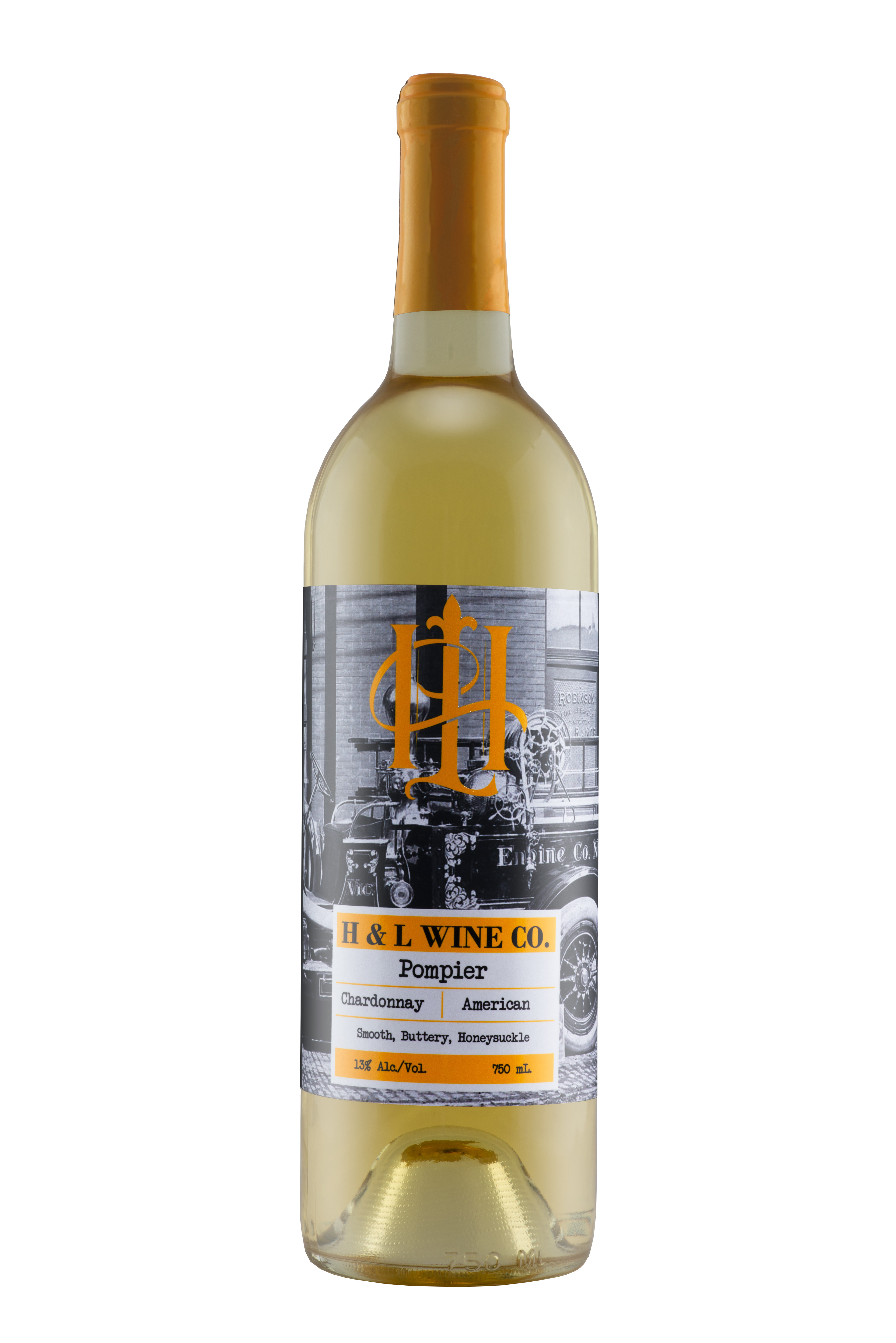
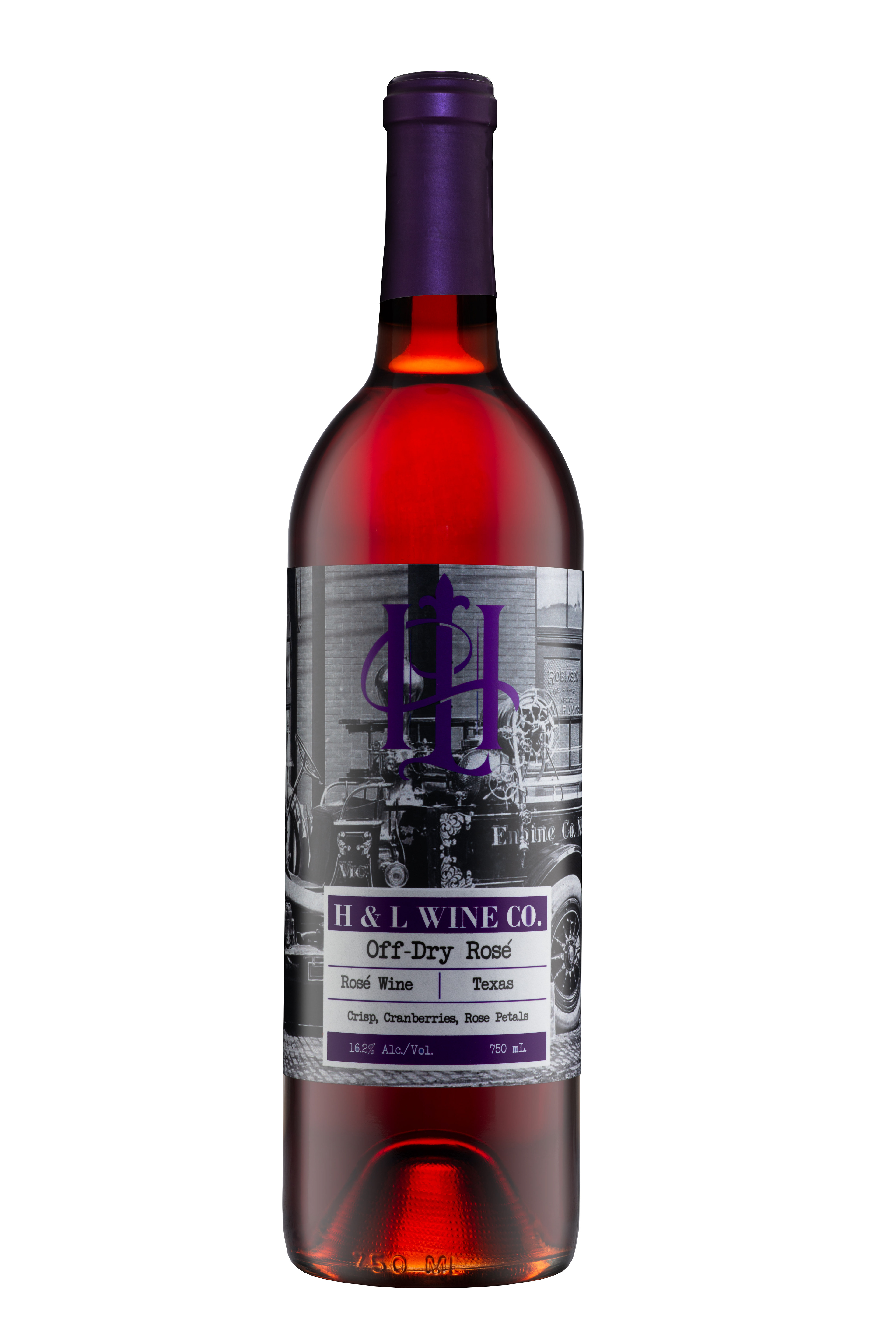
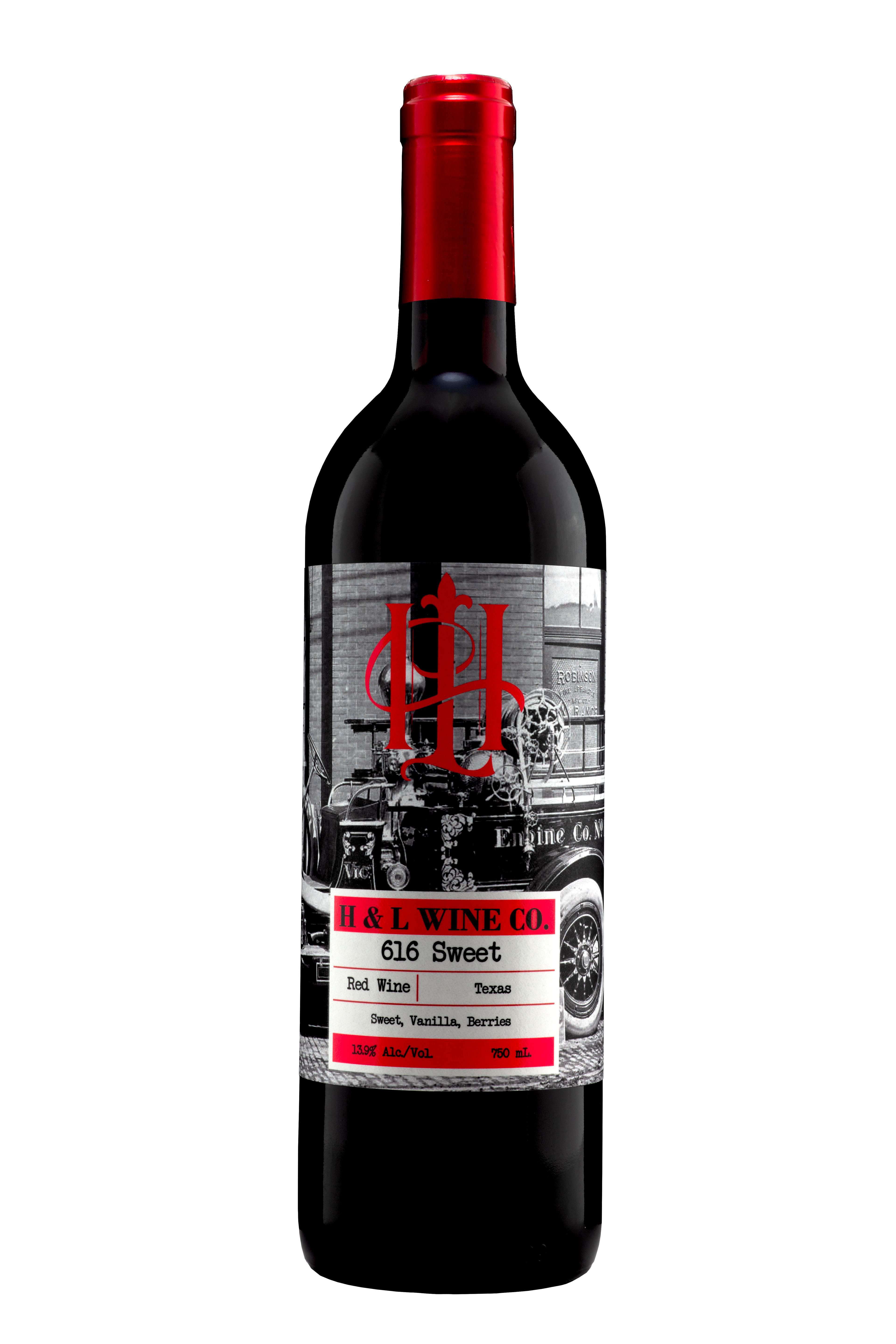
Base Line Label
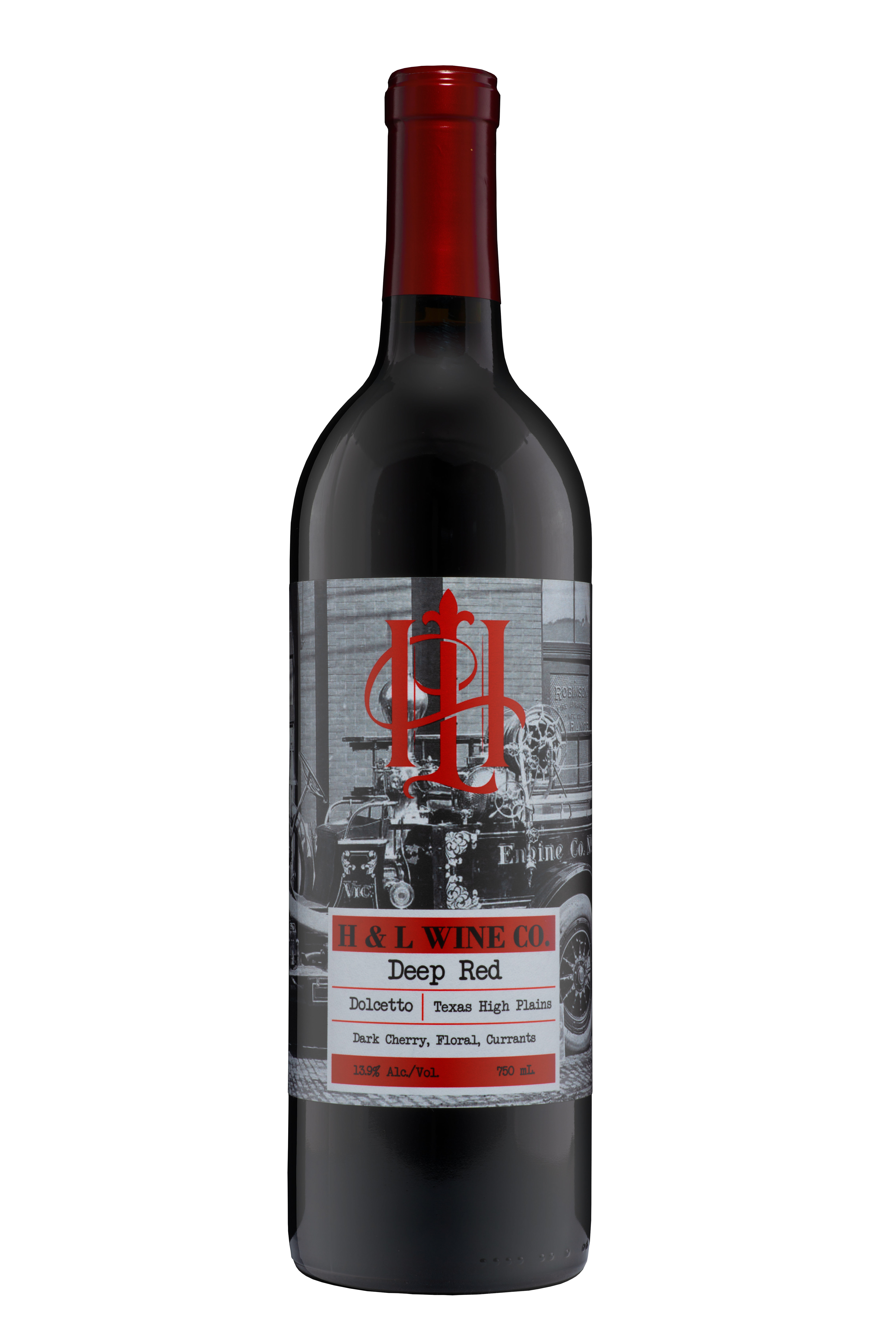
After reviewing the images provided and that would complement the coffee brand packaging. I selected and proceeded to edit and fix any issues with the photograph to get it to print ready standards. I then chose to make it a single image label that wrapped around the bottle and an un-coated label stock to mirror the coffee packaging. Because the coffee brand had a rustic/vintage feel, I made the image into a high contrast black and white image. A specific color scheme for each of the different wines was selected to help customers know which wine they were grabbing at a glance. This would not only avoid confusion but give it a new world urban feel to the wine label. The color design also gave the wine label some pop and contrast by selecting individual Pantones for each different wine. I then created an infographic that had tasting notes, varietal/type of wine, and the grape-growing region. So, at a glance, the customer would know what they were getting and what to expect. I then added the company’s story and federal requirements on the sides. A spot coat varnish accents the logo and wine info panel.
Packaging
Traditional wine packaging was selected that would feel quality and would complement the higher end 616 Reserve. A custom natural 44mm cork was designed using their name, logo, and having their website on it as another possible way of driving traffic to their site. The ended were fire-branded with the HL logo. To make sure no matter how the wine was being stored a matching a capsule to the logo color was used to complete the overall look.

Bottle Photographs I took of the finished products.
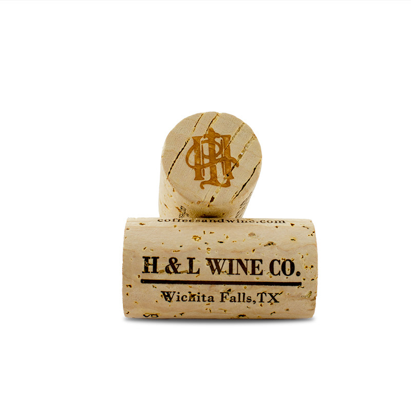
Label Size: 9" x 5" ; Photo of the custom H&L Wine Co. natural 44mm cork
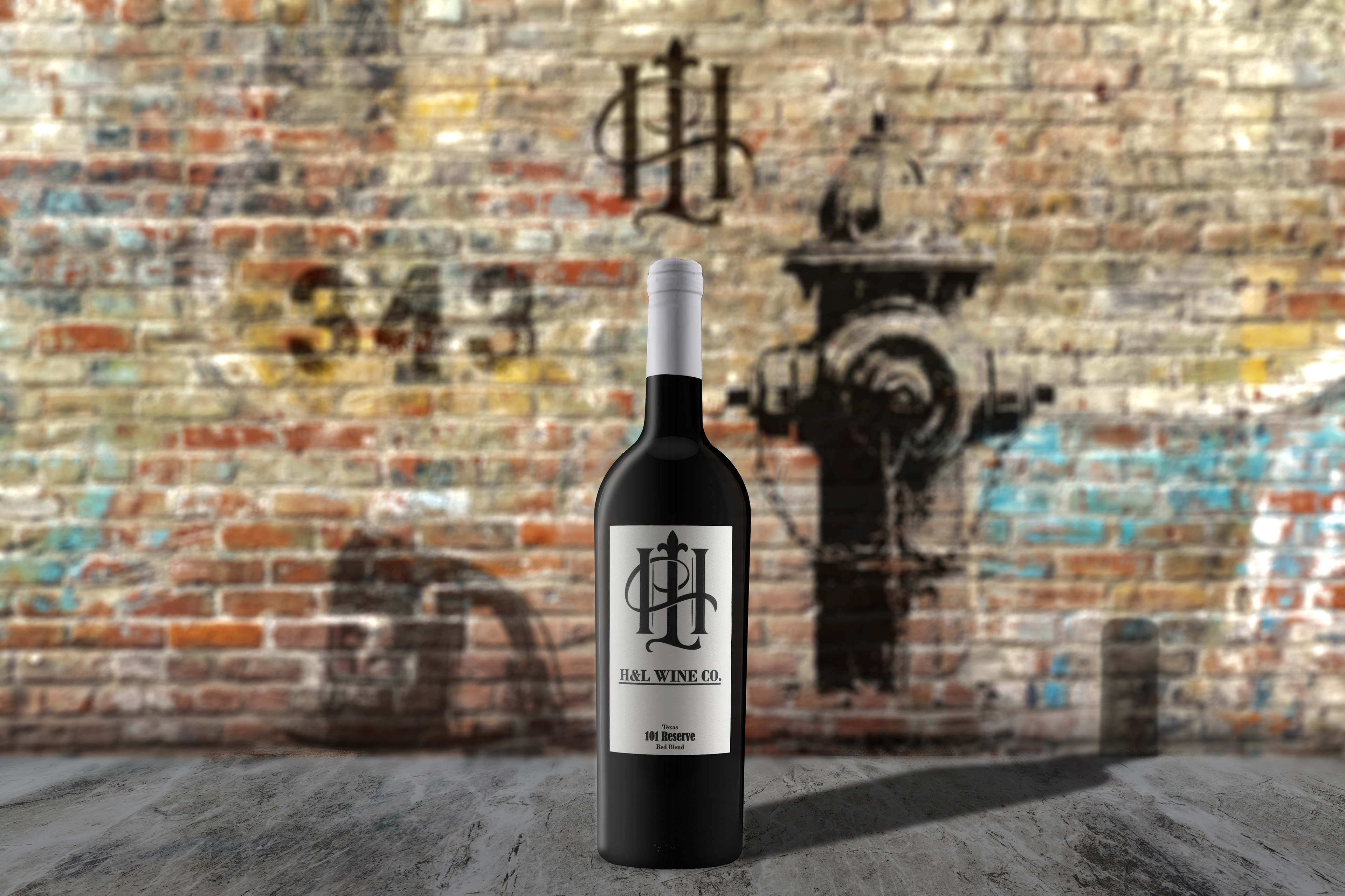
The Design - 101 Reserve
Label
To stand out from the client’s wine & coffee labels, I selected a black and white pallet for the 101 Reserve label. By using a bright white felt label stock and black text along with the H&L logo, this made it a more traditional high-end label. The 101 Reserve labels were printed on an uncoated felt paper, with an embossing stamp applied to the HL logo and wineries name. A layer of spot coat varnish was used on the black ink to separate from the matte paper as well and give it a little bit more dimension.
Packaging
This packaging was designed to set itself apart from the client's other packaging and make sure that it had a premium feel. Doing this a massive broad shoulder, deep punt Bordeaux bottle was selected. To push the high-end aspect of this wine, a custom cork that was designed to have their logo fire branded on both ends with their web site and winery name on the sides of a high end 44mm natural cork. To make the packaging a cohesive look, I selected a white capsule to make the packaging design stand out as well from not only their bottle but other premium bottles.


Photo of 101 Reserve; Label size- Front 2.75" x 4.75", Back 2.75" x 4.5", Photo of H&L custom 44mm cork
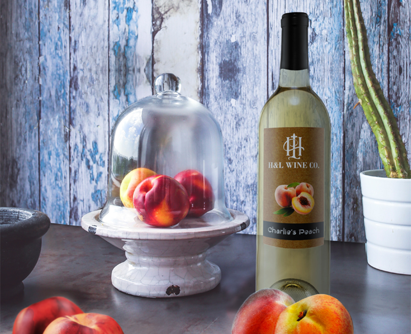
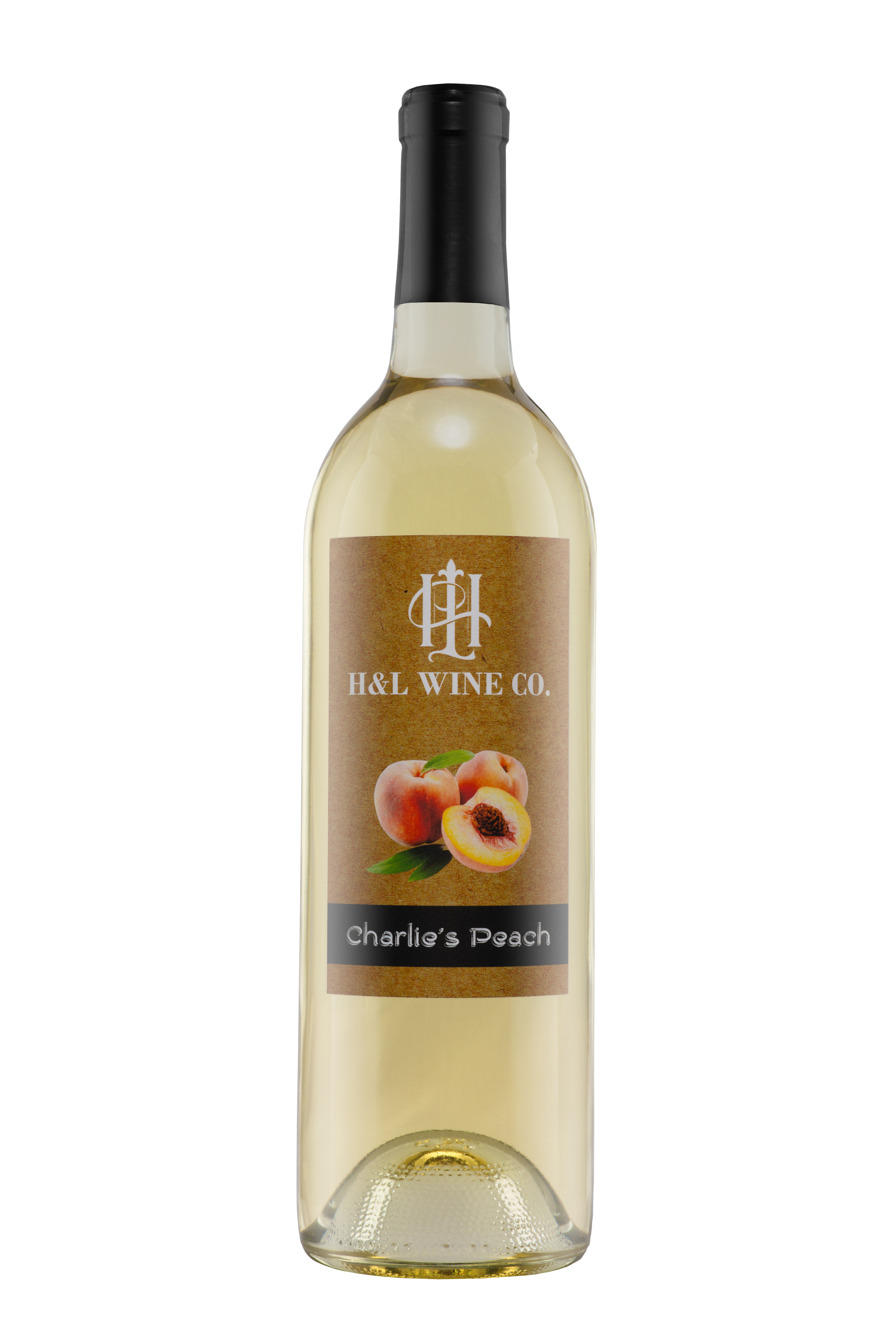
The Design - Charlie's Peach
Label
Charlie’s Peach was designed to have a vintage country feel. By giving it a craft paper background along with a chalkboard font, this provides the wine label with a vintage look. Because printing on craft paper would cause color interference, a craft paper image was selected with four process color printing. Showcasing peaches on the front also keys in that it is a peach flavored wine and sets it apart from the client’s other brands. The back label held the require information to make it Federal approved as well as the client's back story. The back wine label is also where I strategically put the required information that would make the label compliant with both Federal and State regulations. I also put the verbiage that indicates it a formula wine over a traditional peach wine, as sometimes this can be off-putting to customers.
Packaging
To give the wine packaging design a classic traditional feel, I selected a full punt, medium weight, flint(clear) Bordeaux bottle with a cork finish. The wine was also given a custom H&L Wine Co. 44mm natural cork and topped off with a matte black capsule to tie into the black bar at the bottom of the label.
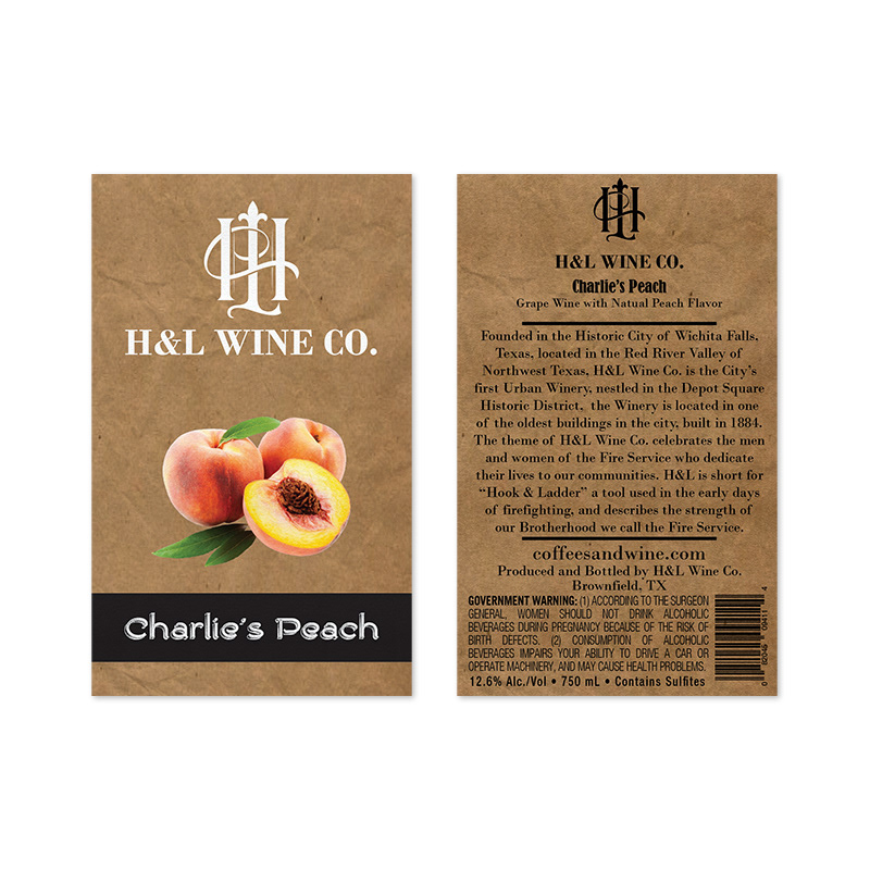

Product Photo of Charlie's Peach ; Label - Front:2.75" x 4.5", Back 2.75" x 4.5"; Photo of H&L Wine Co. custom 44mm cork
The Results
A success! The clients love their logo, label, and packaging. The client submitted the 616 Sweet Label and packaging into the 2018 Lone Start International Wine Competition and won a bronze medal. H&L Wine Co. continues to use these designs, as well as my recommended packaging direction on future wines they produce.