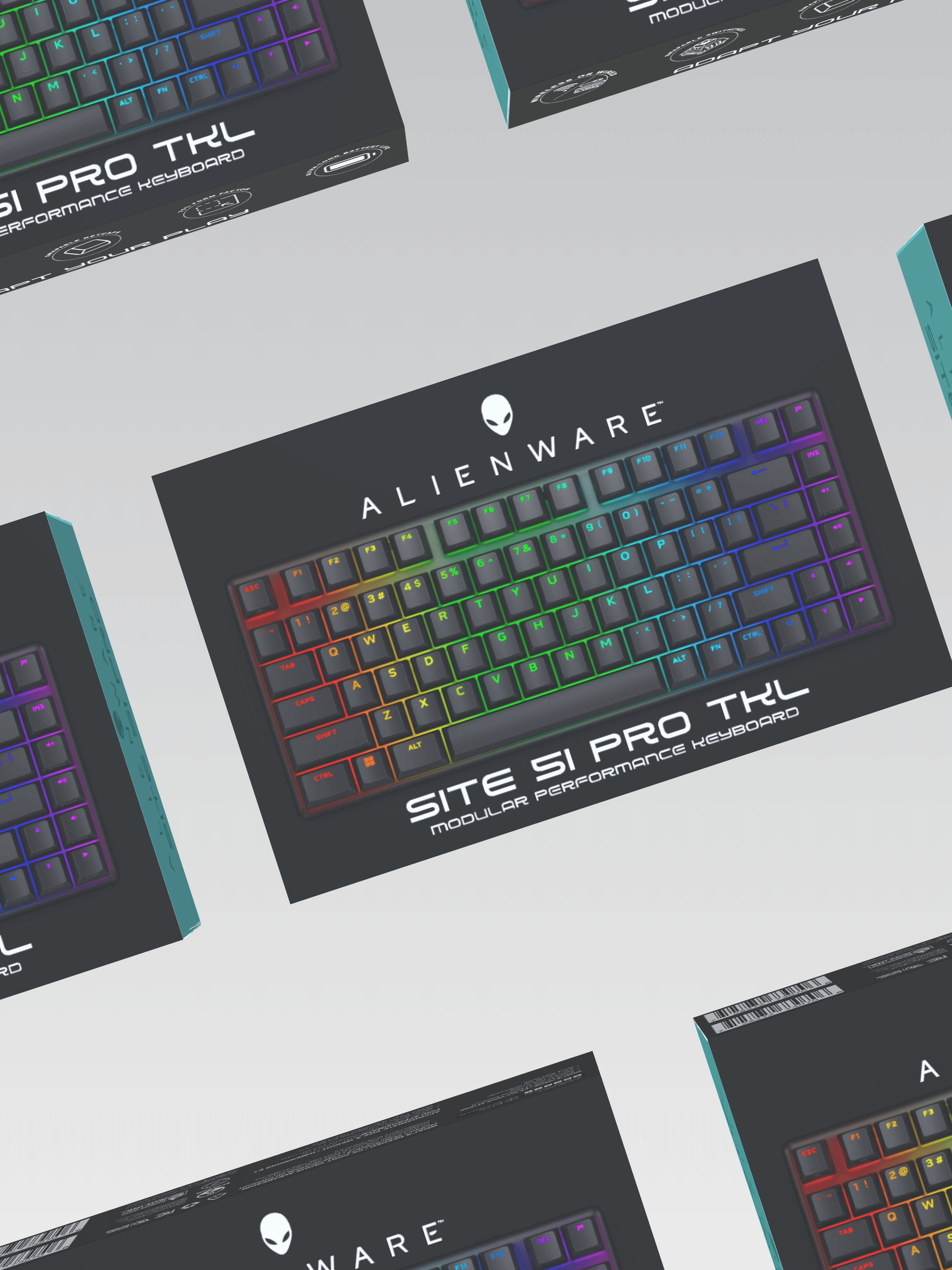
Work Performed
This is a project I completed for Rusty Hook Winery. I was commissioned to complete everything from initial concept creation to finalizing print and direction for the brand and products moving forward. Specific tasks performed for this winery included Packaging, Label, Concept, and Logo Consultation and Design; Original Art and Illustration; Branding Direction; and Print Consultation and Direction.
The Client
Rusty Hook is a family-owned winery nestled in Long Mott, Texas, a charming fishing community near the Gulf of Mexico. The co-owners shared their passion for wine, travel, and the sweet coastal town they called home. They imagined a welcoming atmosphere befitting the warm culture of their shoreside Texas community. They hoped that people would find a convenient and comfortable place for family and friends to socialize and taste Rusty Hook's local, small-batch artisan wines.
The Challenge
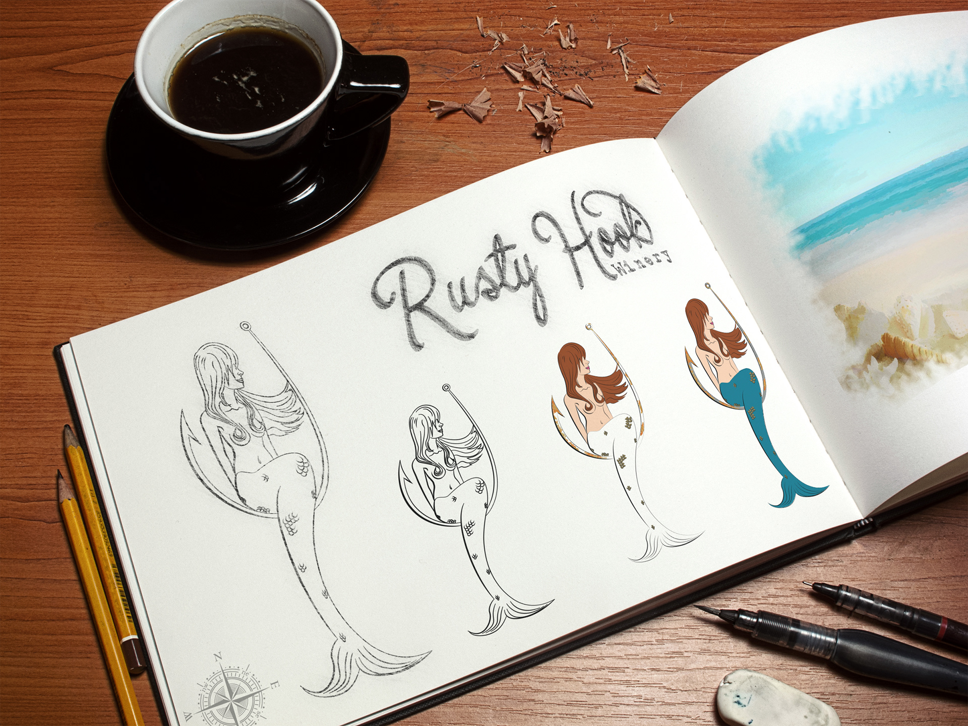
When I first met with the clients, they had the name of their winery but required branding, packaging, and design. They also had a tight timetable and had already set plans for a grand opening. The owners had a rough idea for the brand of a mermaid sitting atop a hook. In addressing the needs of this project, I first aimed to understand the client and their goals better. We talked about what had inspired them to start this new venture. I realized that they had a love for their local culture and wanted their winery to be embedded in their local community. The label needed to be fun and approachable while also bringing in hints of some of the traditions of their local culture. The owners were adamant that they did not want to risk the "stuffy" feel or a more old-world wine label. We discussed how their brand and packaging could be used as a story-telling tool to introduce their company and values. I chose hand-drawn artwork to emphasize the artisan, and hand-crafted feel the owners hoped for, and to preserve the sense of a label inspired by a family member's sketch. The many elements, from the mermaid, hook, and compass rose to the combination of script and typewriter fonts, and the use of specific bright colors and metallics were also chosen carefully to create a rustic coastal label that felt casual and inviting and matched the story and values of the winery.
The Process
Client meeting for values and brand exploration, to get a sense of the personality and mission of this particular winery > Researching the local area, culture, and West Texas archetypes and symbolism > Concepts Created > Eliciting and encouraging client feedback > Design Label Concepts of a few different styles to present to client > Final Label and Packaging Design > Completion of compliance submission for client > Directed and oversaw Label and Packaging printing and production > Wine Production, Bottling, and Labeling (working with these departments as a consultant and providing quality checks in person to ensure successful final product).
The Design
Logo
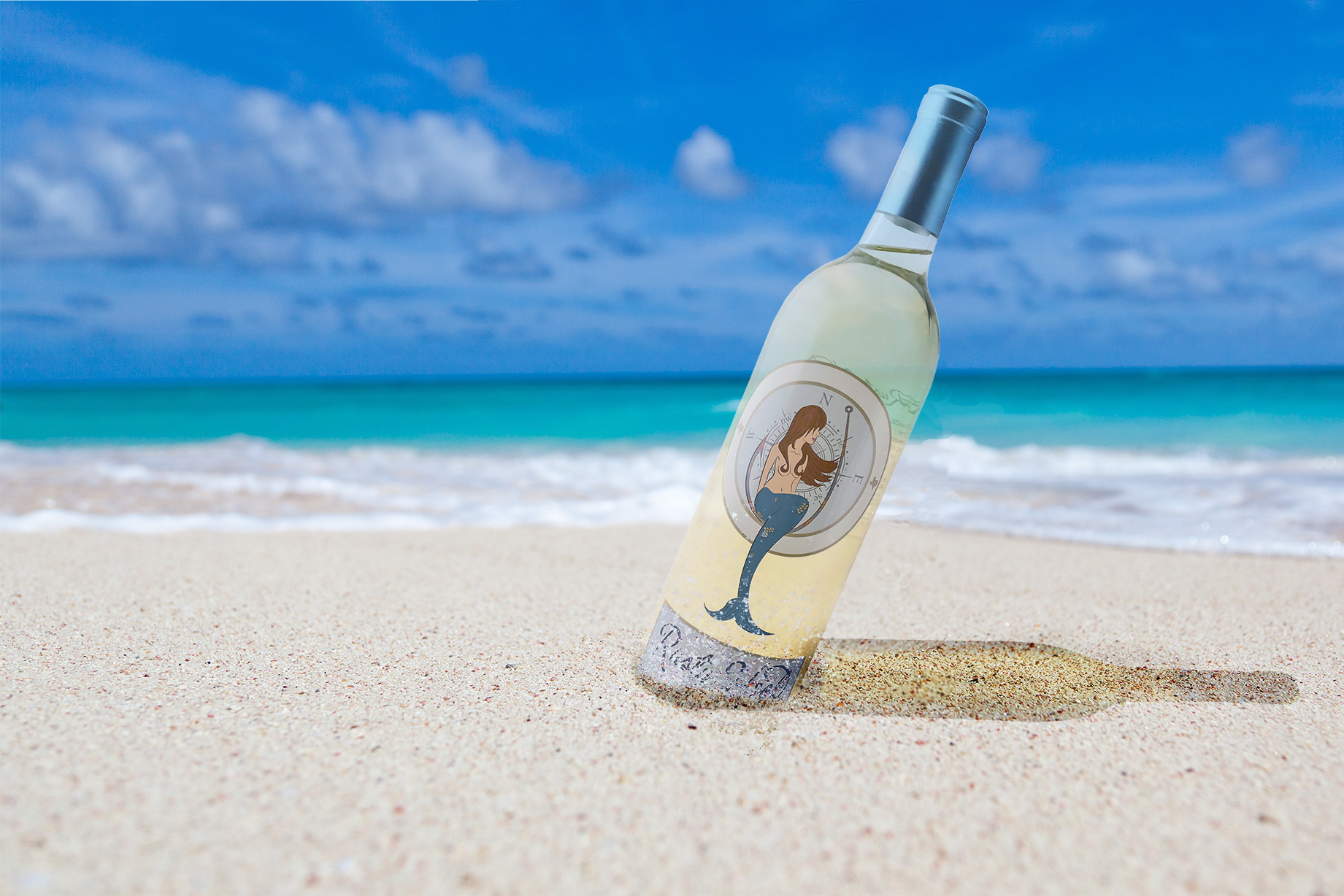
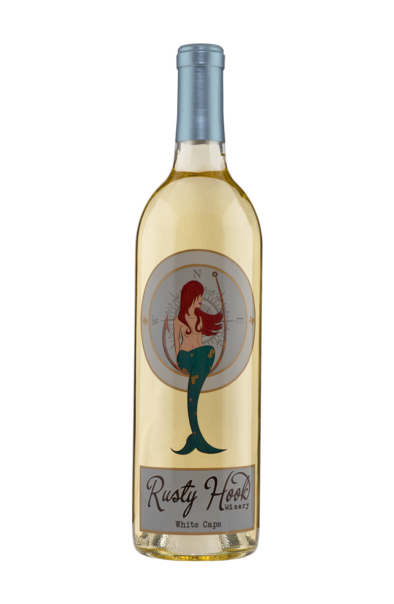
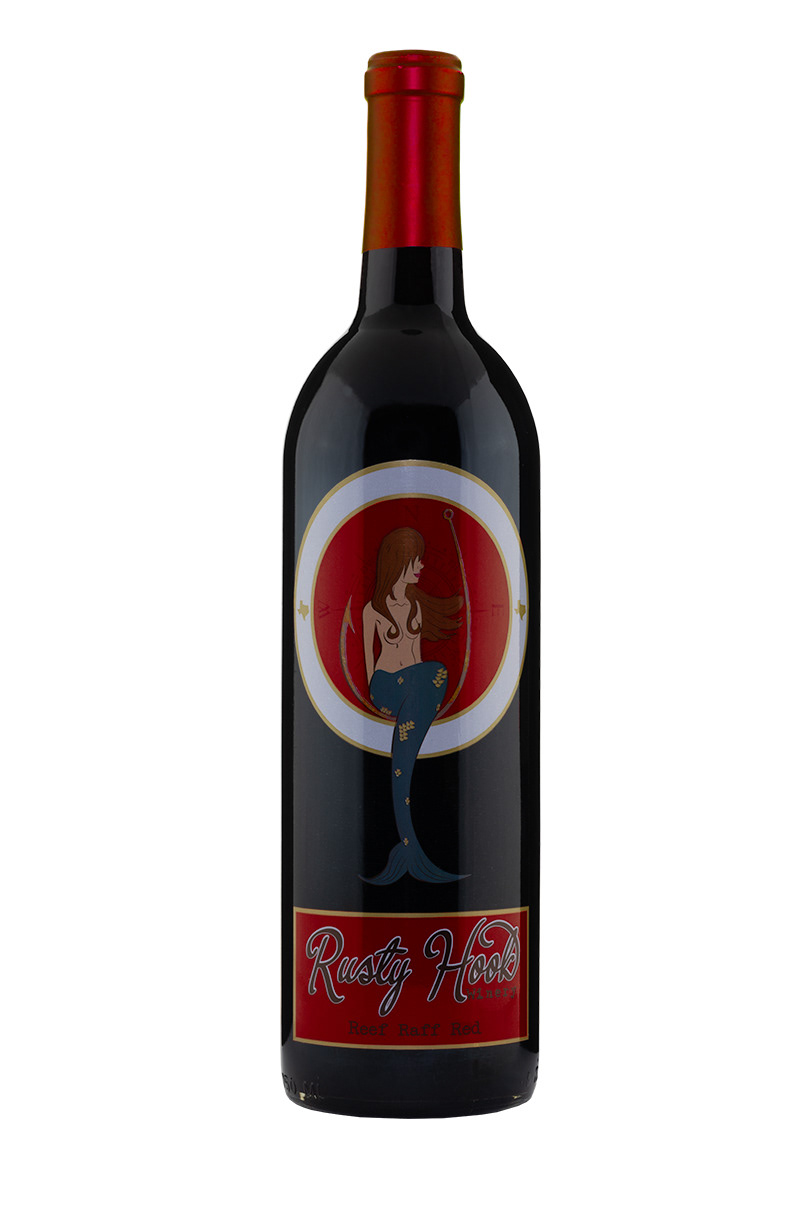
Rusty Hook's design is base on a new world style that encompasses its local coastal region. Using a rough sketch, the client had, I redrew the mermaid and added texture and further developed the logo. It was created as a vector so that it could be scaled to fit a large sign or small enough for a wine glass. I used two fonts that make up the brand name was selected, that was both script and typewriter to give it a rustic coastal feel.
Label
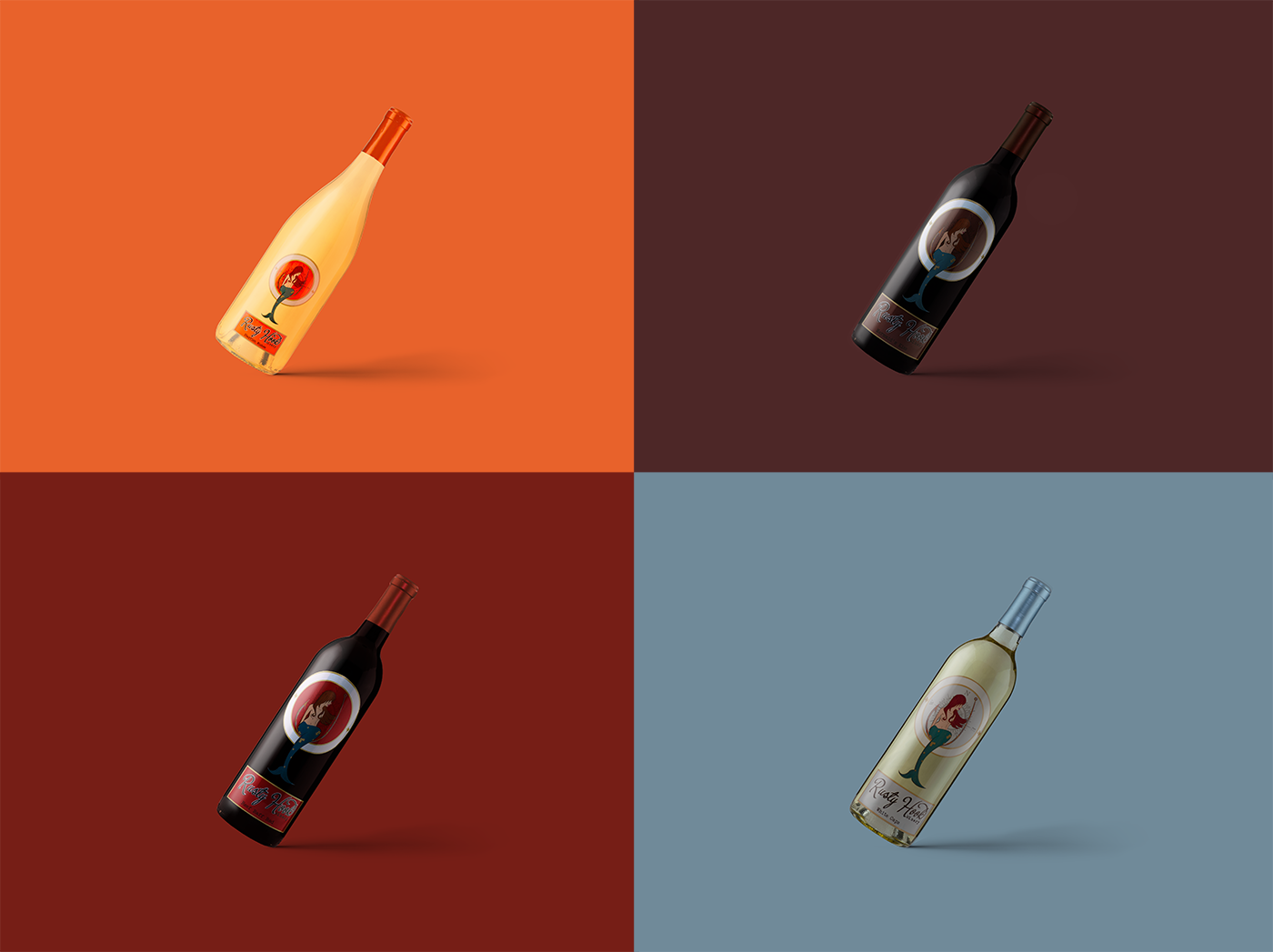
The label was printed on a clear label stock so that there appeared to be a separation between the top and bottom parts of the labels. The front label was designed to look like a porthole and keeping with the natural theme a compass rose was added behind the mermaid on the rusty hook. Under that, the winery's name and the wine name shown. Bright and fun colors were used to not only distinguish each of the wines but are meant to draw the eye to the label if it was ever to sit next to another wine. The label colors were colored matched to capsules that were stock capsule due to time constraints. To make the label pop more a metallic gold ink was used for the porthole and scales for the mermaid. The back label is designed to hide behind the front label and not to distract from the front label.
Packaging
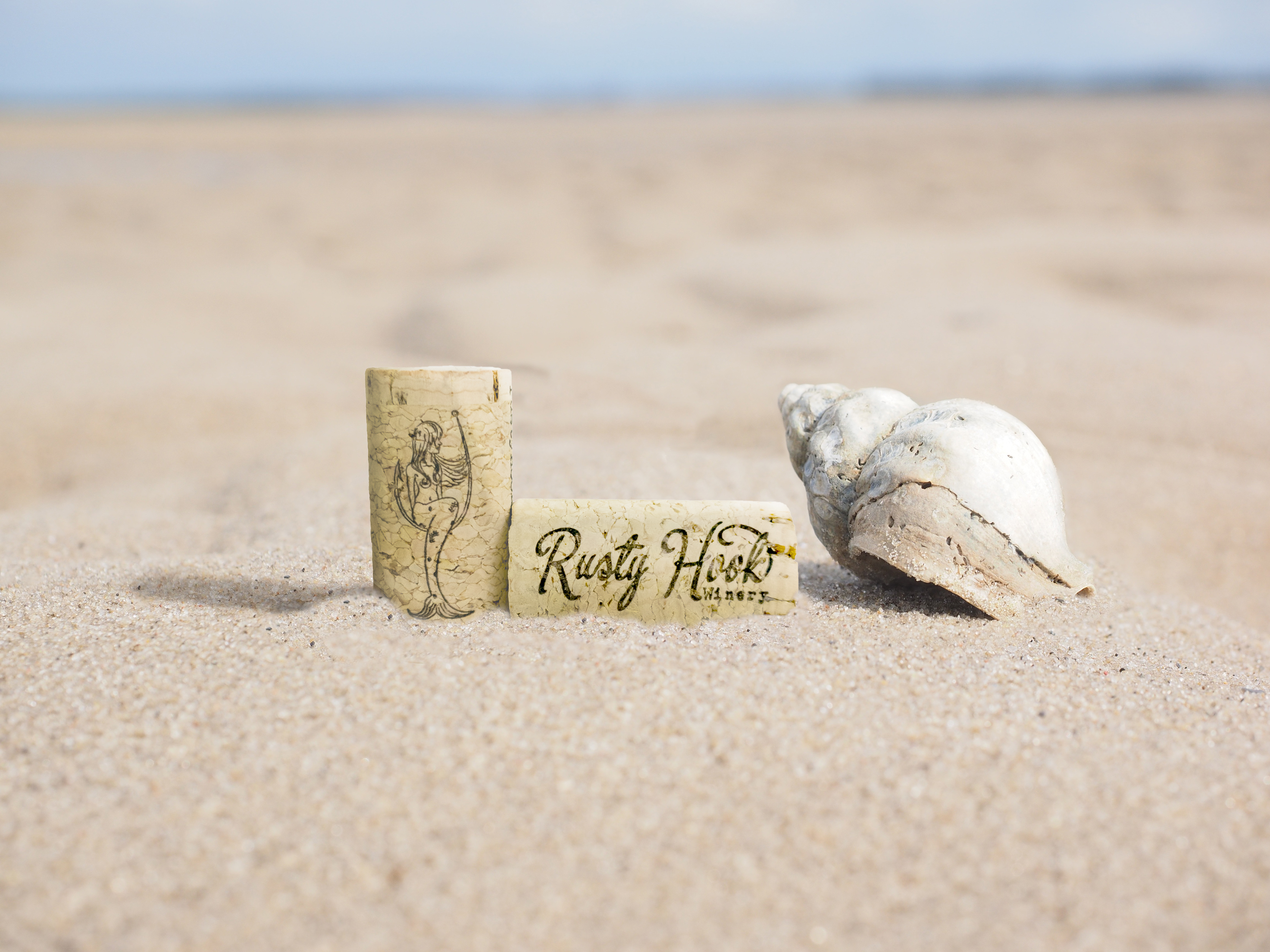
Bright and fun capsules colors were selected that were stock capsules from several vendors to make the timeline. Full punt bottles were used to give it a quality feel and weight and flint(clear) bottles for white wines and antique green for reds. A custom 44mm twin top agglomerated cork was design out to where if it was kept it could display other vertical with the rusty hook mermaid or horizontal with the winery's name.
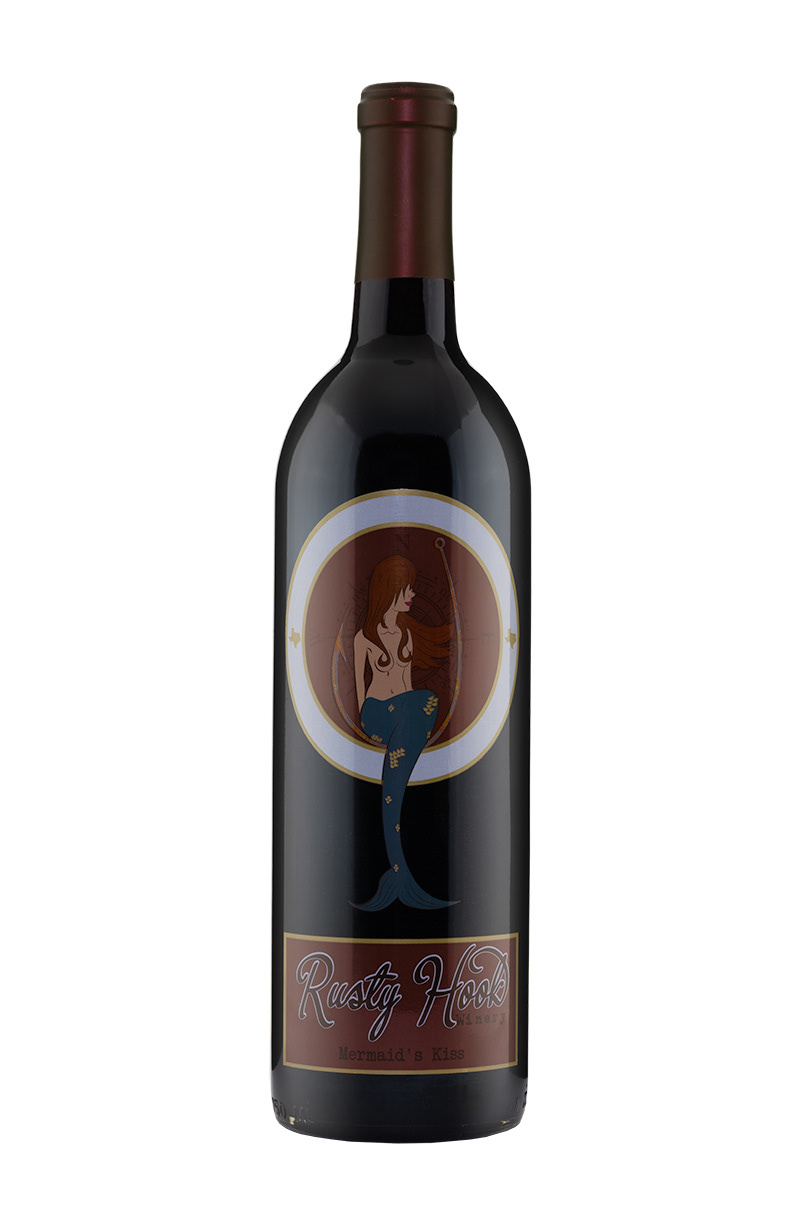
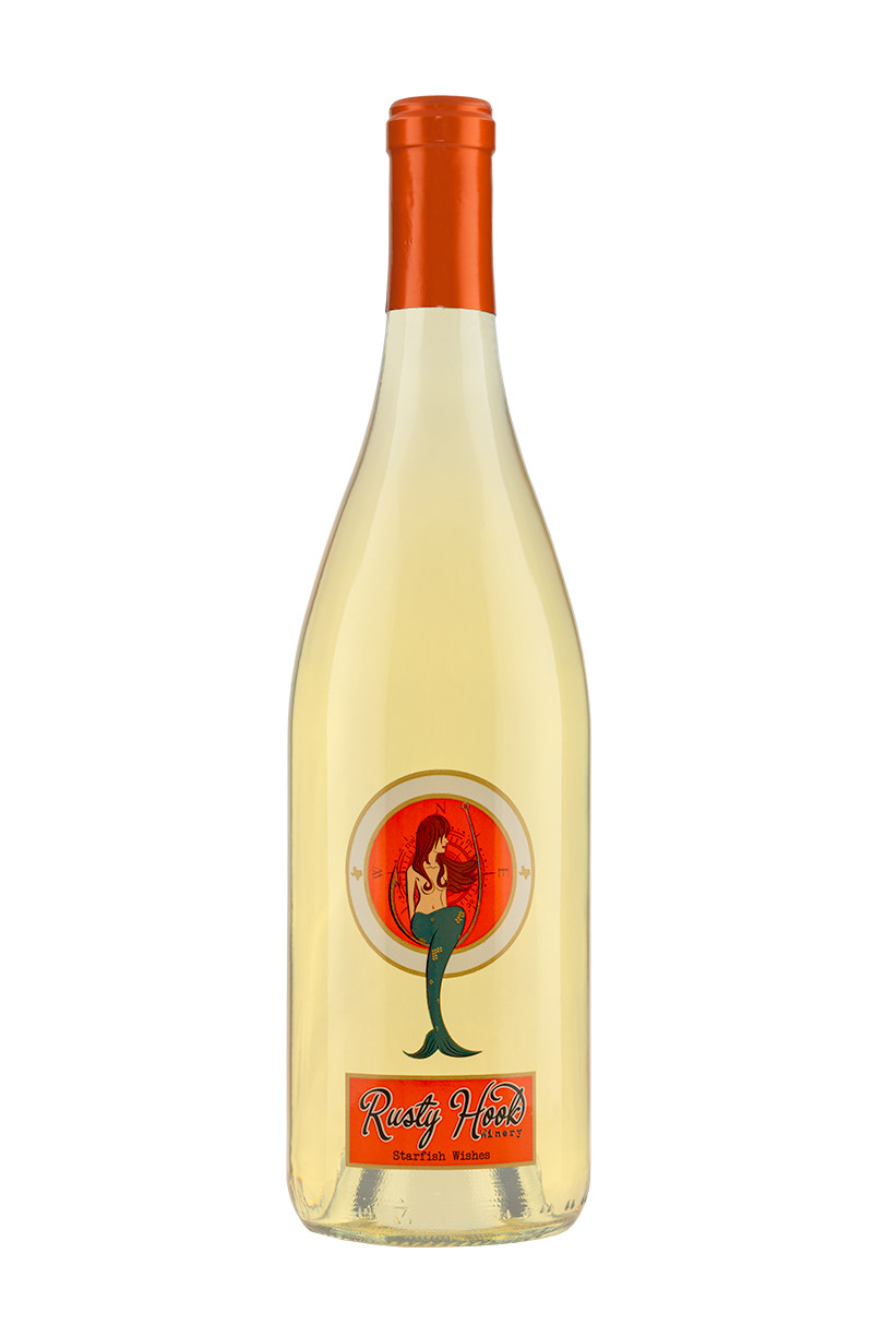
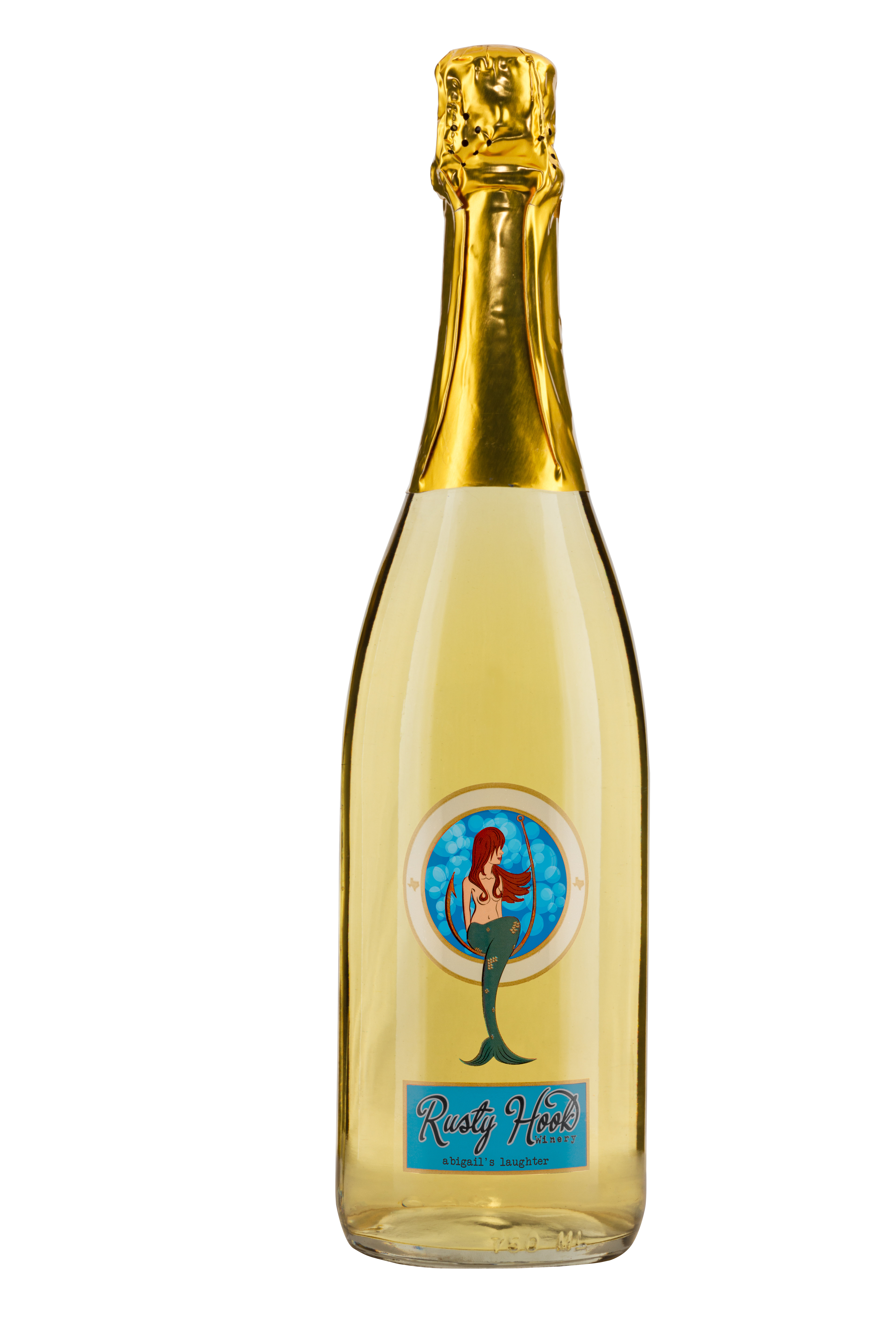
Product photographs I took of the wines. *Due to not having the final label or product, Reef Raft and Abigail's Laughter were digitally created.
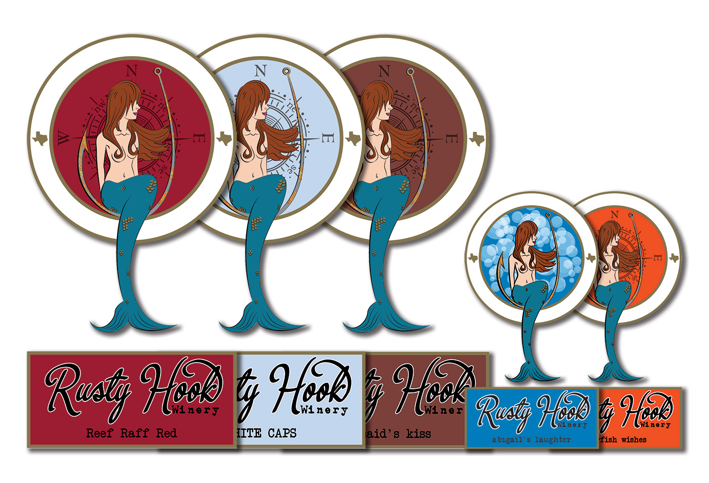
Label Size: front label 3.25" x 6.43" & 2.08" x 4" for Starfish Wishes & Abigail's Laughter, back label are 3.25" x 3.25"