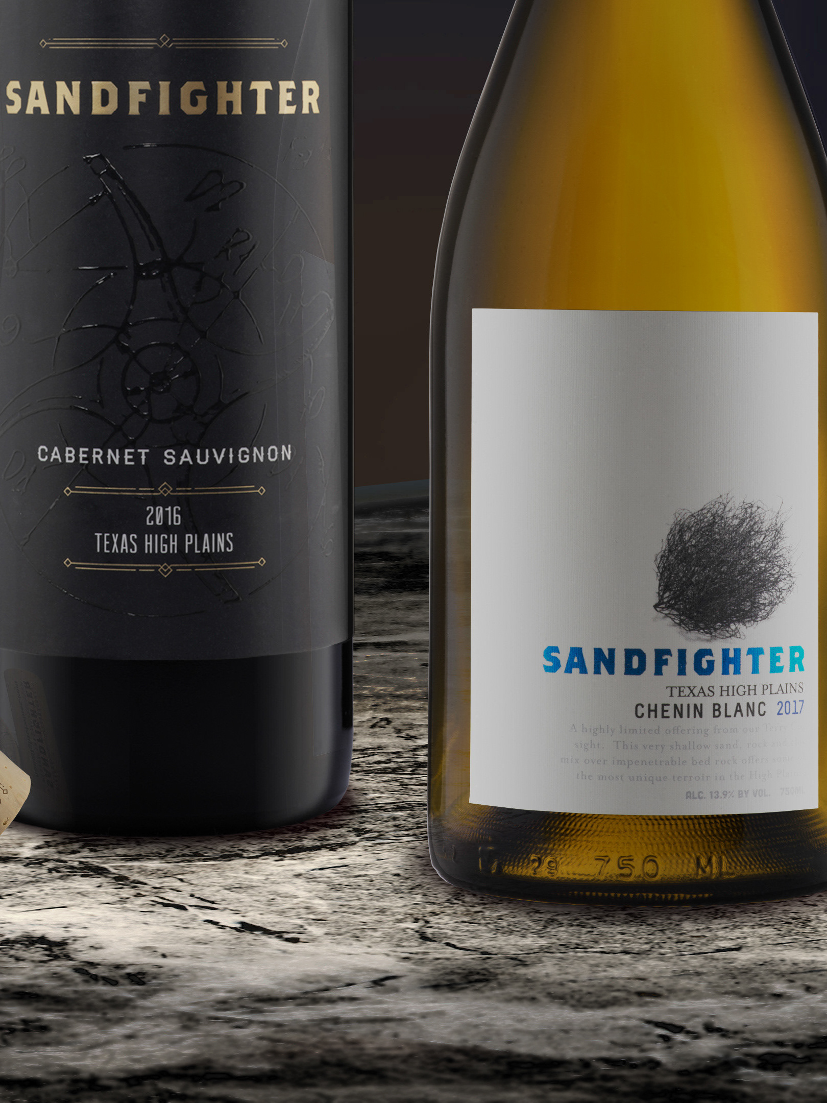
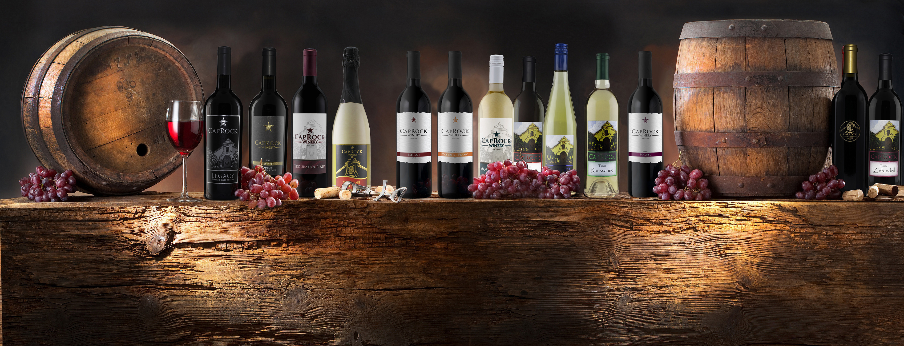
Work Performed
These are projects that I completed for Caprock Winery. I was commissioned to complete everything from initial concept creation to finalizing print and direction for the brand and products moving forward. I would go onto make marketing materials for wines that went into distribution. Specific tasks performed for this winery included Packaging, Label, Concept, and Logo Consultation and Design; Original Art and Illustration; Branding Direction; Print Consultation and Direction; Product Photography; and Design and Production of Marketing Material.
The Client
This winery is on the outskirts of Lubbock, Texas. Once known as Teysha Winery that started in 1988 but has changed multiple owners’ hands several times. Their winery is designed not only to function as a full winery but as well as an event center with a Tuscany theme. With a beautiful facility and a broad array of wines, the owners wanted to make the drive out worth the customer’s trip out there.
*It is now known as English Newsom Cellars.
The Challenge
The initial owner wanted to move far away way from the labels that they were producing and wanted a more youthful take on it. I was tasked to bring each of these projects to life with wine labels that matched the client’s and tasting room manager’s unique vision for their brand. Every time a new owner, or tasting room manager was replaced, new designs were created to reflect their style. I would sit down and make multiple design choices that both the owners and manager could agree too. Overall the client wanted to target the non-wine drinker and college students but not alienate its veteran customers. Some wines were to be designed for high-end consumers and tasting room only while others were to be designed for a retail environment. Retail had to be refreshing and different from the other local Texas wines. Marketing materials for the stores it was sold in would also need to be created.
The Process
Client meeting for values and brand exploration, to get a sense of the personality and mission of this particular winery > Researching the local area, culture, and history of the company and previous labels > Concepts Created > Eliciting and encouraging client feedback > Design Label Concepts of a few different styles to present to client > Final Label and Packaging Design > Completion of compliance submission for client > Directed and oversaw Label and Packaging printing and production > Wine Production, Bottling, and Labeling (working with these departments as a consultant and providing quality checks in-person to ensure successful final product).
The Designs
The Label & Packaging - Tasting Room Label
This design was created to distinguish this brand from the products that they had in distribution and with the idea of this being a tasting room only product. A traditional packaging was selected, which was a full punt, antique green Bordeaux bottle. Its custom 44mm natural branded cork was used. The client wanted to move away from their past labels with the image of the front of their winery. The wine label was produced on a felt stock and kept very minimalist like the 2015 estate Malbec. With a tactile varnish applied to the logo and bar to give it more sensory to the label in terms of look and feel. Although the Merlot was the only one produced the Cabernet Franc and Malbec were to follow a similar design theme. The colors were selected to pay homage to different Texas Universities (Texas Tech University, University of Texas, and Texas A&M).
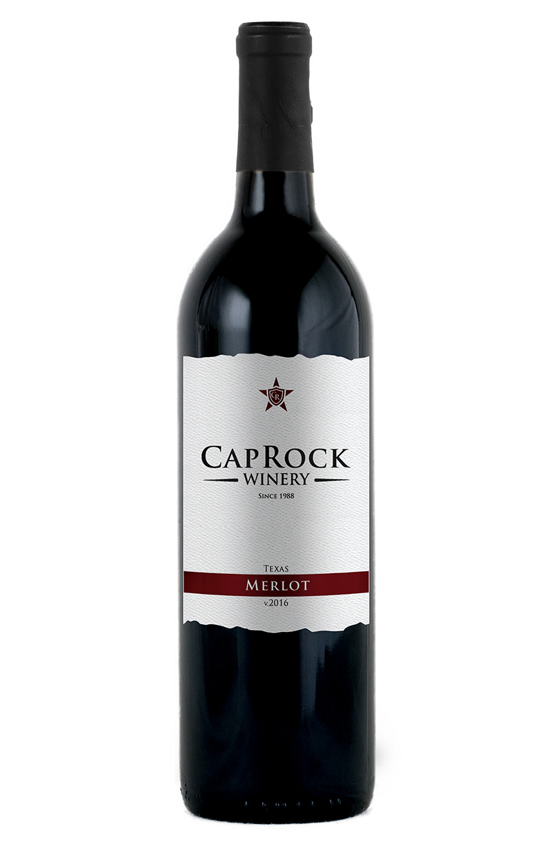
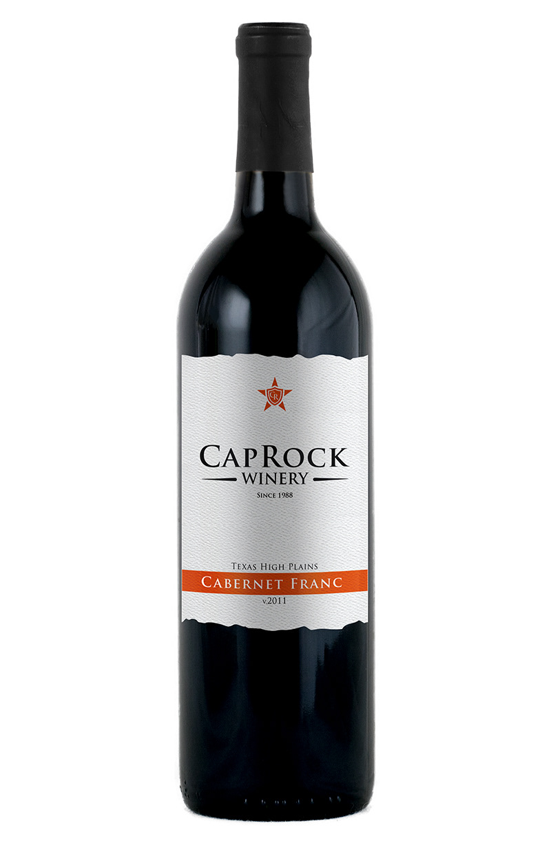
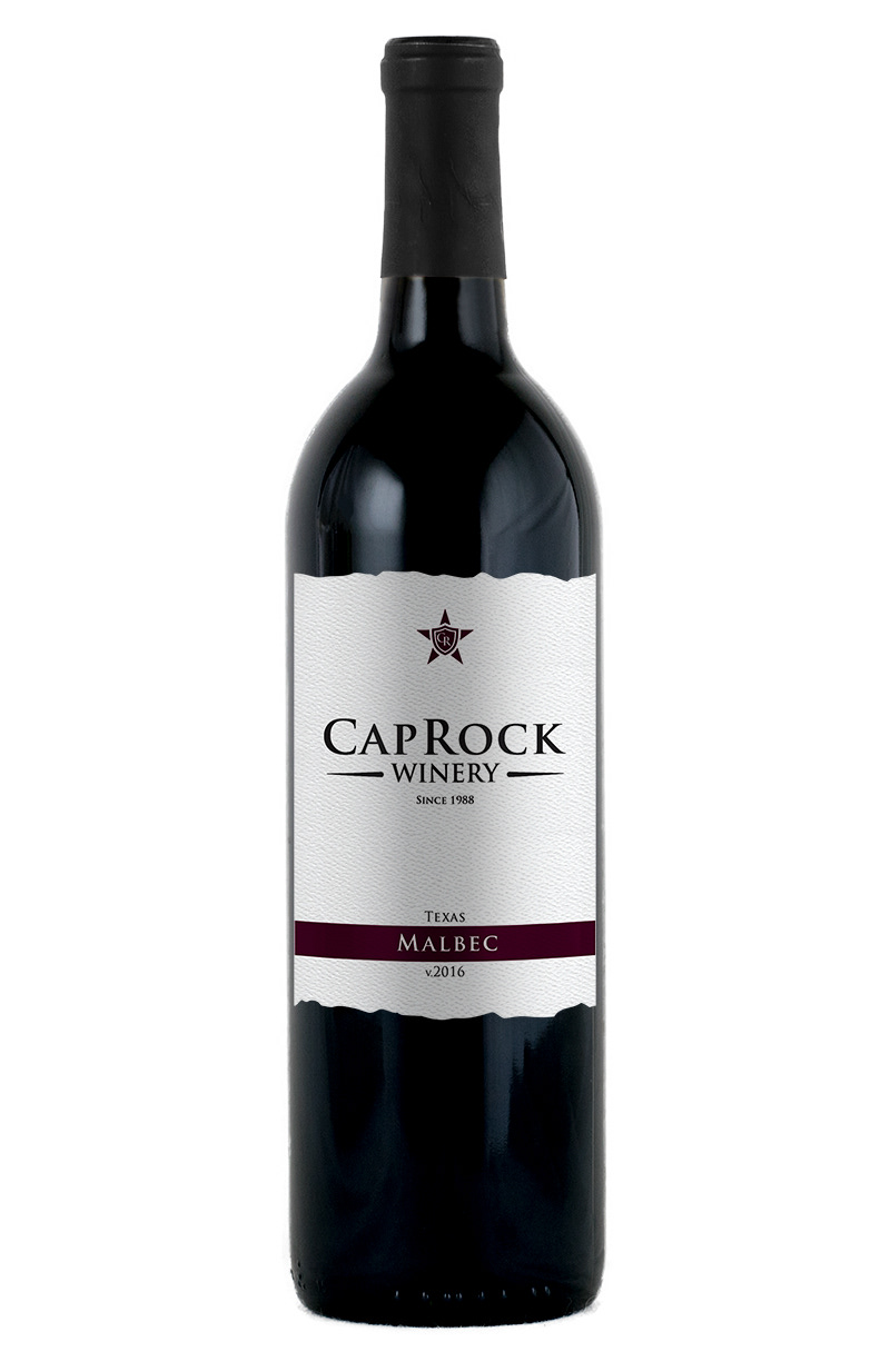
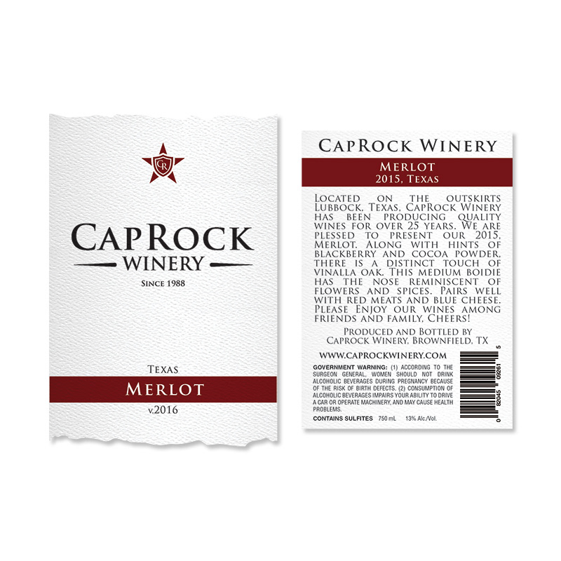
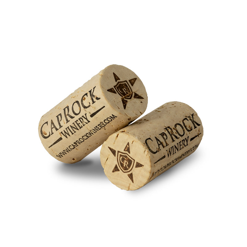
Concepts of Merlot, Cabernet & Malbec; Photo of Caprock's Custom 44mm cork; Label Size - Front 4.5 " x 5.5”, Back 4" x 5"
The Design
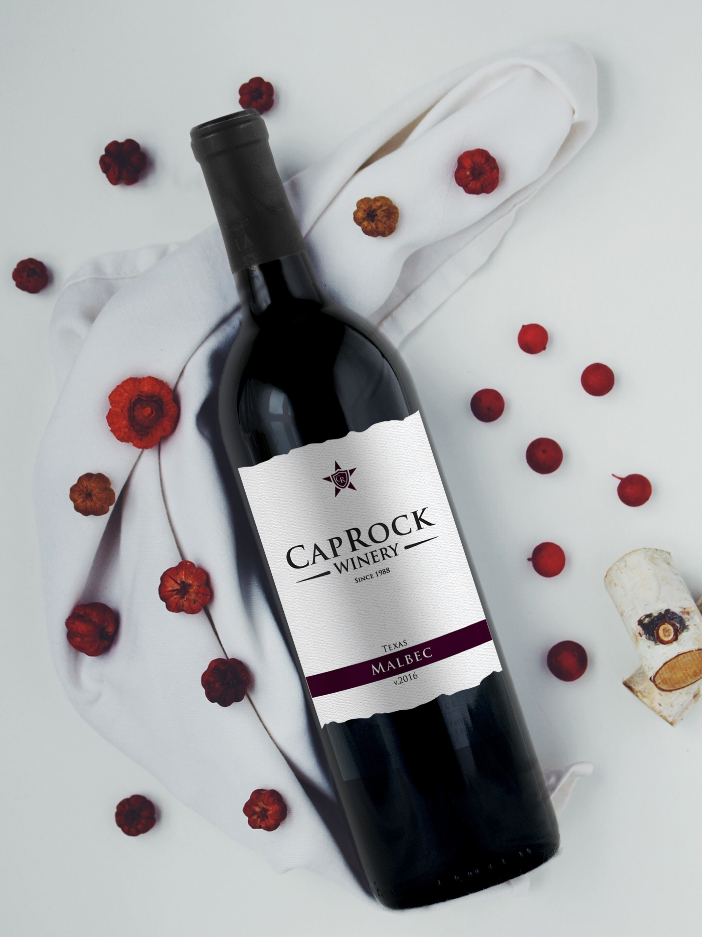
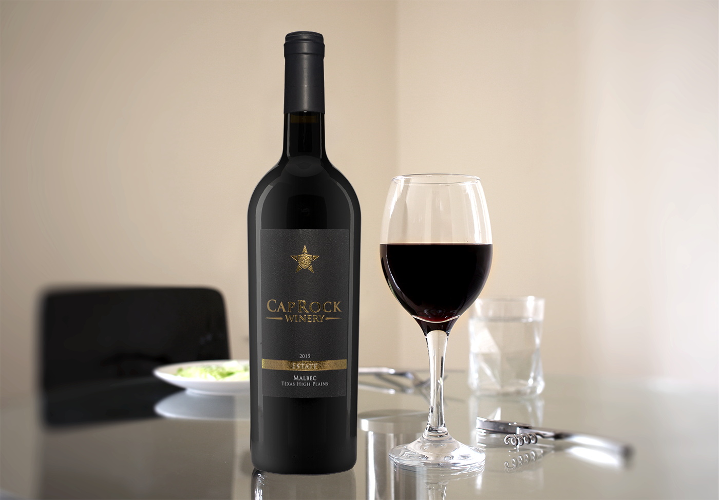
The Label & Packaging - Estate Malbec 2015
The 2015 Estate Malbec wine label was designed to have a more elegant and simplistic design. The main wine label design focused on it being their estate wine and wanting it to be different from other wine labels. So to focus on the brand was brought to the logo. The wine label was printed on luxurious linen paper and used a gold foil stamp. To accent the gold foil the label was contrast with a black background. To complement the wine label and packaging, a matte black capsule was selected to distinguish itself from the previous 2014 Malbec.
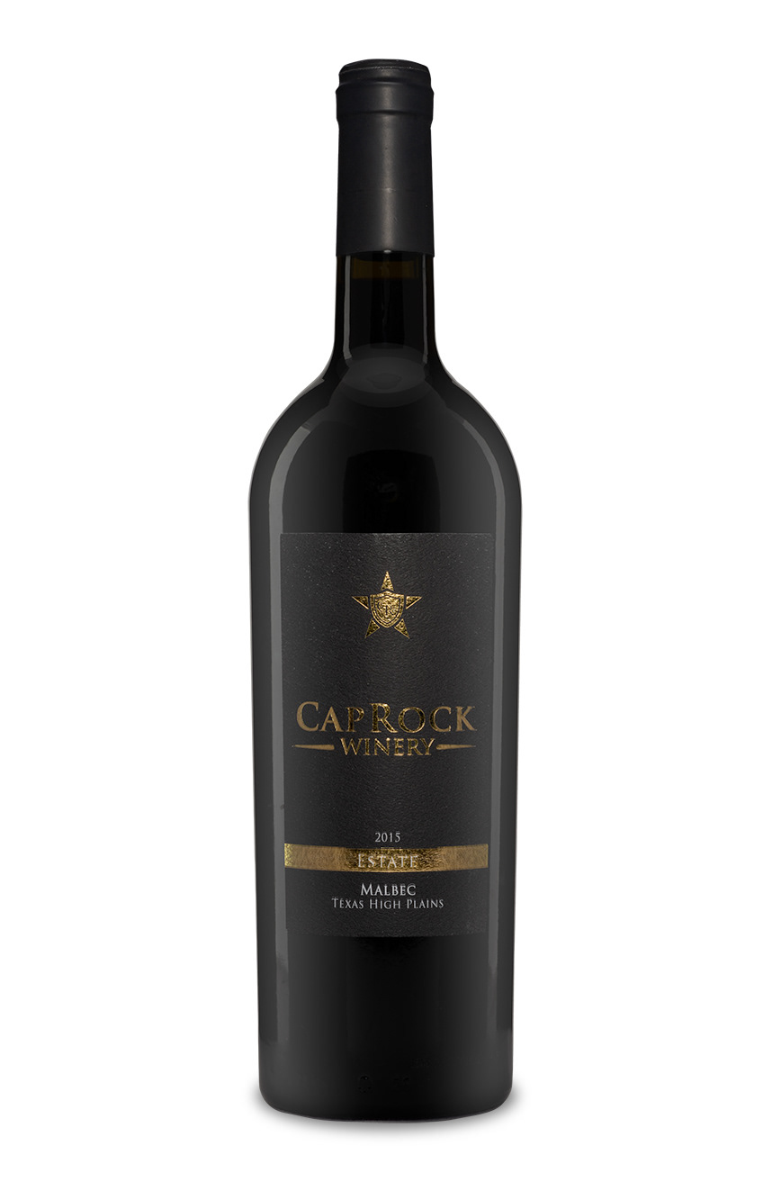
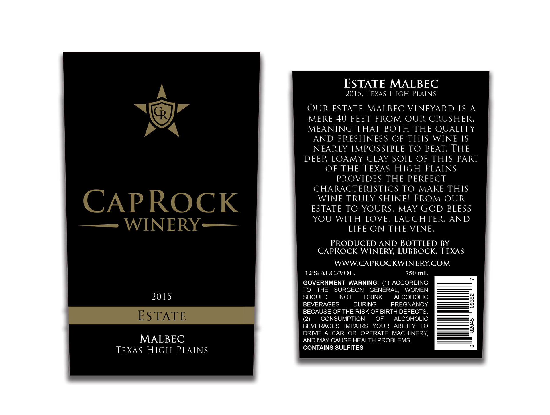

Photo of 2015 Estate Malbec; Photo of Caprock's Custom 44mm cork, Label Size - Front 2.75" x 4.5”, Back 2.75" x 4"
The Design
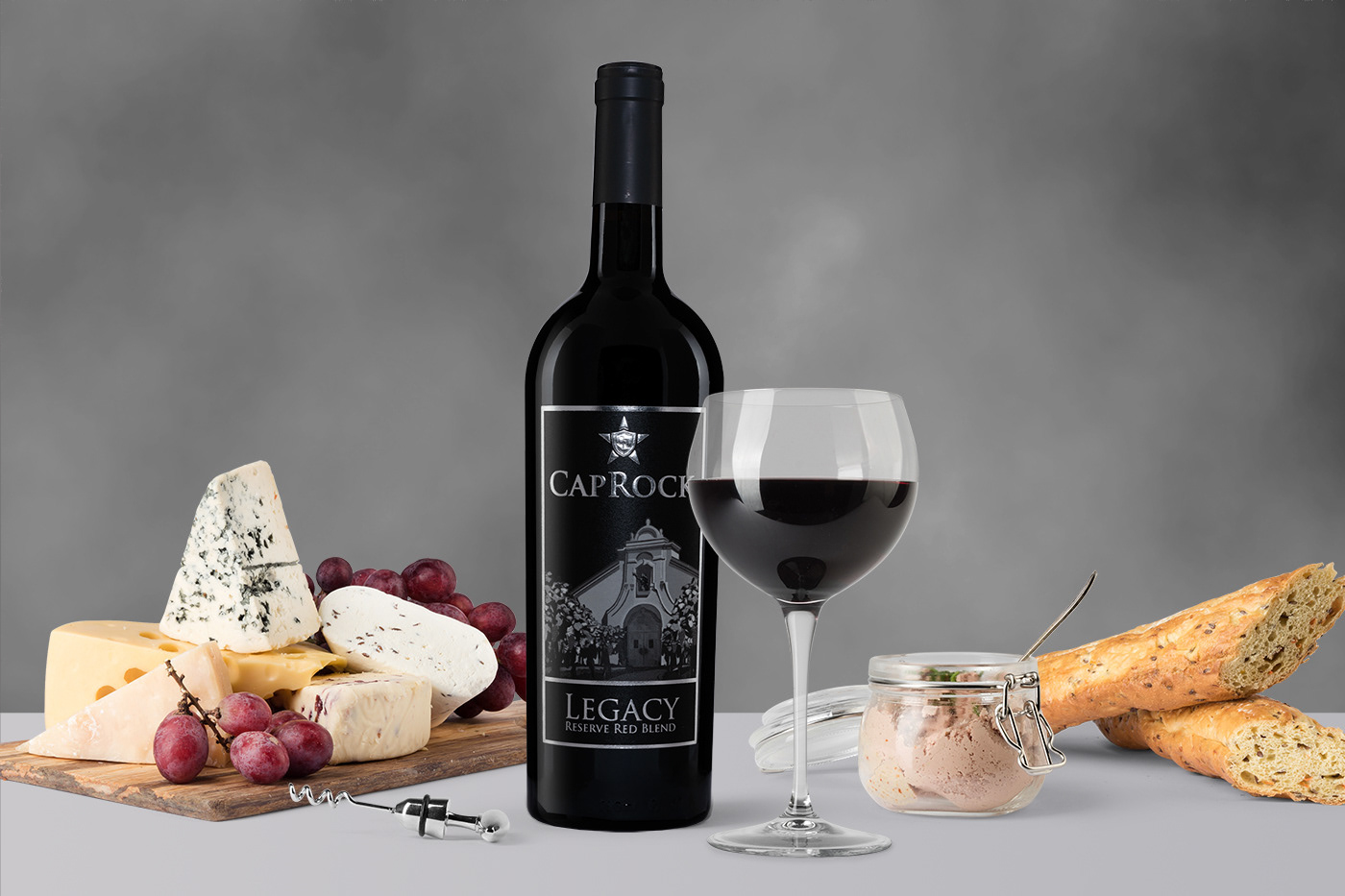
The Label & Packaging - Legacy Red
This project was to redesign its high-end product line Legacy when the winery was rebranding itself. The premium packaging for wine is a full punt, heavy-weighted, antique green tapered Bordeaux bottle. I continued to use the custom branded natural cork that I had previously designed. Going with a dark pallet but wanting their brand to be seen, I used a silver foil stamp and embossed their logo. The back label was also foil stamped as well. The paper stock was high-end cotton to add to the feel of the wine label and absorb the ink well to give the label a beautiful black. The printing allowed the grey inks to stand out and bring focus on the wineries entrance.

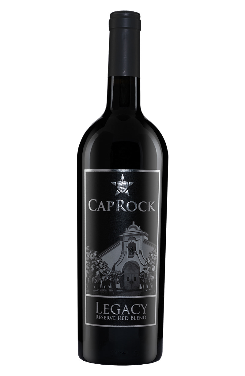
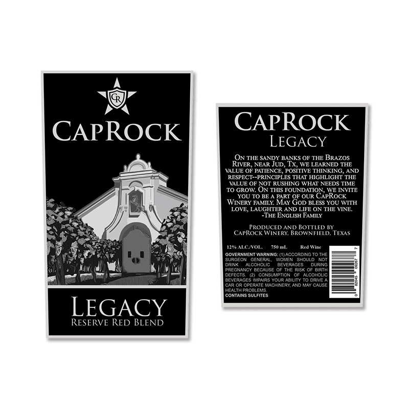
Photo of Legacy; Photo of Caprock's Custom 44mm cork, Label Size - Front 4.5 " x 5.5”, Back
The Designs
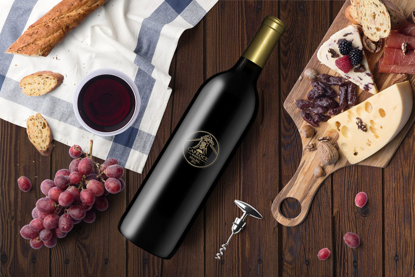
The Label & Packaging - Malbec 2014
The 2014 Malbec design was one of my more challenging projects in my career. Due to not only time crunch but finding a local person to do the etching and figuring out a design that could work with their limitations. The issue was that the design of the image could not be larger than a silver dollar. I drew the front of the winery, and a gold filler was used to make the design pop. I re-drew it in Illustrator as a vector for the machine to give the best quality. The back of the bottle was also etched to give it a premium feel and to match the front etching ink color. A matching gold capsule and its custom-branded cork were used to finish off the look.
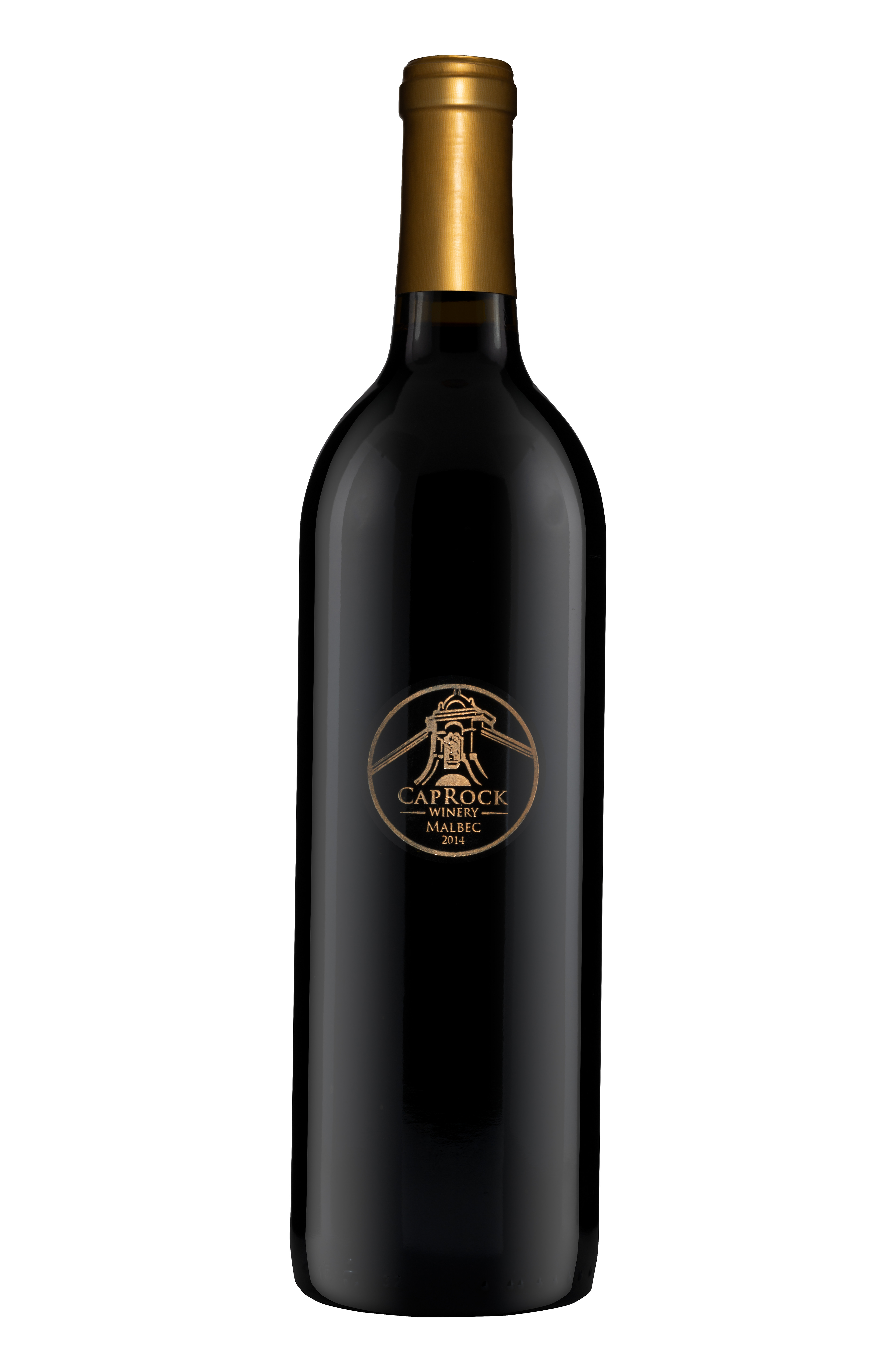

Photo of 2014 Malbec etched bottle; Caprock 44mm custom natural branded cork
The Designs
The Label & Packaging - Distribution Wines
This project was a rebranding of their Royale line that the client had in distribution. To update the look, I made the label larger than what they were using before. The wine label stands out on the shelf from other wines because a beautiful white felt paper was selected and its packaging. A raised spot UV coating was used to give the wine label more dimension. To attract new wine drinkers to its brand, a new world style design was created. The design is both intriguing and refreshing but not alienating their older customers.
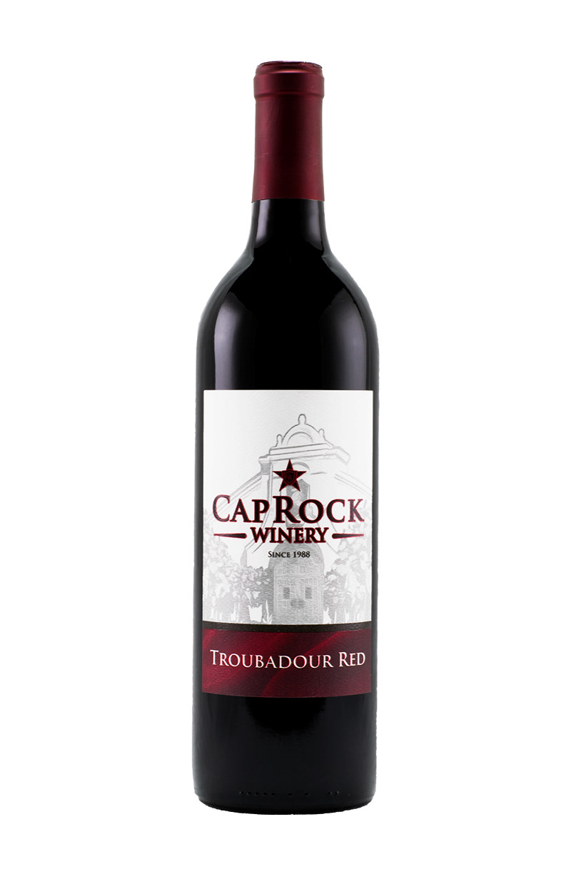
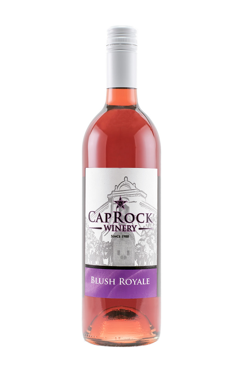
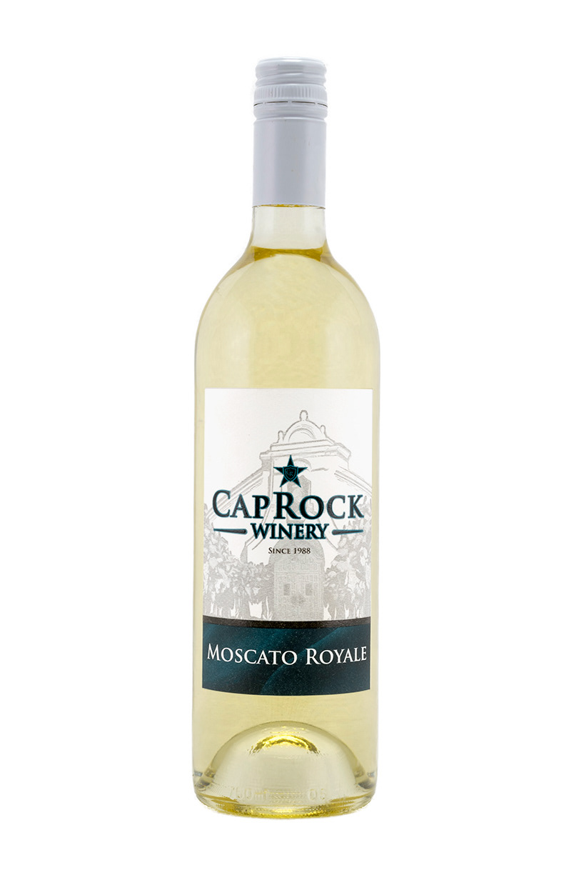
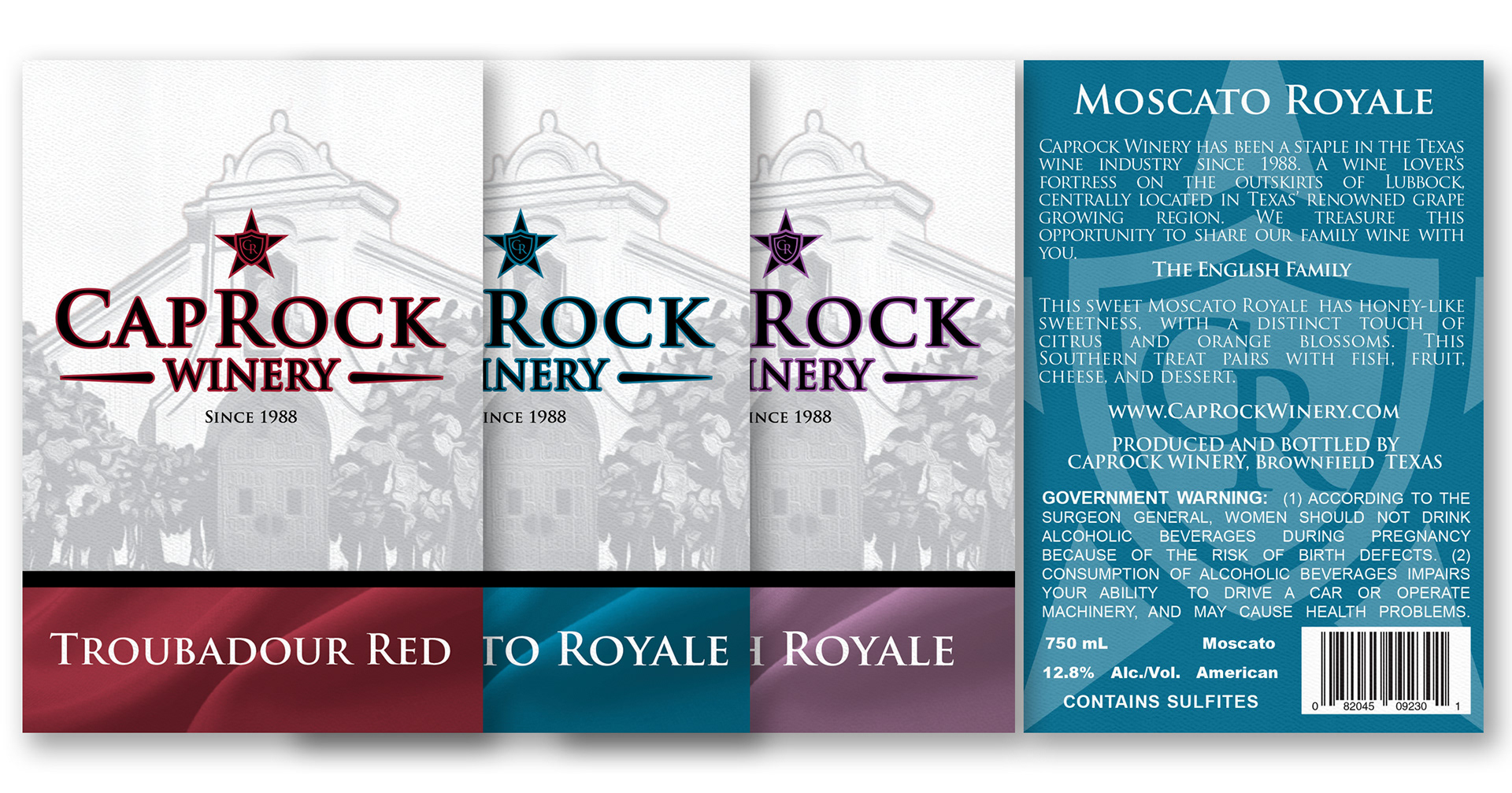

Photo of Royale Bottles; Label Size - Front 4.5 " x 5.5" , Back 4" x 5" ;Photo of Caprock's Custom 44mm cork
The Design
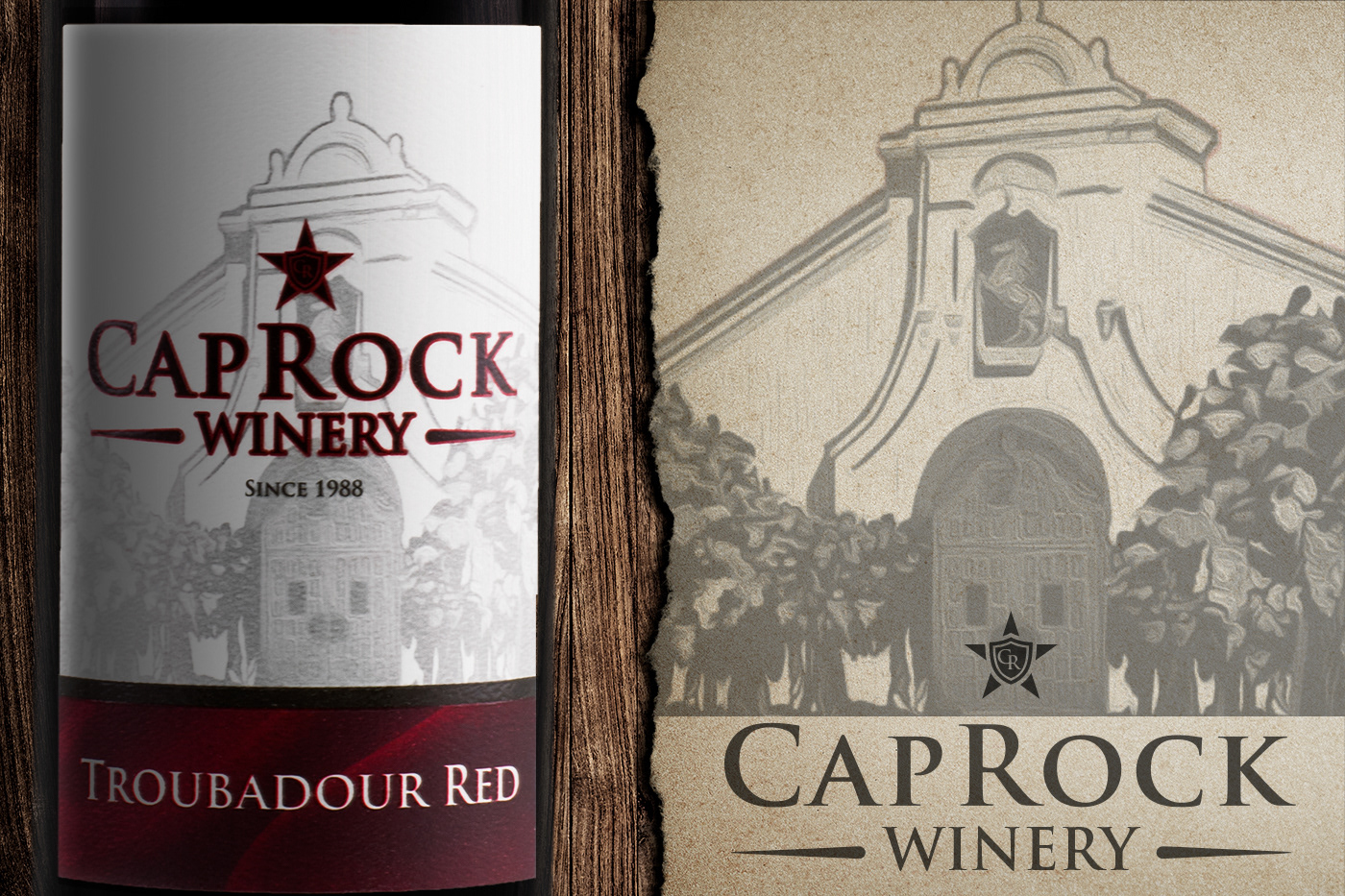
The Label & Packaging - Varietal Tasting Room
The client had taken over this winery and wanted to redo their labels for a younger generation of wine drinkers. Traditional packaging was used for the wines, and if possible, a color matching capsule. The client liked the image of their old labels, and so the image was updated. To get the image to fit the new size of the label, I edited by drawing in on the sides and bottom of the label to center the building onto the label design. A metallic paper label stock was selected and used a variety of colors to draw the eyes onto the brand. Depending on the wines profile, softer colors or more traditional colors were picked to influence the wine drinker. This way, the wine drinker could see the color and know if it was going to be a sweet or dry wine.
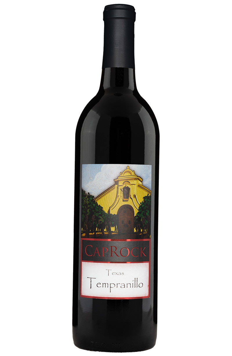
Tempranillo
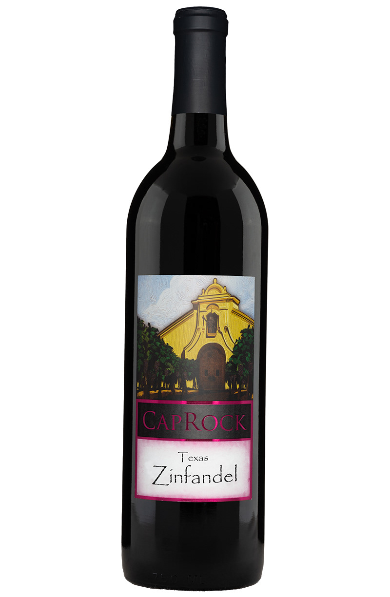
Zinfandel
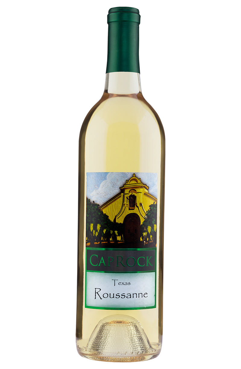
Roussanne
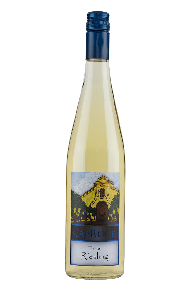
Riesling

Sparkling White Wine
Product photos of Tasting Room Varietals wines
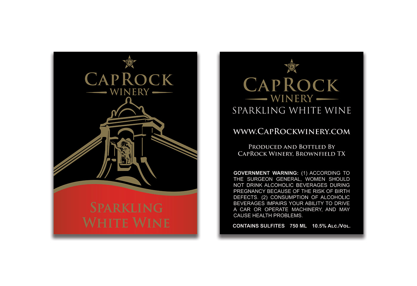
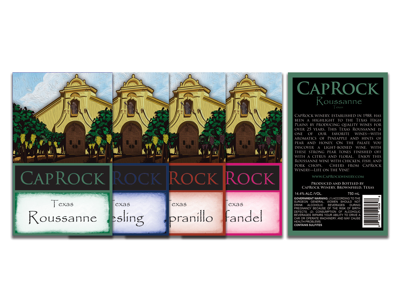
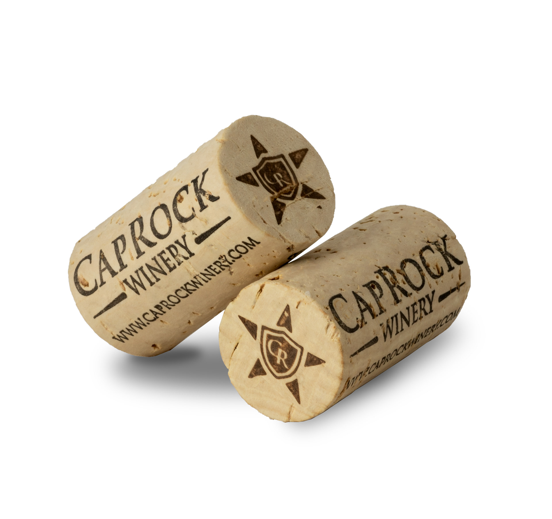
Photo of Caprock's Custom 44mm cork, Label Size - Front 4.5 " x 5.5”, Back 4" x 5